

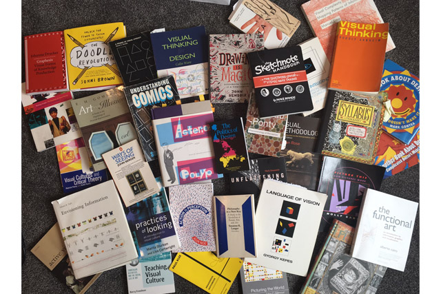
This is a look at my Fall 2016 visual communication course at SFSU (Liberal Studies 426 Thought & Image). You can see my syllabus, a week by week breakdown of things we discussed and readings that prompted them, and then exercises we did and (in separate PDFs) sample student responses. What I’ve posted about Final Projects is pretty sparse – difficult to make anonymous and they were hard to document properly – hopefully the bit I did share from those gives a sense of the range of things students explored… – Nick
Overview: Humans are highly visual creatures and we live in an increasingly visual culture. In this course, we will explore what visual thinking means, work to become visually literate, and engage with visual culture. We will look, read, analyze, critique – and we will make – draw, design, compose. This will be a highly hands-on experience – with no prior drawing or design experience expected or required. In engaging visually with our visual world, we expect to open new perspectives on the world around us previously outside our experience.
Regular in-class and at home ongoing assignments will be posed as opportunities for serious play – to engage with visual communication as maker, critic, respondent. You will be assessed on your exploring them and putting yourself into the work, rather than your existing skill, craftsmanship. These should be fun even as they are demanding in the ways you push yourself to think and work in ways you aren’t accustomed. Ultimately, the course should get you to ask questions about what thinking looks like and prepare you to go on visual explorations of your own devising…
Overview of what we did, day by day follows. Examples of student responses to each prompt/project are in PDFs here (descriptions of projects are under each day below):
Student Responses Part 1 – 1-6 LS426 Student Projects pt1
Student Responses Part 2 – 7-12 LS426 Student Projects pt2
Student Responses Part 3 – 13-18 LS426 Student Projects pt3
Student Responses Part 4 – 19-21 LS426 Student Projects pt4
Student Responses Part 5 – 22-27 LS426 Student Projects pt5
Student Responses Part 6 – 28-36 LS426 Student Projects pt6
Final Projects LS426 Student Projects pt7 Final Projects
Class 1: Introduction
Introduced what we’d be doing, overview of my work and how it connects to goals of course, and then we got to drawing with Grids & Gestures in-class.
For next class, they looked at these short Visual Note taking Resources:
Read/View Mike Rohde on sketchnoting http://alistapart.com/article/sketching-the-visual-thinking-power-tool,
Giulia Forsythe on Visual Note-taking (video) http://gforsythe.ca/visual-notes/
Scott Torrance visual essay on shifting from text to visual https://medium.com/visual-thinking-in-business/the-shift-from-text-to-visuals-e260ef138fae
Response Gallery 1: Grids & Gestures
Class 2: The privileging of text & Sketchnotes/Doodle
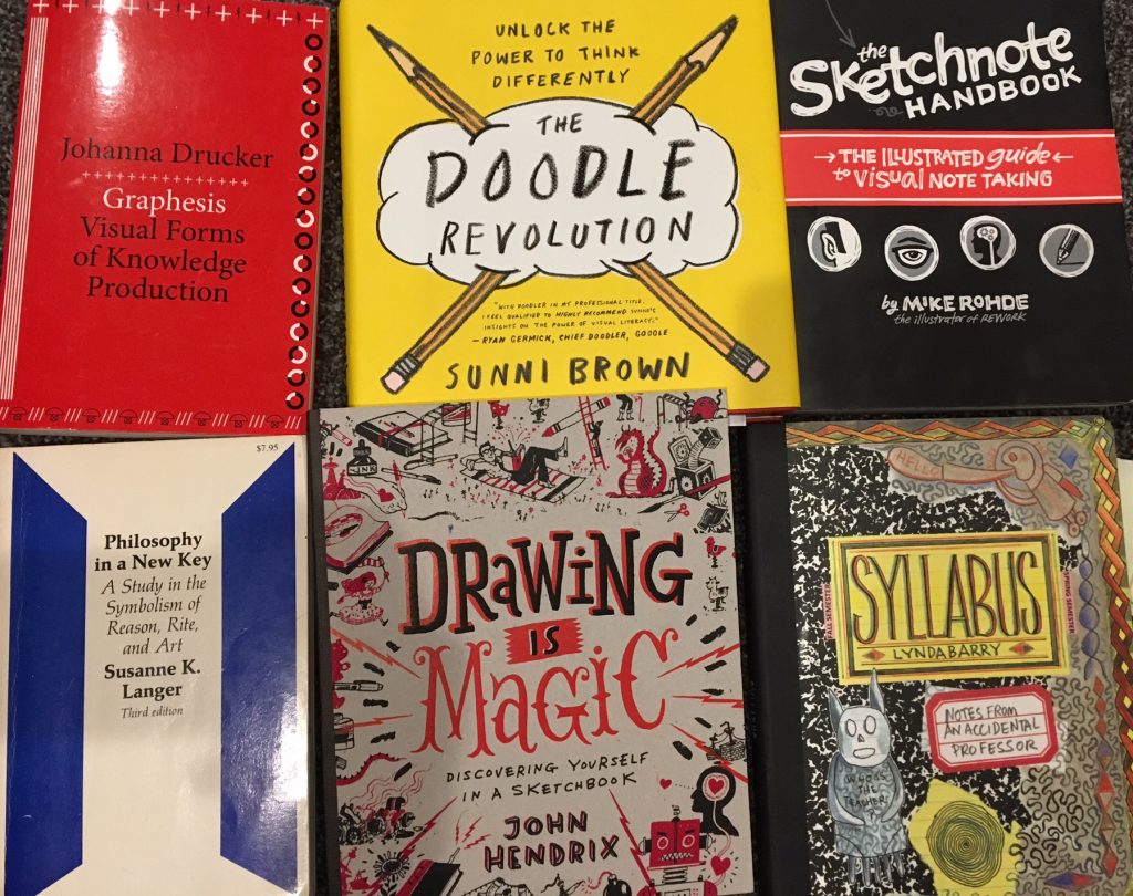
Books I drew on for my slide talk: Johanna Drucker Graphesis, Sunni Brown Doodle Revolution, Mike Rohde The Sketchnote Handbook, Susanne K. Langer Philosophy in a New Key, John Hendrix Drawing is Magic, and Lynda Barry Syllabus.
We discussed the longstanding bias against images, the concept of the Gutenberg Parenthesis, and considered the advantages of sketching, sketch-noting, and doodling to enrich our thinking. From Lynda Barry, talked about the magic of a drawing as a place to play – from Sunni Brown, about visual literacy as compared to verbal literacy. Gave them some examples from Mike Rohde on fast ways to draw figures – which they turned in as part of daily work. Also played Sunni Brown’s “Doodle Game” – quick prompts to doodle things and share with another.
For next time: READ: Keep Calm/Doodle On http://www.pbs.org/wgbh/nova/blogs/education/2014/07/keep-calm-and-doodle-on/
For next class – you will turn in a sketchnote you made in another class (or public talk, or TED talk, something you had to listen to).
Response Gallery 2: Doodles
Day 3 “The Eyes Have it” – Perception, Optics, cognition…
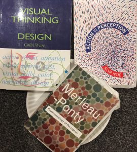
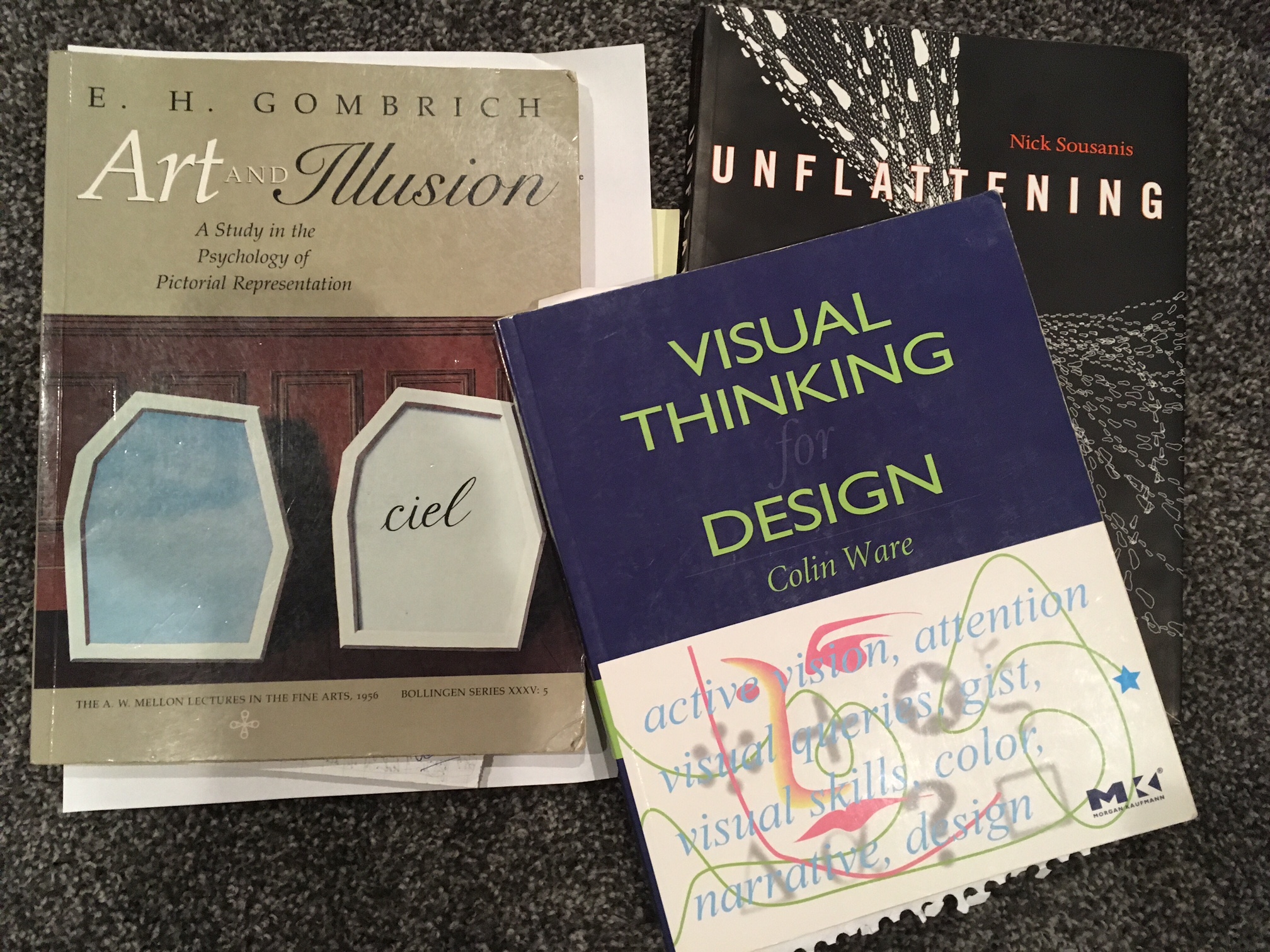
Readings I drew on Colin Ware Visual Thinking for Design, Alva Noë Action in Perception, Maurice Merleau-Ponty Phenomenology of Perception.
Discussed Perception, optics, and cognition, with two keys: 1) our vision is not whole – segmented, and 2) Vision is active – something we DO. This was a lot on Colin Ware and Alva Noë. I gave them the example of a paper plate – something we know to be round, but almost always see as an ellipse (i drew this in Unflattening) – citing Noë: “Perceptual experience is a way of encountering how things are by making contact with how they appear to be.”
We also looked at Gestalt drawings.
We got at some of this by looking at the concept of Change Blindness – videos…
- The Door Study: https://www.youtube.com/watch?v=FWSxSQsspiQ
- Change Blindness https://vimeo.com/126969182
- Selective Attention https://www.youtube.com/watch?v=vJG698U2Mvo
- IG & others http://www.theinvisiblegorilla.com/videos.html#tryit
- Monkey Business Illusion https://www.youtube.com/watch?v=IGQmdoK_ZfY
Saccadic Motion video
Sunni Brown Doodle Revolution TED Talk
Sketchnote examples from beginners (at Sketchnote Army)!
My comic on sketchinghttp://spinweaveandcut.com/sketching/
Page from Unflattening on Sketching http://spinweaveandcut.com/deletedscenes2/
A few specific citations:
From Fish & Scrivener (1990):
- Sketching, or the production of untidy images to assist in the development of visual ideas, is one of the oldest and most familiar activities of artists and designers.
- Sketching is conducted both to clarify existing ideas and to develop new ones.
- suggest that sketches “contain selective and fragmentary information” (p. 119), “deliberate or accidental indeterminacies that are important to their function,” which “preserve alternatives” (p. 120), and use “denotation systems that include tolerances and indeterminacies in ways that can amplify the artist’s ability to perceive or imagine many options” (p. 117).
From Goel: He found that because freehand sketches in the early design process are “dense” and “ambiguous”, they work well for crystallizing design ideas.
- Goldschmidt observed that there are two ways of inspecting sketches, i.e. “seeing as” and “seeing that”, and that the former is an especially powerful means for what she calls interactive imagery.
Goel (1995, p. 179), Goldschmidt cited in Suwa and Tversky (1997, p. 386). While not explicitly referenced here, but implicit in the visuals, Fish and Scrivener (1990) suggest that sketches “contain selective and fragmentary information” (p. 119), “deliberate or accidental indeterminacies that are important to their function,” which “preserve alternatives” (p. 120), and use “denotation systems that include tolerances and indeterminacies in ways that can amplify the artist’s ability to perceive or imagine many options” (p. 117). It’s what Suwa and Tversky (2001) call “constructive perception.”
We then looked at Harold & The Purple Crayon, the generative process of my sketches to make a comics page (see here), before turning to Austin Kleon’s Tea Bag Drawings: http://austinkleon.com/tag/tea-drawings/.
In class, we did crumple-drawings (crumple a sheet of paper and then flatten it back out and draw into what you see in the crumples) and an exercise where a partner scribbled on your sheet of paper, and then you found things in it. For HW, they were to do Kleon’s stain/tea bag activity.
Response Gallery 4: Sketch-note from other class
Response Gallery 5: crumpled paper & partner scribble – with a few comments about them…

Student Responses Part 1 – 1-6 LS426 Student Projects pt1
Day 5: Drawing as Seeing or Living in Line
Some readings I drew on: Gyorgy Kepes Language of Vision, Paul Klee The Pedagogical Sketchbook, Serge Bloch The Big Adventure of a Little Line, Bruno Munari book of lines, Norton Juster The Dot & the Line The Dot & The Line (video here)
We got absorbed with a discussion of “the dress” and other optical illusions as a side-note: “The Dress” explained https://www.newscientist.com/article/dn27048-what-colour-is-the-dress-heres-why-we-disagree/ & Wired & in Slate
And then, jumped into drawing, with Paul Klee – a line is a dot that went for a walk… Discussion of Lines, drawing, as a way of visualizing thought – of externalizing your thinking…
The idea that Drawing as a permanent trace of gestures…. From Lynda Barry, “in motion, you speak the language that language is based on”
From Barbara Tversky: “Marks can either be likeness or a glyph – simple figures like points, lines, blobs, and arrows, which derive their meanings from their geometric or gestalt properties in context. Glyphs… allow visual means of expressing common concepts that are not easily conveyed by likenesses.” And so, We can draw representations of things or actions, emotions, …
This led to looking at Serge Bloch Big Adventures of a Little Line, Klee, and Munari’s play with lines, as well as Kandinski. Then we did Grids & Gestures again to set up the next activity.
Response Gallery 6: Stain/Tea Bag Drawings
Response Gallery 7: in-class, lines in action/grids/gestures
Day 6: Relationship Cutouts
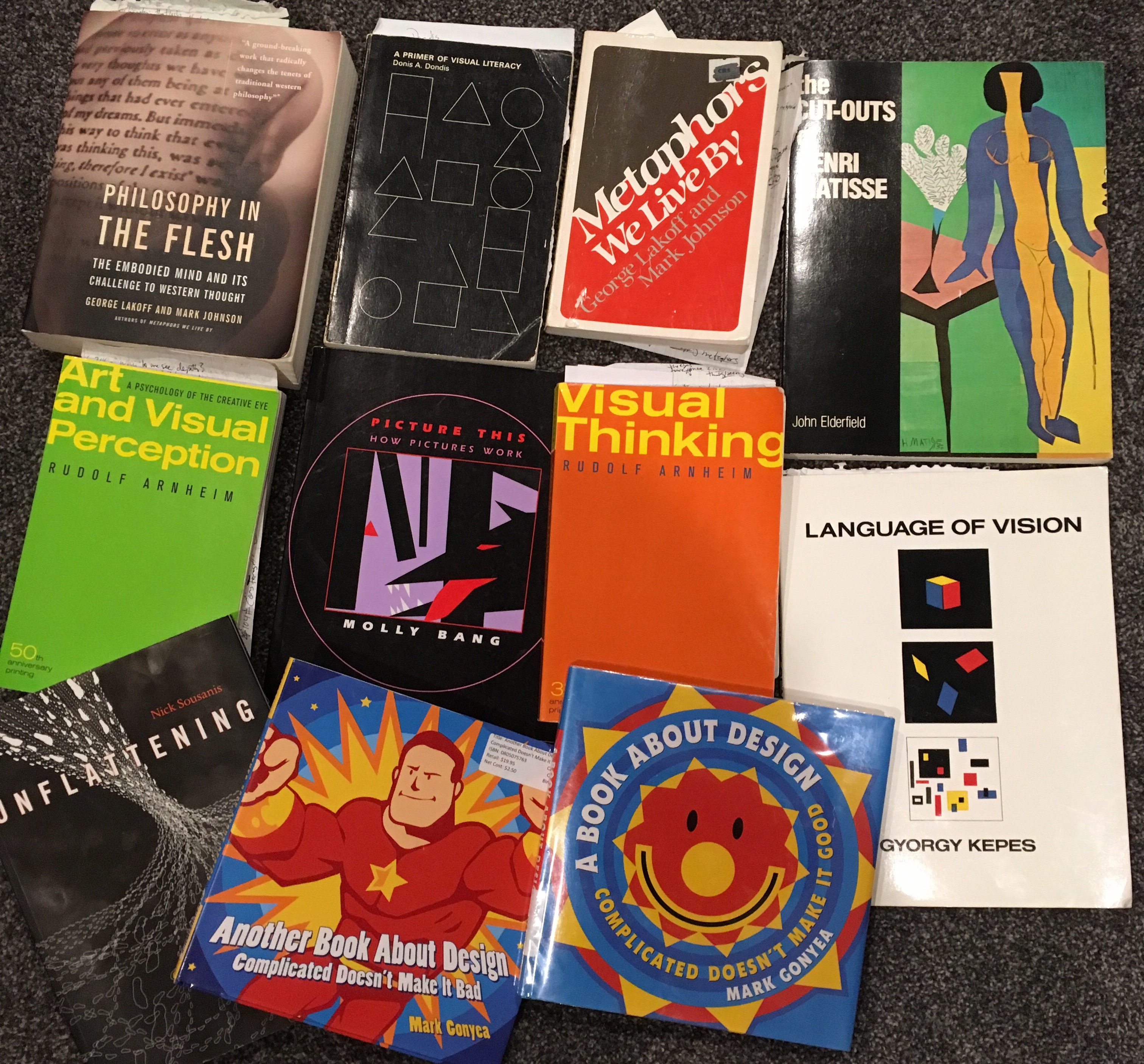
Readings I drew on: Lakoff & Johnson Philosophy in the Flesh, Lakoff & Johnson Metaphors We Live By, Donis A. Dondis A Primer of Visual Literacy, Henri Matisse Cut-Outs, Rudolf Arnheim Visual Thinking and Art and Visual Perception, Molly Bang Picture This, Gyorgy Kepes Language of Vision, Mark Gonyea A Book About Design and Another Book About Design, and me Unflattening
Bring scissors and construction paper!!!! (and maybe glue too…)
We looked at our Grids & Gestures, and used what we’d done to set up a discussion of embodied thinking and Metaphor – looking at Lakoff & Johnson and “happy is up” among other things. Looked at some examples from Arnheim (“all perceiving is also thinking” and “to see is to see in relationship”), before looking at Gonyea’s design examples, which led to Molly Bang’s Picture This, which i feel gets at Arnheim’s work in a way that is instantly accessible and profoundly sensible. This is all to get at the idea that drawing is a way of seeing, and thus a way of knowing – thus grasping experience. This set up the cutout exercise – “relationship cutouts” – where using colored construction paper they cut out shapes and arranged them to express some relationship that was important to them (between another person or pet or group, an institution, between two people that weren’t them, etc….). For homework, they would continue that by making cutouts around a few self-chosen abstract concepts.
20 Useful Design principles
Response Gallery 8: Relationship Cutouts
Response Gallery 9: choose 4 words – concepts/ideas/abstractions – and respond to each word with cutouts. Post a picture of all 4 along with the word, and some brief explanation of what you did/why?
Day 7: I See Faces Everywhere or Why Do Pictures Work?
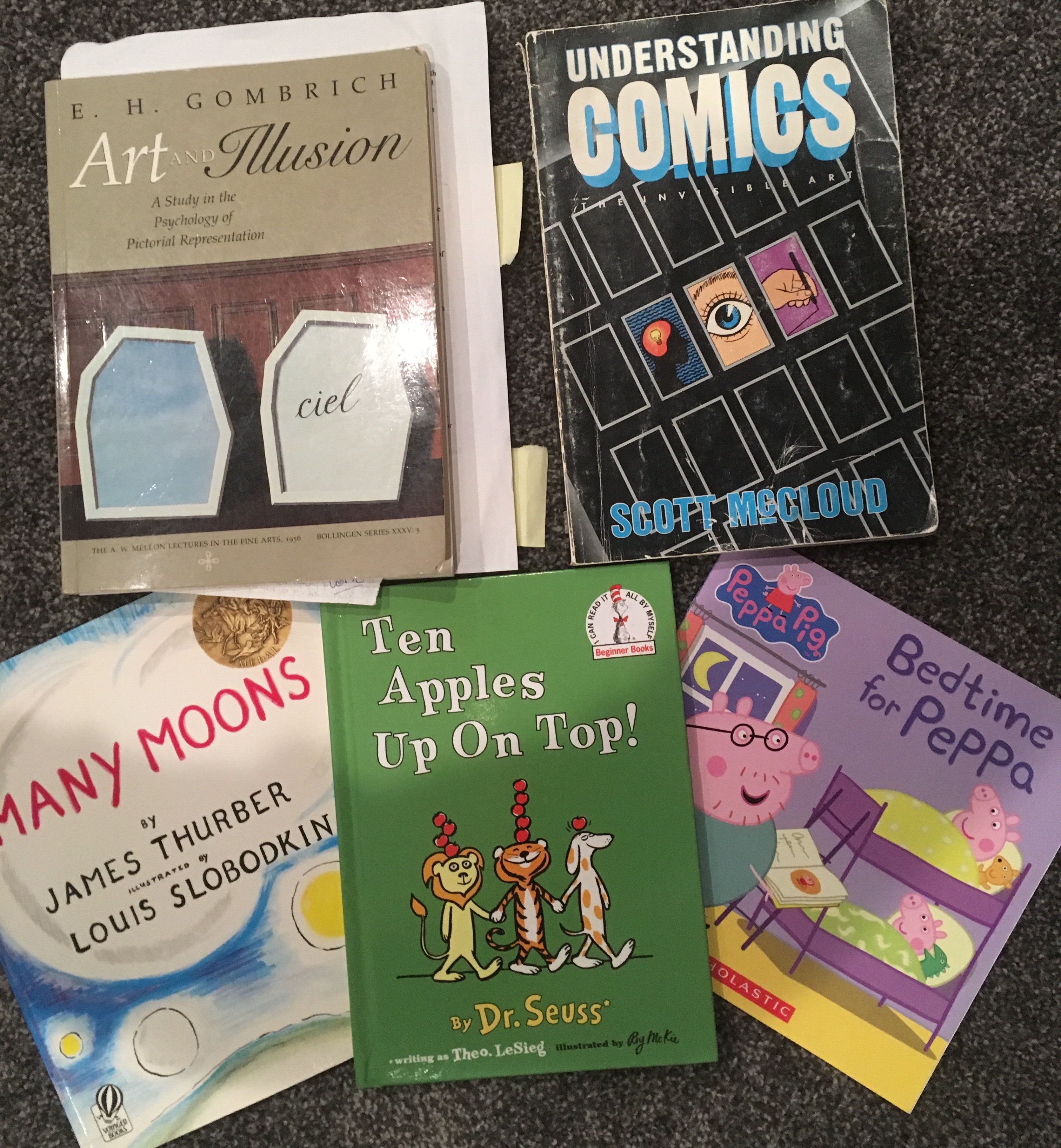
EH Gombrich Art & Illusion, Scott McCloud Understanding Comics, James Thurber & Louis Slobodkin Many Moons, Dr. Seuss & Roy McKie Ten Apples Up On Top, Peppa Pig…
Here i looked at the idea of why drawings work – why do we see faces in things? Töpffer dealt with this long ago, McCloud hits on it. We look at examples of the I see faces everywhere meme photos. Did Colin Ware’s “Boids” exercise – drawing a curlicue squiggle and then turning it into a bird with the addition of one triangle and one dot. We talked about the simplicity of Peppa Pig – how little there is there, and how quickly we accept the cartoon as a huggable friend. And then got into issues of the uncanny valley. Wrapped with returning to the cartoon image, why it works, and McCloud’s triangle.
Uncanny Valley: Atlantic Article, Guardian Article, Austin Kleon summarizing McCloud, etc., Cute explanation
TinTin Preview
Polar Express preview
Response Gallery 10: Drawing Faces
Day 8: Drawing is Alive
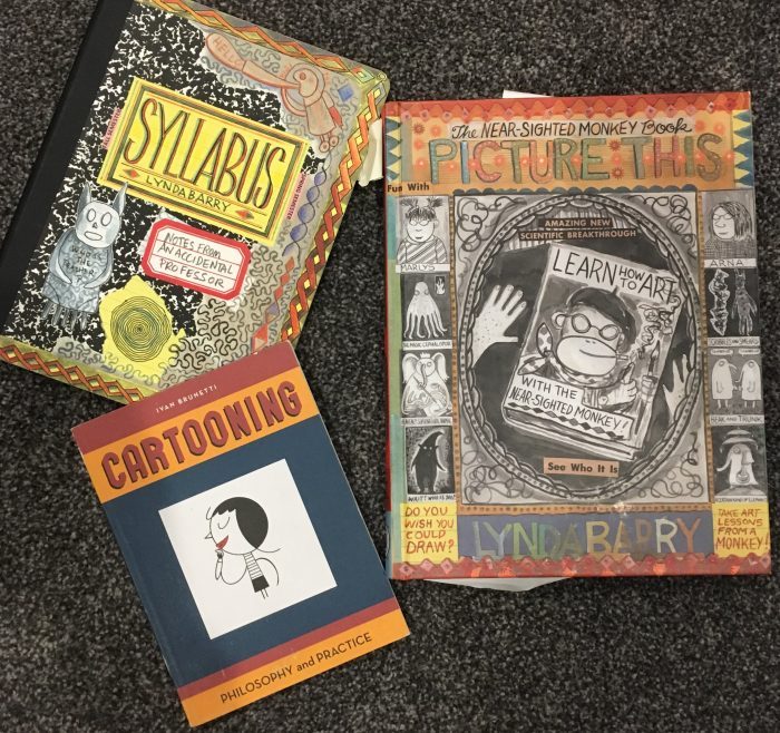
Some readings I drew on: Lynda Barry Syllabus and Picture This, Ivan Brunetti Cartooning
We began with a history of comics – from Paleolithic to illuminated manuscripts to the first use of the word “cartoon” with Punch Magazine. Then turned to talk about the live-ness of a drawing, looking at Lynda Barry’s text to get at this. Reviewed the simple way to make people, and did Ivan Brunetti’s eyebrow drawings. Finished with Brunetti via Barry draw Batman in 3 minutes, then 2 minutes, then 1, then 30 seconds, then 15, then 5 exercise. Did the same for a car, and other things.
For next time, READ Lynda Barry’s Short comics about comics here…
Response Gallery 11: Batman/car/house/beach exercises, as well as your eyebrow and character design page – include a few words about working in shorter increments of time…
Response Gallery 12: Make a four panel comic (either a horizontal strip, or a 4-box grids) using simplified characters ala our drawing exercises today. Post with a few words about its creation..
Student Responses Part 2 – 7-12 LS426 Student Projects pt2

Day 9: Sequential Art
Some readings I drew on Scott McCloud Understanding Comics, Will Eisner Comics & Sequential Art, Thierry Smolderen The Origins of Comics, Jessica Abel & Matt Madden Drawing Words & Writing Pictures
Began with a quick look at comics history from the 1800s to now (way too much!). Then to talking sequential art via Eisner and McCloud’s definition of comics.
Today we’ll talk comics, Scott McCloud’s definition of comics as sequential art, and collaborate on Matt Madden & Jessica Abel’s comics-making exercise “Panel Lottery”… (Do try it – it’s a blast!)
Additional comics readings:
Dan Clowes’s Mr. Wonderful
Richard McGuire’s Here
Chris Ware’s Heads or Tails
Response Gallery 13: in-class Panel Lottery

Day 10: Space, Time, & Simultaneity in Comics
Some readings I drew on: Thierry Groensteen The System of Comics, Ann Miller Reading Bande Dessinee, Chris Ware Jimmy Corrigan, Richard McGuire Here, Barbara Postema Narrative Structure in Comics, me Unflattening
A discussion of space, time, and simultaneity in comics. Talked about how time unfolds in space in comics, the concept of simultaneity from Groensteen, and my take on it in Unflattening.
Extra reading: Check out Alan Moore & Rick Veitch’s “How Things Work Out” – it’s amazing…
For next time, read Asterios Polyp – all of it. We’ll be discussing Monday and Wednesday. Pick a single page from it that you do a rough redrawing of and then diagram and provide some notes and analysis of the page all over it/around it. This will be due to be uploaded Monday before class and used for discussion.
Slides on comics from the last few sessions to help you with analysis of a comics page and discussion 426 Comics slides
Response Gallery 14: post an image of your finished collaborative comic that you started in class with 2 others and finished at home, and share a few words about making it and the process of working on each the different steps…
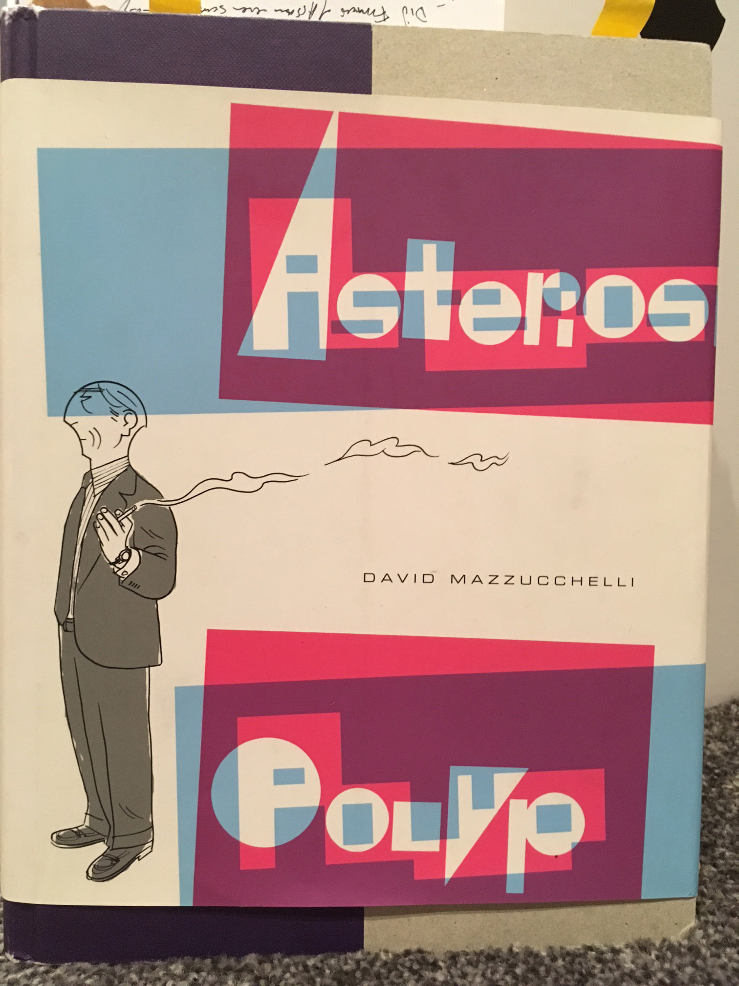
Day 11: Asterios Polyp
A discussion of David Mazzucchelli’s Asterios Polyp…
Response Gallery 15: Pick a single page from Asterios Polyp that you redraw and then diagram and provide some notes and analysis of the page all over it/around it. Post it here before class on Monday with a few additional comments/questions about the book.
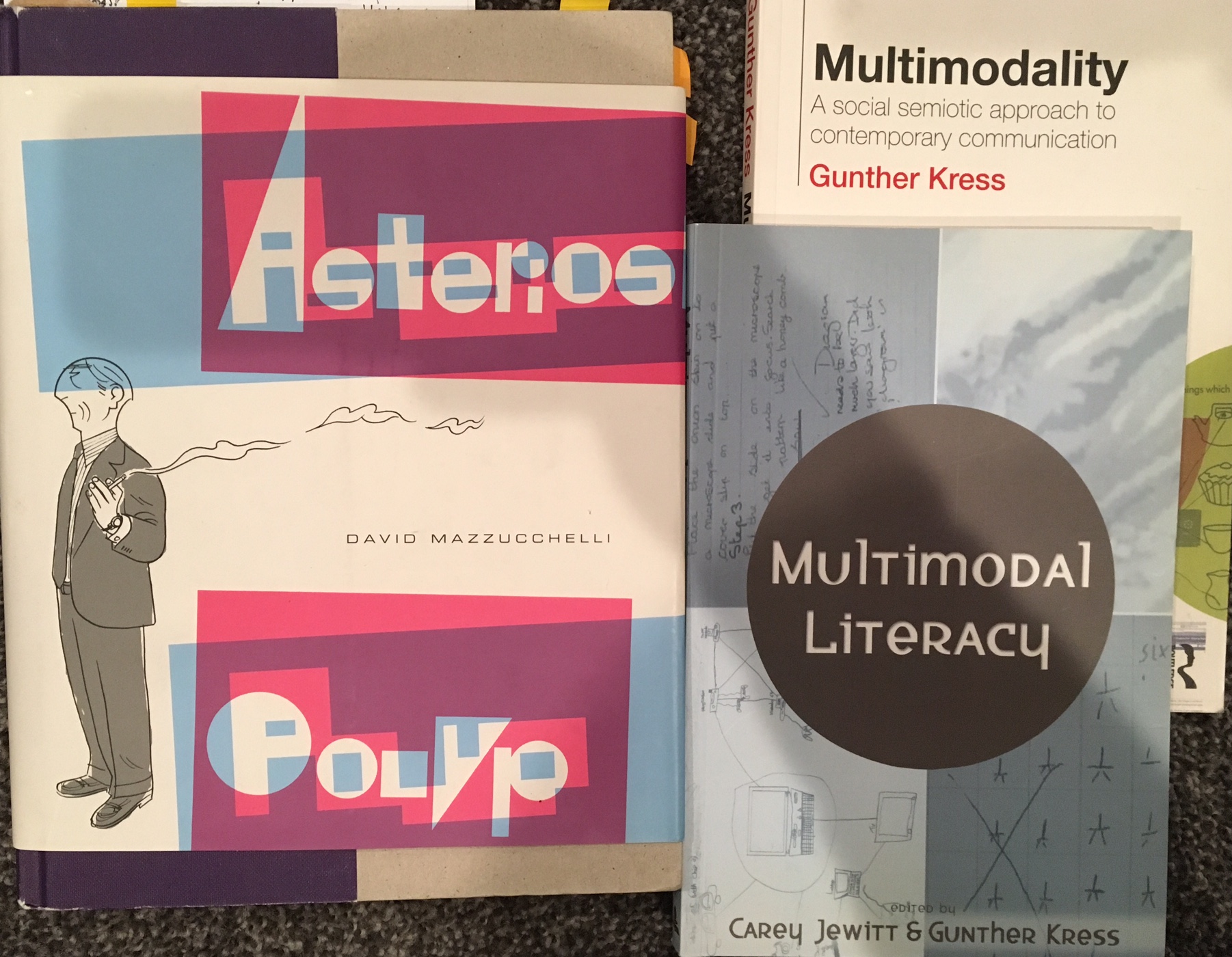
Day 12: Asterios Polyp 2
Continuing discussion of Asterios Polyp alongside multimodality and emanata in comics – this included speech balloons, sound effects, and much more… Additional Readings I drew on: Gunther Kress Multimodality, Carey Jewitt & Gunther Kress Multimodal Literacy
Response Gallery 16: Further Asterios Polyp Responses
Identify 3 instances where Mazzucchelli uses the visual to create his conceptual meaning. For example as we discussed in class – the word balloon shouting “Hey!” done in the style of the Metro card logo and lettering – so it’s clear it’s stemming from an MTA employee even if you never see one, or the conversation between Asterios and Hanna at the end, where as they get more comfortable with each other, their word balloon tails start to mingle and intertwine. So – pick 3 of these from the book (they could be small details or the way the whole page composition reads), redraw them simply, and then label these 3, post a picture of them here, and briefly type up for each of the 3 an explanation of what he’s doing/how he’s using the visual. You should have one picture and 3 brief descriptions to accompany your redrawings.
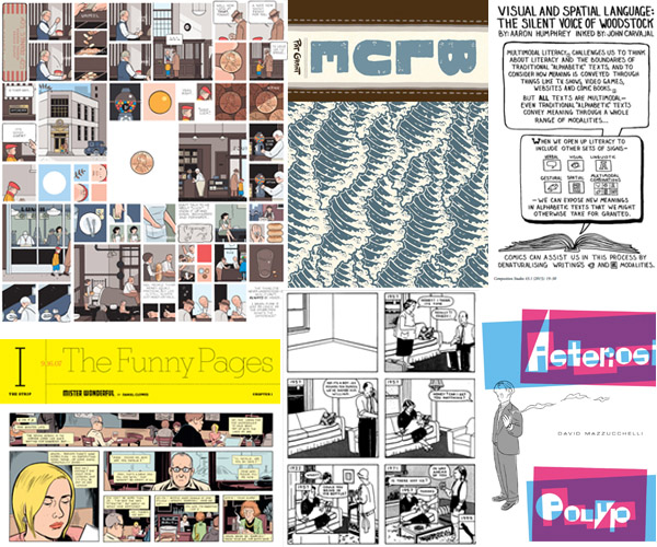
Day 13: More Comics
Read:Dan Clowes’s Mr. Wonderful
Richard McGuire’s Here
Chris Ware’s Heads or Tails
Chris Ware Unmasked
Pat Grant’s Blue (online comic – on the long side, but quick reading, others are all very short)
Humphrey and Carvajal multimodality
VISUAL ANALYSIS PAGES – Visual Analysis Pages PDF
A review of how comics work
Visual Annotation Samples
Response Gallery 17: Quick Analysis – Identify 3 interesting instances from the short comics readings posted for this week where the author does something very purposeful with the visual to create conceptual meaning, as we did with Asterios Polyp. Again, redraw them simply, and then label these 3, post a picture of them here, and briefly type up for each of the 3 an explanation of what he’s doing/how he’s using the visual. You should have one picture and 3 brief descriptions to accompany your redrawings.
Response Gallery 18: in-class analysis – post an image of the super quick in-class analysis example we did together…
Student Responses Part 3 – 13-18 LS426 Student Projects pt3
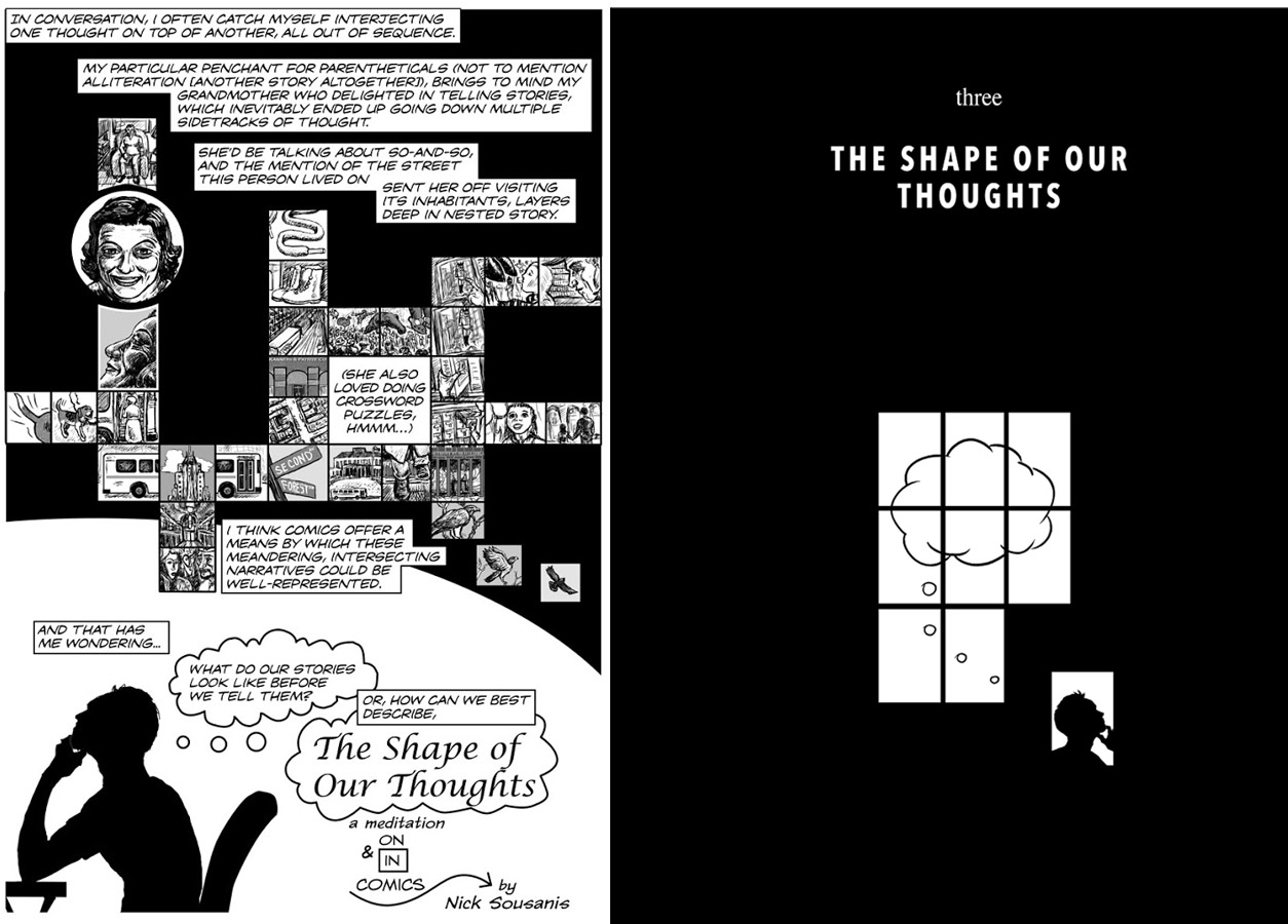
Day 14: The Shape of Your Thoughts
We will share and discuss the things we created that try to picture what our thoughts look like…. Should be fun!
My early comic attempting to figure this out: “The Shape of Our Thoughts”
I reworked some of this for Unflattening to do a chapter with the same name – excerpt here.
Response Gallery 19: The Shape of Your Thoughts – post an image(s) and brief text description of what you came up with in terms of what your thoughts look like. There is no right answer, one hopes it will simply give you all more ideas for how to think about thinking in seeing and sharing everyone else’s depictions. Also, bring physical piece to class to share – we will be discussing. Looking forward to whatever you come up with!
Day 15: Drawing as Thinking
Special guest, Dr. Andrea Kantrowitz joined us for some drawing exercises and theory…
Learn more about Dr. Kantrowitz’s painting and research here and here for her thinking through drawing organization.
Response Gallery 20: Visual analysis/annotation project: Choose a single comics page from those provided (See here) along with a comics page of your own choosing NOT from our readings to visually annotate and analyze. Redraw, trace, print, or photocopy your pages, and then annotate them with notes and diagrammatic elements. Draw directly on the page, and explain the effect of the various stylistic and other creative elements. Offer analytical commentary in regards to the creative decisions being made, and what they do to your understanding of the comic. We want to emphasize observation and what you can deduce from everything you have observed. This should help you think about the construction of the comic—how is it made, why is it made in this way, and what is the effect of it being made this way? I want to emphasize visually engaging with the comic and working right on top of it – and letting those visual discoveries guide any commentary you come up with.
Response Gallery 21: post a picture(s) of the collaborative drawings you made in class with Dr. Kantrowitz and a few comments…
Student Responses Part 4 – 19-21 LS426 Student Projects pt4
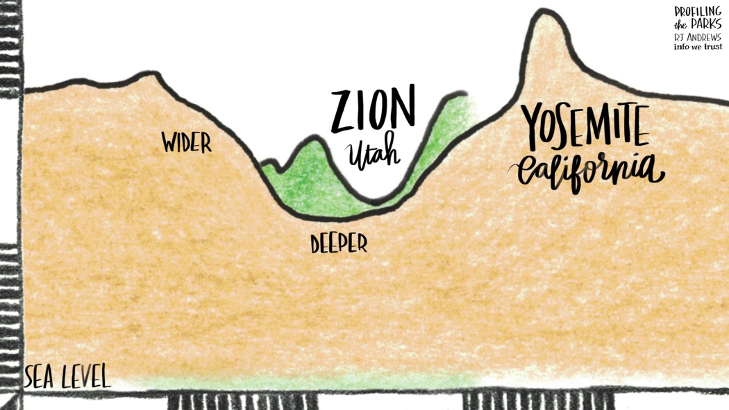
Day 16: RJ Andrews Data Stories
Special guest RJ Andrews introduced us to concepts in Data Visualization. See more about his work at his site www.infowetrust.com. Check out his recent tribute to the National Parks in Data Stories.
Data story from OK Cupid
Visual Analysis of Hip Hop Vocabulary
Response Gallery 22: Sketch-note from RJ Andrews’s talk
Day 17: Data Visualization 2
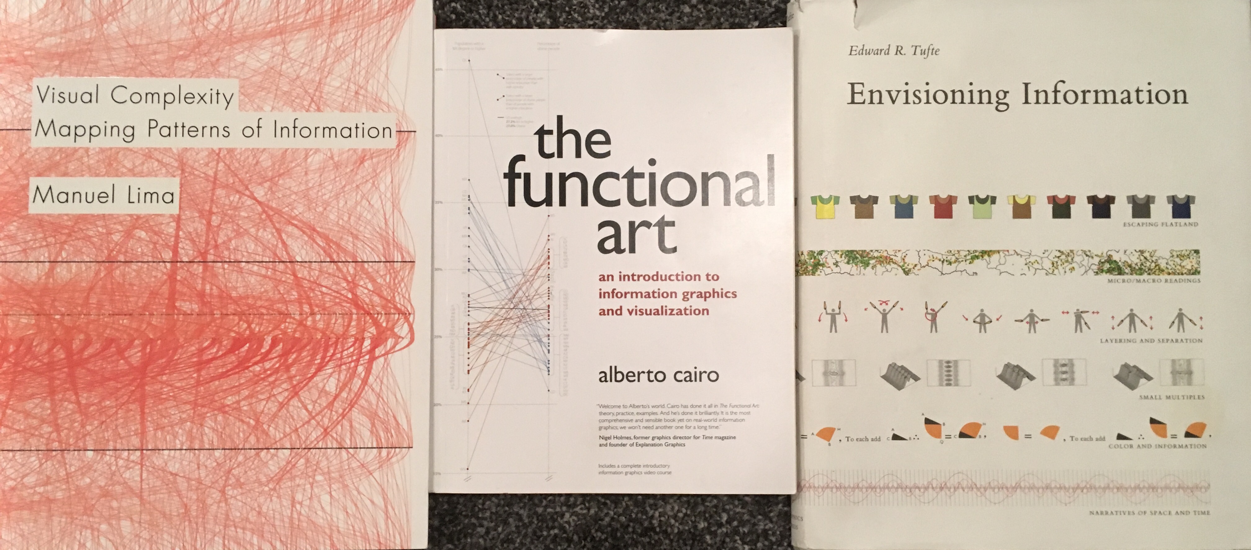
Readings I drew on: Manuel Lima Visual Complexity: Mapping Patterns of Information, Alberto Cairo The Functional Art, Edward Tufte Envisioning Information
I really wanted something students could do hands on in class and that led to discovering the Dear Data project (which is now in book form).
We also collected a data set from everyone by looking at their commutes – time, distance, mode of transportation, frequency – and they went home to map out in their own way, the classes’ commute.
Data Design Book, early history overview of Data Viz
Storytelling with Data Criteria
Types of Data Visualizations (chart)
Information is Beautiful Awards
Information is Beautiful (site) – great examples
VIDEOS
Hans Rosling video 200 Countries 200 Years
Divided Congress animation
Our DATA Set LS426 Commuting Data
Response Gallery 23: Commuting Visualization
in class we created a data set from all of you. I’ve given it to you as a table. Explore it, play with it, find something you want to bring out through a data visualization, and post an image of that here. Think about the core principles: position, color, shape/size, and labels. Use all 4 categories. It should have some sort of key that helps us understand what you did, and with the text here, provide some explanation of your thinking so we can see why you did what you did.
Day 18: Data Viz 3
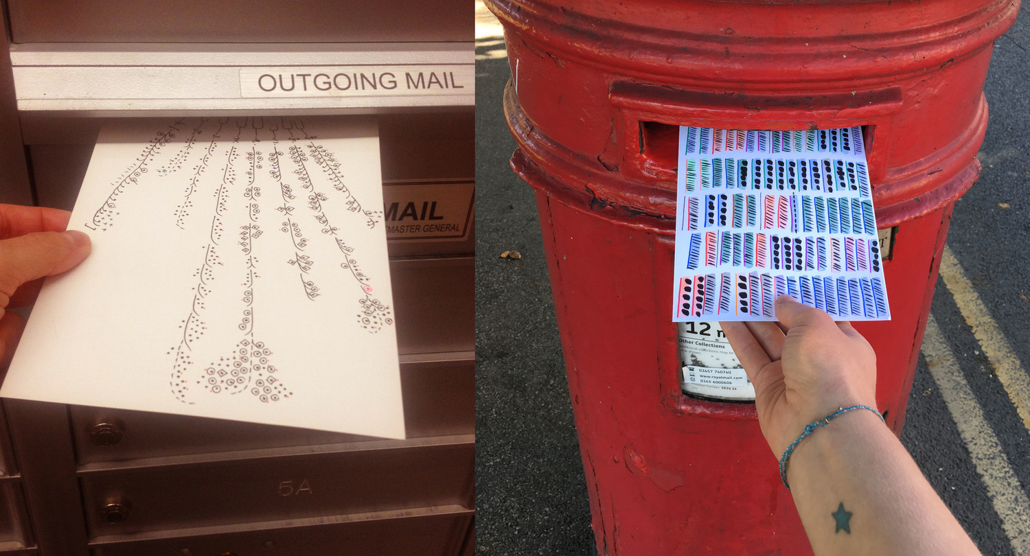
Dear Data project Giorgia Lupi and Stefanie Posavec
Quantified Self site
A Face a Day Project and Video
What I Ate Project
Math with Bad Drawings
Dear Data project, Overview of Dear Data, article on DD on BrainPickings, Dear Data week by week
Dear Data Video
Day 19: Final Project Overview
Some words about the Final Project & Proposal – see below for lengthy explanation. We will discuss in class. Proposal is due next Monday 11/7!
Final project – an intense examination of your choosing that addresses something with visual communication or visual culture. You are invited to do this in a visual form, but you may also do it as a traditional essay. Whether project or paper, what matters most is that it incorporates what we’ve done over the term, that it demonstrates that you brought to bear your creative and critical attention to it, and is meaningful to you. Topic and format will be discussed in class and approved in conversation with the instructor. To this end, before you begin the final project, you will be required to submit a formal proposal outlining your intent and the form the project will take.
Proposal/pitch: The proposal must be between 100-150 words long, can include any accompanying visual or other information to make clear what you have in mind, and should clearly state how your project relates to course material. Finally, it should indicate the working thesis or aims of your proposed project. Input from cohort and review by instructor will shape revisions – upon which student will receive approval to proceed.
For those doing a project in a creative format, your project needs to address course material in some fundamental way. That is, your project should indicate an advanced understanding of what we’ve explored over the term. In addition to your project itself, you are required to submit a short reflective essay 500-1000 words long that outlines your motivations and aims for the project in relation to the overall course content.
If you choose to do it as a traditional paper, you will draw on what we have learned to write a traditional analytical essay of 1500-2000 words. Your essay should have a clearly-outlined thesis—that is, it should have an argument, and be an attempt to convince the reader of something concerning the topic in visual communication/culture you are addressing.
Final Gallery Tour: On the final regular class period, December 14, everyone will showcase a visual summary – essentially a small poster – of their final projects. We will discuss specifics of this activity over the term. Final projects are due by noon on Wednesday December 21.
Day 20: Maps & Networks
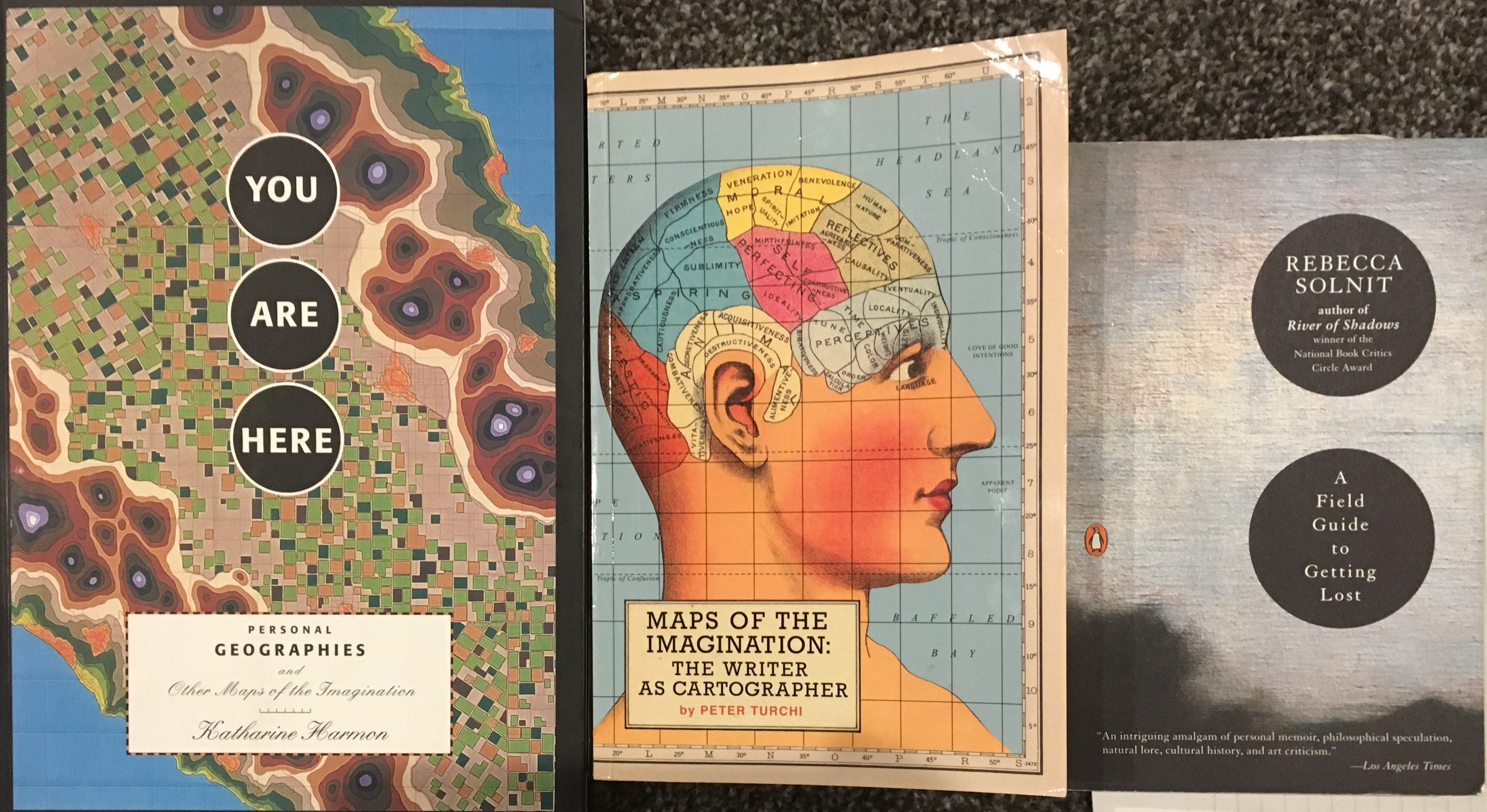
Some readings I drew on: Peter Turchi Maps of the Imagination, Katharine Harmon You Are Here: Personal Geographies and Other Maps of the Imagination, Rebecca Solnit A Field Guide to Getting Lost
Continuing to talk Data Visualization as Make the invisible visible – sift through the overwhelming complexity all around us, and derive patterns, meaning. Look at the network graphs of Mark Lombardi before turning to Maps.
From Peter Turchi: “To ask for a map is to say, ‘Tell me a story.’” and “The first lie of a map – also the first lie of fiction – is that it is the truth.” and “The map neatly shows us something no one has ever seen before.”
As well as: “Not only is it easy to lie with maps, it’s essential. To portray meaningful relationships for a complex, three-dimensional world on a flat sheet of paper or a video screen, a map must distort reality. As a scale model, the map must use symbols that almost always are proportionally much bigger or thicker than the features they represent. To avoid hiding critical in- formation in a fog of detail, the map must offer a selective, incomplete view of reality. There’s no escape from the cartographic paradox: to present a useful and truthful picture, an accurate map must tell white lies.” – Mark Monmonier “How to Lie with Maps”
We looked at maps of all sorts, talked about why North is up – and what that means, shared Pacific Islander stick charts in contrast to gridded maps. Ended by looking at Denis Wood’s local maps and other mappings of oddities and left them to try their own.
Some interesting links about Maps that we will explore in class…
Day 21: Dear Data & Map project sharing…
Dear Data project Giorgia Lupi and Stefanie Posavec
post an image of the map you made with its key, and write a few words about what prompted this, what you learned in doing it.
Personal Mapping Overview: Choose some feature in your neighborhood, building, route to school, whatever to feature and map. It could be gum on the sidewalk, broken lights along the road, flower you see along your way – anything to strikes your interest. As with the data visualization project – it’s not just quantifying it, it’s finding the story. As Peter Turchi wrote “To ask for a map is to say, ‘tell me a story.'” Make something visible that is usually hidden about your experience by eliminating the extraneous information around it.
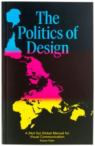
Today we will be looking at your Selfie explorations, and going through some ideas from the text for class “The Politics of Design” by Ruben Pater. [If you haven’t read, make sure you do…]
To prep for your own selfie project – see the Selfie City Project and Selfie City Interactive Exploratory – and play with their data to inspire you for ideas for exploring your own network…. This is your chance to invent an assignment, maybe something you do will trigger ideas that we all look at as a class.
Intro & blog for Politics of Design
Pink & Blue Project
NY Subway Font Helvetica
R Sikoryak’s iTunes Terms & Conditions
Changing the color of food aid in Afghanistan
Luscher Color Test online
Kodak Shirley Card
Fake Diversity and Racial Capitalism on Medium
Accessible Icon Project
Response Gallery 28: Selfies
1) Explore SelfieCity Project and try a few things on the interactive part of their site. Post a quick reflection on something that surprised you, you didn’t expect, found interesting.
2) Thinking about SelfieCity – look at your own social network. See if you can find some interesting patterns, observations about the way those in your network take selfies. You can map this out visually if it helps – and/or write some words about two different observations you made.
3) Post 3 selfies of you here – say some words about what prompted each picture, why you take them/these, how you use them, etc…
Began looking at examples from the Politics of Design as well as the difficulties of creating warnings for people 10,000 years in the future…
Politics of Design Website and Digital Preview
The politics of design blog – more examples
Article with excerpts from The Politics of Design
Photoshopping:
War Journalism photoshop
NYTimes Article on photomanipulation in journalism
NYTimes on Iran missile photoshopping
Daniel Soares H&M adbusting project
Time-lapse Photoshop Video HuffPo
Dove Evolution Video more on Dove Campaign for Real Beauty
Scott McMaster Truth and Photography press
Designing a Nuclear Warning system that will still make sense
Response Gallery 29: The Politics of Design – select a favorite section from “The Politics of Design” and 1) reflect on that here: What caught your interest, what it made you think of, list the pages it came from, etc. 2) Find some visual examples that relate to this reading and share both the images here as well as some reflective comments about them and their connection to the example in the book.
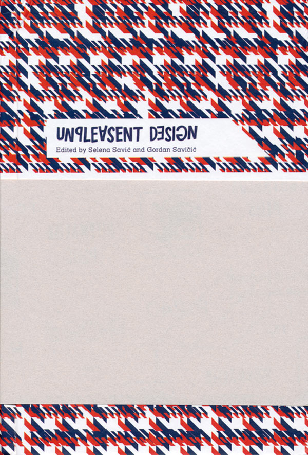
Day 25: Unpleasant Architecture
Unpleasant Design edited by Gordan Savicic and Selena Savic
More on the Politics of Design, photoshop and “fake news”, and then, Discussion of Unpleasant Architecture from park benches to window sills.
99% Invisible episode on Unpleasant Architecture
Unpleasant Design website
Article from Popular Science on Unpleasant Architecture
BBC article on Unpleasant Design
Designing a Nuclear warning sign that will make sense 10,000 years from now (Slate/99% Invisible) and on 99% Invisible
Nuclear Waste signage on Forbes and article in LA Times
Waste Isolation Pilot Plant statement
On the creation of Fake News from NYTimes & from England Channel 4
Response Gallery 30 Ten Thousand Years – post an image of your in-class warning to the future – either done individually or as a group…
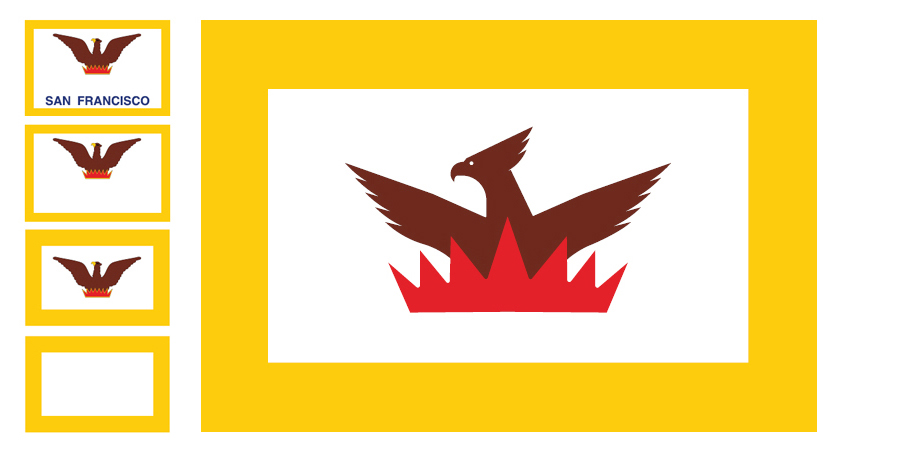
Day 26: Flag Redesign
99 Percent Invisible – Flag Redesign in-class, Roman Mars on Flag Design – 99 Percent Invisible/TED
City Flags – including Chicago’s
2004 American Flag Survey – top 10/bottom 10
Redesign Pocatello’s Flag – contest till December 2!
Response Gallery 31: in-class Flag Project post an image(s) of your city flag, and then write the name of the city, if it had an existing flag (maybe post a picture of that one as well) and describe some of your decisions for color and design….
Day 27: Politics of Design/Unpleasant Architecture
We will share our Special Projects related to The Politics of Design as well as our Unpleasant Design documentation….
For next time – UConn Logo Evolution http://today.uconn.edu/2013/04/a-new-husky-for-a-new-era/
New Cleveland Baseball team logo/mascot contest
Response Gallery 32: Politics of Design – pick a page/section/idea from The Politics of Design as a jumping off point to make your own small exploration into a related topic. Pretend YOU are making another page or two that could be included in the book. This will mean a relative brief writeup – around 250 words or so – that begins with acknowledging what part of the book got you curious and then discuss in some depth what you are exploring and include at least 3 visual examples. (It could be a single picture that has multiple images in it – as with the sports mascot page in the book). Your goal, as is the goal of the book, is to make us look at something we may take for granted in the world around us and get us to see it in a new way, to question our assumptions about things as they are, and see how much the visual world has an effect on our thinking. Have fun with it!
Response Gallery 33: Unpleasant Design: post an image of something you find that exhibits Unpleasant Design/Hostile architecture – with some comments. Then, either post a picture of something that represents more positive design choices, or write some suggestions as to how the Unpleasant Design could be made more inviting…
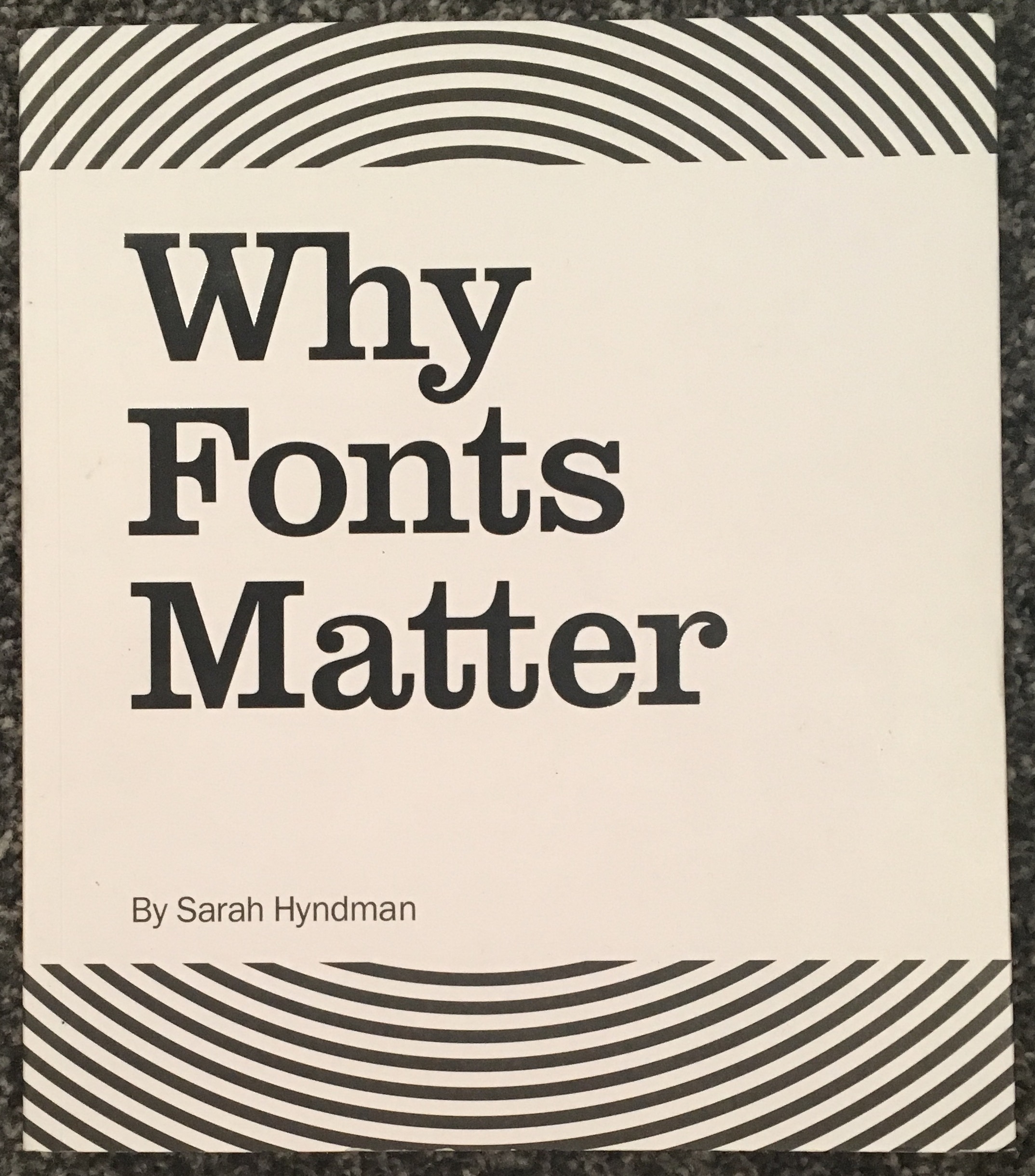
Day 28: Why Fonts Matter! by Sarah Hyndman
Sarah Hyndman’s Type Tasting Site, her talk at It’s Nice That, and TEDx, article in Its Nice That
Comics Sans Criminal site
GAP logo fail
We’ll be briefly looking at logo projects to start class as with the evolution of the UConn Husky: http://today.uconn.edu/2013/04/a-new-husky-for-a-new-era/…
Response Gallery 34: Logo/Mascot Evolution – look for images of the mascot or logo of a sports team, university, or corporation – and find three images of its evolution over time. See for instance the evolution of the UConn Husky: http://today.uconn.edu/2013/04/a-new-husky-for-a-new-era/ or look at the Gator at SFSU – and its recent renovation (which was almost a replacement). Whatever you find, post 3 images, and a few words of speculation as to why this particular team/institution revised its logo/mascot over time.
Response Gallery 35: Font Surveys – post an image of your in-class responses to the different fonts, plus a comment or two reflecting about how fonts have an effect on our experience…
Day 29: Recap and ….
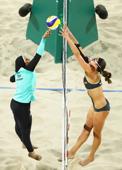
Olympians in Hijab and Bikini NYTimes
Volleyball in a Hijab – BBC
Response Gallery 36: In-class sketchnote – post an image of the sticker you drew on in class, and a few words reflecting on why you drew this image…
Student Responses Part 6 – 28-36 LS426 Student Projects pt6
Day 30: Finale!
Visual sharing from our final projects…
Response Gallery 37: Final Gallery Tour: On the final regular class period, everyone will showcase a visual summary – essentially a small poster – of their final projects. Post an image or images here, with a quick summary.
Final Projects LS426 Student Projects pt7 Final Projects