(Note, this was originally discussed here.) In the fall of 2015, I taught a new iteration of my comics courses – “Comics as a Way of Thinking” (see the syllabus at the link). This was a theory and readings course built around an emphasis on making comics – and everyone working visually from day one, regardless of prior drawing experience. My aim with this approach is two-fold – to give students a better understanding of how comics do through hands on play and to reawaken the possibilities of working visually, something they can bring to whatever work they do. The class was, to say the least, a blast – and I’m so pleased by what these students discussed and produced over the past three months. They’ve granted me permission to share excerpts of their work, so I’ll start that here with a likely follow up in early January (in conjunction with a panel I’m doing on teaching comics at MLA).
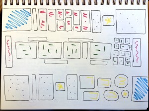
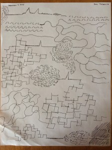
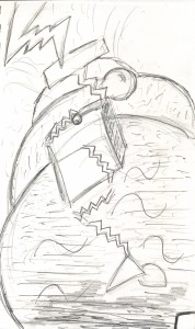
One of the first things we do is an exercise I made up for the class that I also frequently do in public talks that I call Grids & Gestures. I mentioned it in some detail here, and I wrote it up in detail for publication this fall in the SANE comics education journal here. In short, this exercise asks participants to organize the events of their day into a compositional shape on a single sheet of paper thinking about the way comics organize time in space. (For full explanation, do see the published writeup.) I like starting here because it gets people thinking about the entire page from the ground up, and because I stress that they are not to draw representational things – it allows them to draw without falling back on stick figures. Ultimately, it ends up prompting discussion about how much about drawing they already know and how in working visually they start to notice things about their thinking they wouldn’t when working otherwise. For me, it sets a good tone for the class to really question what drawing can be and how much comics can do through organization of the form alone.
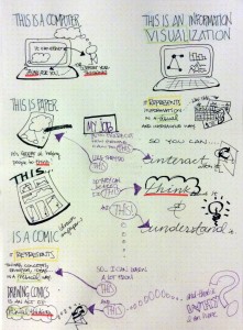
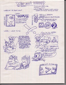
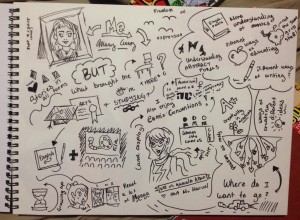
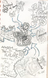
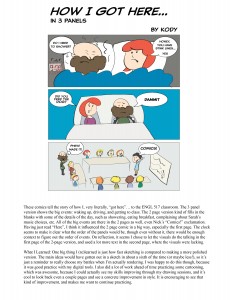
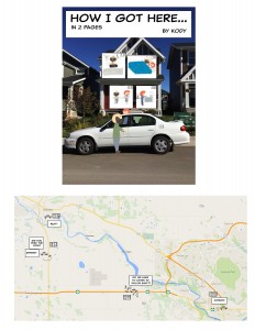
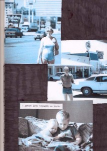
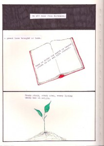
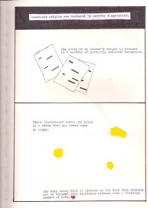
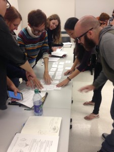
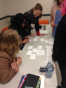
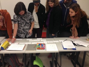
From there (and I’ve got the whole class syllabus posted here), we try a whole variety of exercise – some quick in-class and others to work on at home, that are aimed to parallel what we’re discussing in terms of theory. I’ve found that in the act of making, students always hit upon sophisticated concepts that we later come across in the comics we study. This time around, I had them do sketch-notes for the “how you got here/what do you want to take from this experience” exercise at the beginning of the course. I shared a few links with them to give them an idea of what a sketch note is (again on the syllabus), and they ran with it. Matt Madden and Jessica Abel’s brilliant collaborative comics-making Panel Lottery gets students working together, as it simultaneously gets them thinking about how story is constructed – even from nearly random elements.
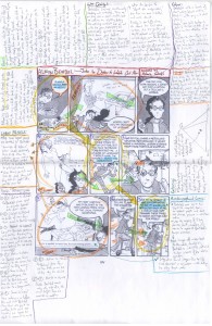
One of my favorite things, is not quite making comics – it’s visually analyzing/annotating a comics page by writing/drawing/diagramming directly on the work. It invites one to start noticing everything the comics maker employs to construct meaning on the page – and they often result in this beautiful and insightful explosion of thinking. We did it a few times, and when we read Ellen Forney’s Marbles, I had them do a sketch note about the book with a mini-analysis embedded within. See some samples of these visual annotations in a pdf here.
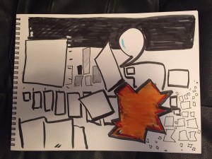
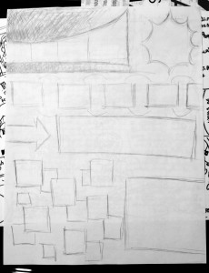
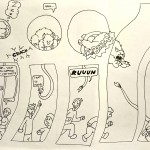
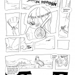
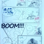
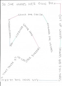
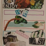
One thing that turned out far better than expected, started with each student taking a sheet of paper and in five minutes constructing a panel layout. When they were done, we passed to another student – who in the first iteration of this exercise took it home and drew it, and then brought it back and passed again for the final student to add words. This worked well, but then we did it again where we started the same, but as the second step had the person add words, and then in the final step they drew pictures. They really enjoyed the challenge of this, and the comic with balloons shown first above – was not only impressive for the exercise, I found it to be one of the strongest single page comics I’ve seen! There was something almost magic in how the disparate elements came together. A lot of fun all in all and taught us a lot about creative process.
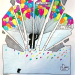
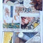
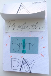
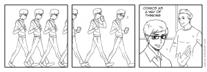
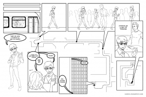
Finally, for this time around, I want to share a few of their final projects. The assignment was to do something in comics or comics-like that tackled something related to the class and their own work. Projects ranged from an augmented reality comics-making thing (which i can’t share at this point) to personal explorations of loss. I’m putting just a handful of them here, but I’ll revisit again and share more and some of the other exercises we did.
Kody…
Sarah Rae:
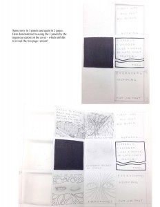
Jenny, from a past class, who ingeniously made her 3 panel, a folded page with cutout reveals of the 2 page it was made on:
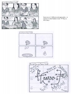
As one of our course texts, we read Matt Madden’s wonderful “99 Ways to Tell a Story,” in which he tells a mundane one page story in comics, and then proceeds to revisit it 98 times in different variations and styles. Reading this book teaches a ton about thinking in comics. We played with it for 3 versions, some examples:
Melanie:
Jenni:
In class, we also enjoyed Madden and Jessica Abel’s comics collaborative exercise “Panel Lottery.” A super fun group activity, easy for anyone to do, and teaches a lot about storytelling. I highly recommend it. See instructions here and a downloadable PDF here. And more comics making ideas on their site dw-wp.com. We did several other in class and take home exercises – including a piece focusing on using a single visual/verbal metaphor throughout, wordless comics, and more. But this should offer a good sense of what we did.
Ok, that’s a little taste of what we’ve done – and I’m thrilled by the experience. Don’t forget to check out all the resources on comics and education I’ve compiled here.


