Some news first, and then below, a look at my classes, and a new Grids & Gestures twitter challenge (with a bonus twist!). Please read on…
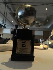
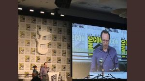
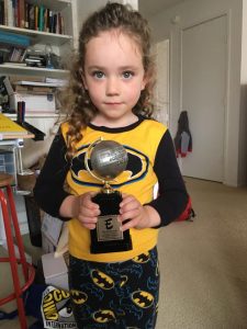
A belated update about Comic-Con and the Eisners, for which I was nominated for Best Short Comic for my comic on Columbia’s comics librarian Karen Green – I won!! Over the moon to be in the company of authors I looked up to as a kid, and those who I teach to my students now! The event was a blast and I feel incredibly grateful to have been a part of it and to receive this honor. I dedicated my speech to Librarians everywhere, for the role they’ve played in making comics increasingly a part of education – and that certainly applies to the sort of work I’ve been able to do as a comics maker and a professor with my own comics studies program now at SFState. A magical evening all around – and late in the afterparty I got up the nerve to talk to Dave Gibbons (who had just been inducted into the Eisner Hall of Fame – and gave this amazing speech) and give him a copy of Unflattening, which led to a lovely conversation on teaching comics! Not a bad night! Great to bring it home to a delighted child – and on top of everything the globe spins! My university did a nice feature on the whole thing here. And for info on all the winners (from My Favorite Thing is Monsters to Monstress) lots of Eisner coverage including the San Diego Union Tribune, Publishers Weekly, Forbes, Hollywood Reporter, and Deadline.
- F2018 Comics & Culture
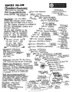
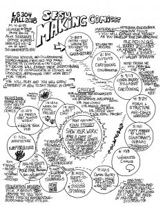
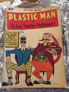
Classes have started up again, and with that I’m sharing my syllabi from my new courses – alongside many of my past classes on the Education part of my site. There you can find details on those classes, plus in-depth looks at past courses with breakdowns of what we did over the term, exercises, examples of student work, and more. I’ve been making a point of making a more drawn version of my syllabus the last couple of semesters, and I’ve included my visual syllabi for my F18 Comics & Culture and F18 Making Comics courses above and at the Education tab. One bonus – my F16 Visual Communication class is posted in great detail, and while I’ve not done so yet with the Spring 2018 version of the course, I documented that class’s take on Stefanie Posavec & Giorgia Lupi’s brilliant Dear Data project – and those results are really cool and I posted many of them here. One further note related to teaching, as our Comics Studies program continues to grow at SFSU – I’m pleased to announce, the university is now the home of The Thomas Bentley Rue Collection of Golden and Silver Age Comic Art. This is the boyhood collection of the late Thomas Rue, which spans the late 1930s to early 1950s. This gift was made possible by his wife Virginia Rue, and includes a copy of Superman #1, Plastic Man #2, and many, many more really cool finds I’m excited for my students to start exploring!
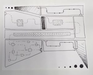
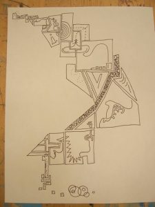
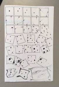
Finally, in the back-to-school spirit, I want to announce a new version of the Grids and Gestures twitter challenge I did originally back in 2016. (Some results of which can be seen here). Details about Grids & Gestures can be found in full here (or at www.gridsgestures.com) – including an academic article version of the exercise and a video of me explaining it. The short-ish description of it as as follows (or better yet, go over to the full page for it):
Quickly, have a look at your ceiling tiles or other grid-ish things around you. If you then imagine putting these features to music, you might have regular long notes on the tiles, some shorter notes, and maybe rapid staccato beats on a ventilation grill. Ok, now come back to a comics page – and think about the idea that in comics, time is written in space. Comics are static – and it’s in the way we organize the space that we can convey movement and the passage of time. Unlike storyboards, to which comics are frequently compared, in comics we care not only about what goes on in the frame, but we care about the size of the panel, its shape, orientation, what it’s next to, what it’s not, and its overall location within the page composition. The way you orchestrate these elements on the page is significant to the meaning conveyed – there are some strong correspondences between comics and architecture in terms of thinking about the way the entire space operates together.
Observe some architectural composition around you – a building, windows, a street layout, floor tilings, a dresser, the dashboard of a car, whatever – find one you are inspired by, take a picture of it, then make a single comics page based on the composition of the actual architecture. (Any subject matter, you can now draw things too if you want!) Post both the image of the architectural element and your comic to twitter at the same hashtag #gridsgestures.
If you’re not on twitter – feel free to email me through the site with permission to post to twitter (crediting you of course) and I’ll do so as I can. My Making Comics students are doing the same thing this week, so it will be fun for them to see how others are playing along. Looking forward to what you all come up with!
I’m beginning to get deep into drawing the followup to Unflattening. I’ve shared a few sketches from it already and expect to share more glimpses as I go… – Nick


