The state of things these last months has meant that I’ve posted much less about my teaching than I’d intended (though as always, I have tons of my teaching materials compiled here). But I recently shared some activities from class on Twitter, and given the response to them, I thought I’d detail them here. The two activities come from my introductory Making Comics course and both offer related ways to think about laying out a page and from my experience, are likely to spark some new ideas. I’ll set it up as I do in class and then get to the instructions.
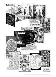
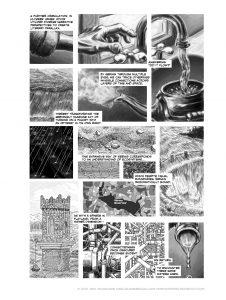
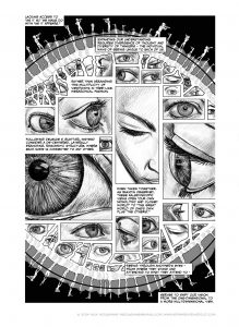
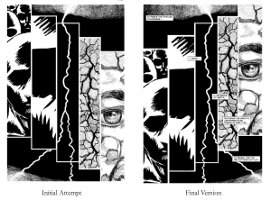
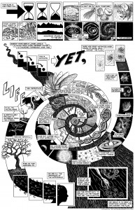
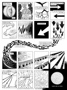
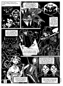
In discussing my own work, I talk about how one of my formal decisions has been to consider how I can embody the very idea I’m exploring within the shape of the page layout and being extremely conscious of how the reading flow relates to what I’m trying to get at. So some examples from my work – the Scheherazade page from Chapter 5 of Unflattening: I wanted this one to move across the page as I imagine her name might, so it makes this backwards S or Z as it snakes across the page. This one was fairly straightforward as these things go. Next, the page from Chapter 2 on connectedness referencing the passage “Did it flow?” from James Joyce’s Ulysses. In this one, I wanted the page to flow back and forth in ways akin to a river meandering or pipes bending and turning labyrinthine below our floorboards. The placement of the words does a bunch of the work of ensuring proper reading flow, as does the drawing that continue across panels and other subtle aspects. For the Kaleidoscopic page from the same chapter, I wanted the feeling of de-centered and looking from all directions at once. This page on “lightening” from Chapter 7 – makes the pun of making things lighter alongside the lightning bolt (creating a nightmare for translators and everyone who butchers the spelling of “lightning”…), but I wanted the page to rise up in conjunction with this idea of becoming lighter (in contrast to the heaviness discussed in the first prelude). My initial attempt as you see here, moved the panels down, which seemed opposite of my intent, but reading upwards is tricky. I realized I could let the words move down even as the images moved up and they cross in the right spots to make this work. For my page on Entropy in the Boston Globe (and hey, you can get a hi-res copy of that piece here), I wanted to mirror this reverse movement against the downward flow, and ended up with a page that at one point reads right to left and then top to bottom. It’s all detailed at length with all the sketches that went into it here.
Even in something more straightforward, like my recent political comic “No Lines”, which was intended for a newspaper, you can still make these unusual moves – in this case the middle section making a sudden switch to go right to left and then flow back to regular reading.
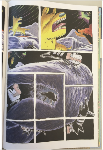
For my courses, I gather up all sorts of examples of pages that do interesting things. Here’s a page from David B.’s Epileptic, in which it reverse S’s. And then this extraordinary composition in Gregory Benton’s amazing B+F! Besides the structure of the panels, he uses the landscape, the Ghost Dog breaking across panels, all to help guide us through this wonderful sequence.
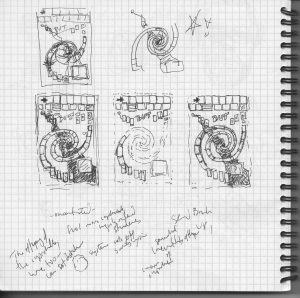
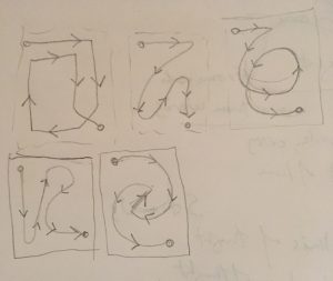
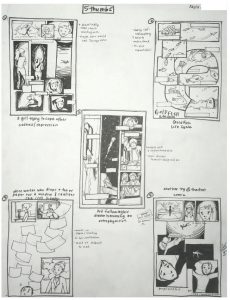
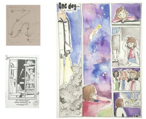
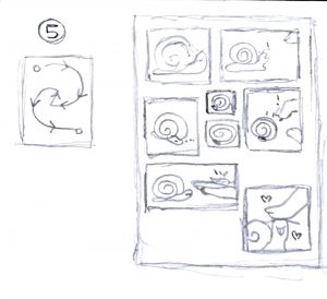
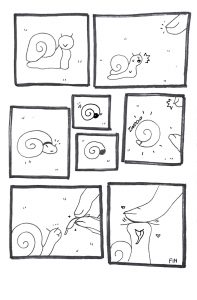
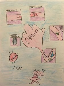
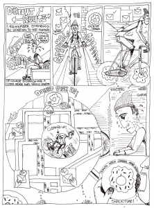
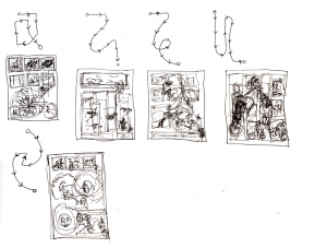
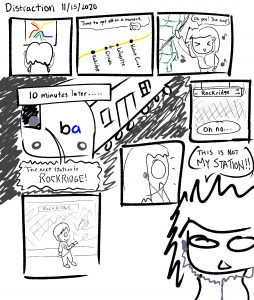
So the assignment I came up with a few years ago around this idea is called “Zithers” – essentially, I draw for my students (and anyone can do this for themselves) a circuitous reading path, and then ask them to “solve” it. That is, design a comics page in which the reading path follows the drawn curve by using whatever affordances of making comics that you can bring to it: panel layout, word balloons/captions, sound effects, figures crossing panels/outside of panels, background imagery – whatever they come up with. I do stress I would prefer it not to be a snake/chutes and ladders gameboard sort of thing – that’s a little too easy. What surprised me the first time we did it was not just that students solved it creatively, which they did, but the sort of stories that it generated. Yes, we had jumping figures that made the reading paths, but we also had totally novel stories, things that weren’t on their mind to create, but the prompt itself sent them in new directions. And that’s the excitement for trying these. I share here a set of Zithers I made a while back for a student who made a thumbnail in response to each and then proceeded to pick her favorite one and make it into a fully realized page. Additionally, I’ve share a few of this year’s class and what they came up with in response to the same prompt. You can see some past ones in my compilation of what we did in the Fall 2018 version of the course here, and all my teaching stuff as always here.
So that’s Zithers. You can try yourself, use my zither-y diagrams or invent your own.
This term, we followed up that activity by having students create Intentionally Bad Layouts – that is blank panel compositions where reading order was impossible or extremely difficult to follow by that structure. (And this builds off my Grids&Gestures activity as well.) These layouts were then “passed” to another student (given that we are all on zoom – this involves uploading to our university’s class system and then each student orderly responding to a classmate’s), who tried to “solve” these difficult layouts by using whatever features of comics they could to make it work – from characters breaking panels, word balloons, sound effects, anything to try and make the reading path clear despite the layout. It’s fun to try – both to come up with a bad layout, and then to have to make sense of these and see what sorts of unexpected story decisions you end up making. Give it a try! We’ll try this as a twitter collaborative activity on November 23-24. One that Tuesday we’ll do the Zithers – people can use the one I shared or post their own for others to try and share. On the second day, people can post bad layouts, and can claim those that have been posted and try their hand at solving them. Can use the Hashtag #Zithers for both and participate in whatever way folks want… – N
this was done right after we finished the “zithers” activity – essentially, i draw a reading path, Ss try to design a page that works for it using composition, character movement, words, etc. I think I’ll write both these up, and offer as a twitter activity next week. Stay tuned! pic.twitter.com/KyeWvZTgQt
— Nick Sousanis (@Nsousanis) November 17, 2020


