


I was delighted and honored to talk about Unflattening, comics, and the importance of visual thinking at the National Gallery of Art in Washington DC earlier in June! it was an amazing experience and It’s exciting to see more and more places open up to comics. The event was recorded and the NGA has released a video recording with slides, as well as an audio podcast . This Friday, June 24, I’m off to Vancouver to keynote the conference Sketching in Practice at Simon Fraser University. Looks to be a terrific lineup including my friend and colleague Andrea Kantrowitz, who is one of the organizers behind the Thinking through Drawing consortium (which I was fortunate to participate in a few years back). Check out the Sketching in Practice website and you can follow along on twitter Friday at #skip16.


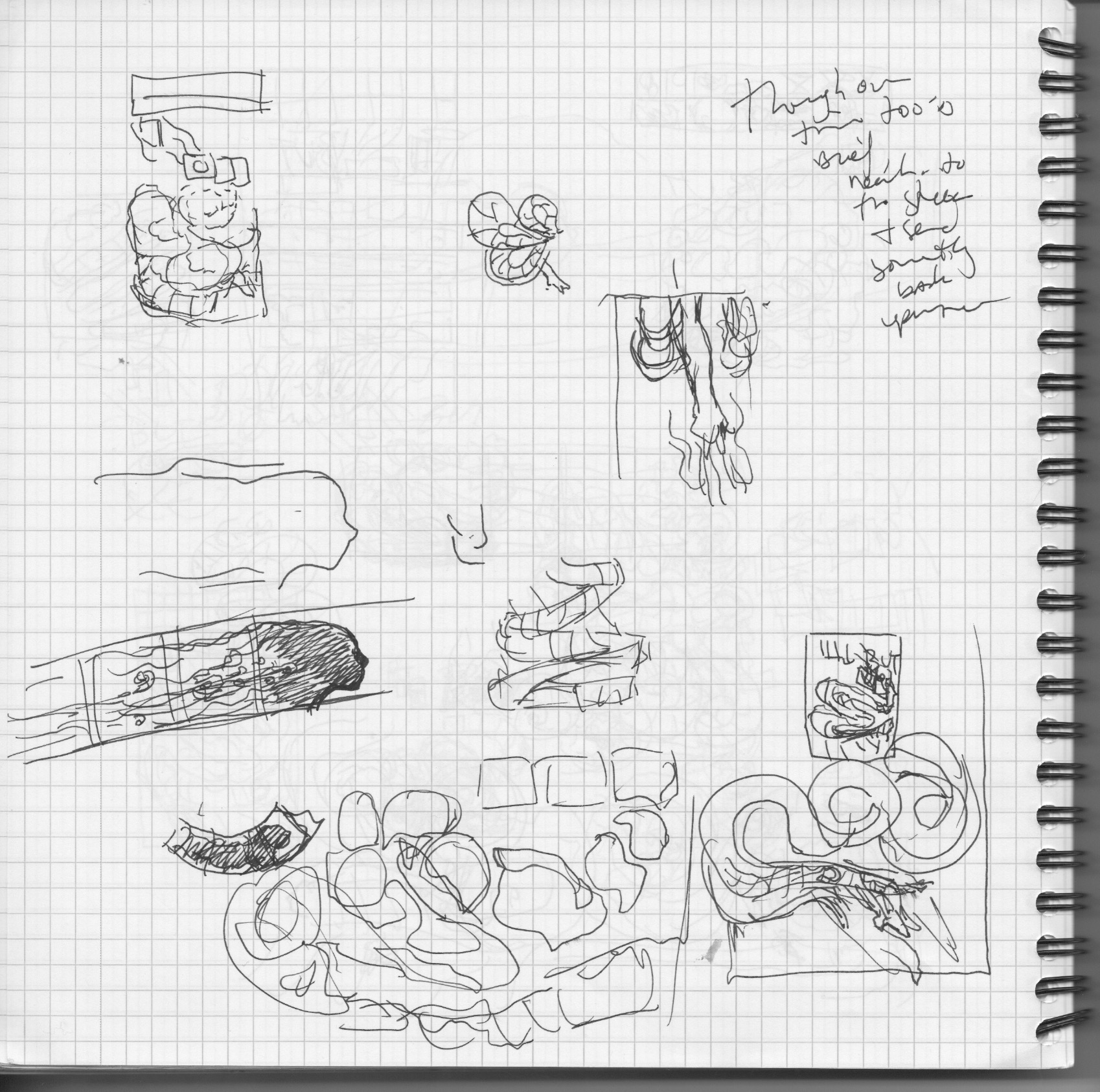
And since we are talking about sketching and process, I’m frequently asked, how long does it take you to make a page? There’s no easy answer. Sometimes it’s a few days, sometimes a few weeks, and other times… For my second full page comic for the Boston Globe last October it stretched out quite a bit longer from conception to sketches to final concept to publication. For those curious to get an inside look at how my work all unfolds, I scanned all of the sketches and thought I’d share them in full here with some minimal commentary. Bear with me, there are over 50 pages of sketches here… I’ve shared process sketches several times on my site in addition what was reproduced in the back of Unflattening, you can see these posts by clicking the process category link to the right. (click on any of the thumbnails to see the sketch in full)
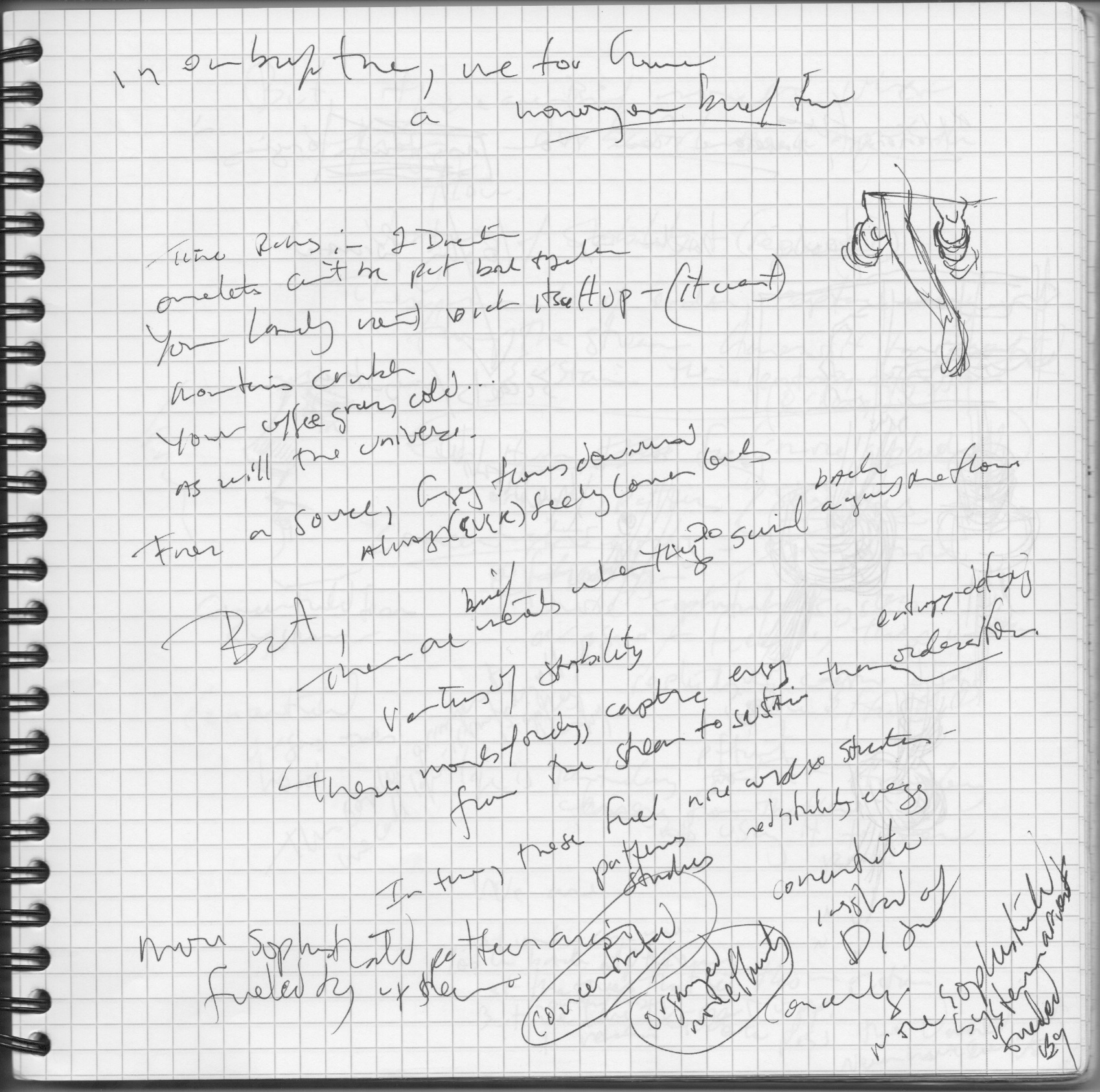
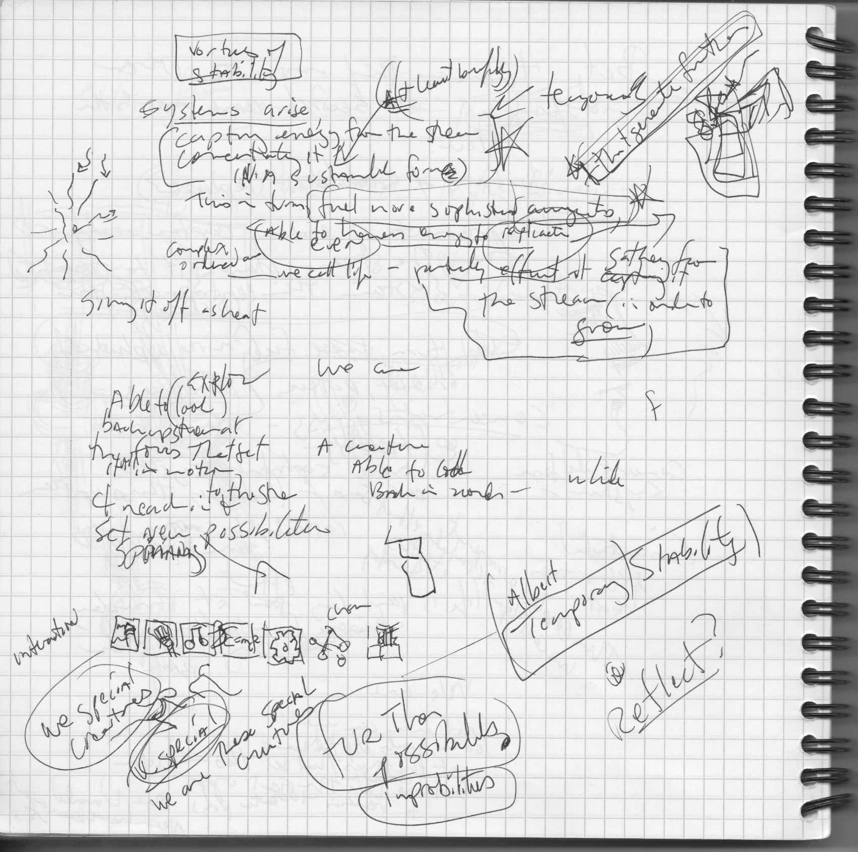
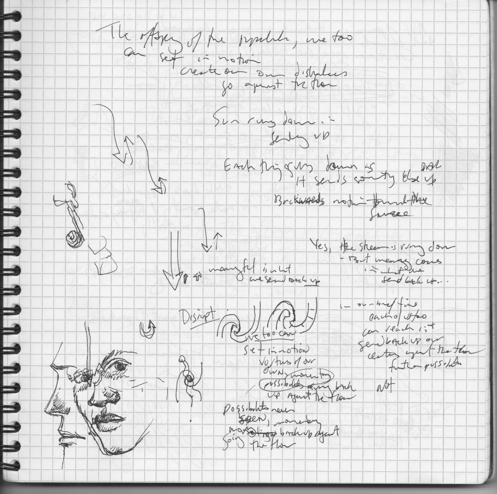
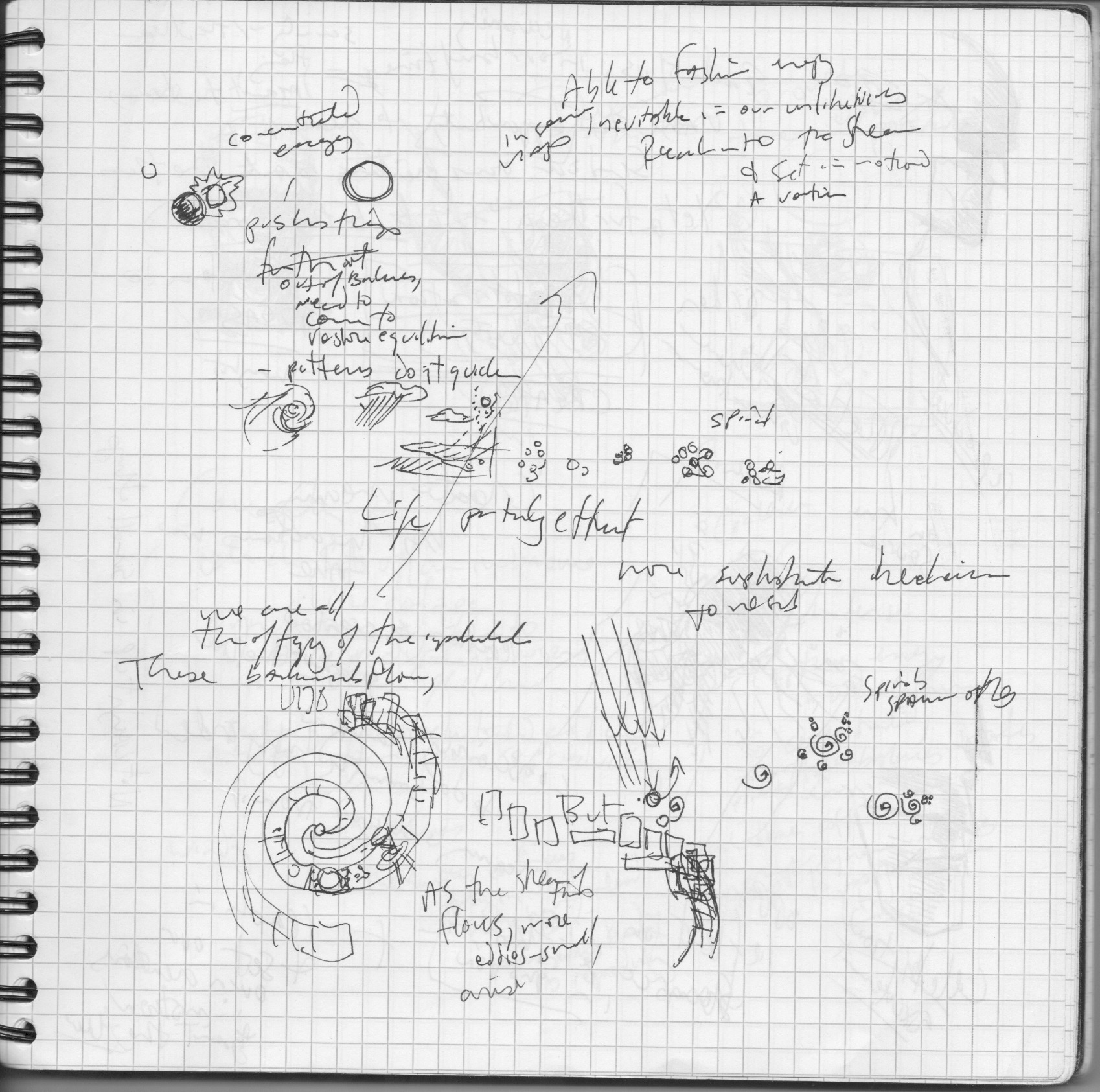
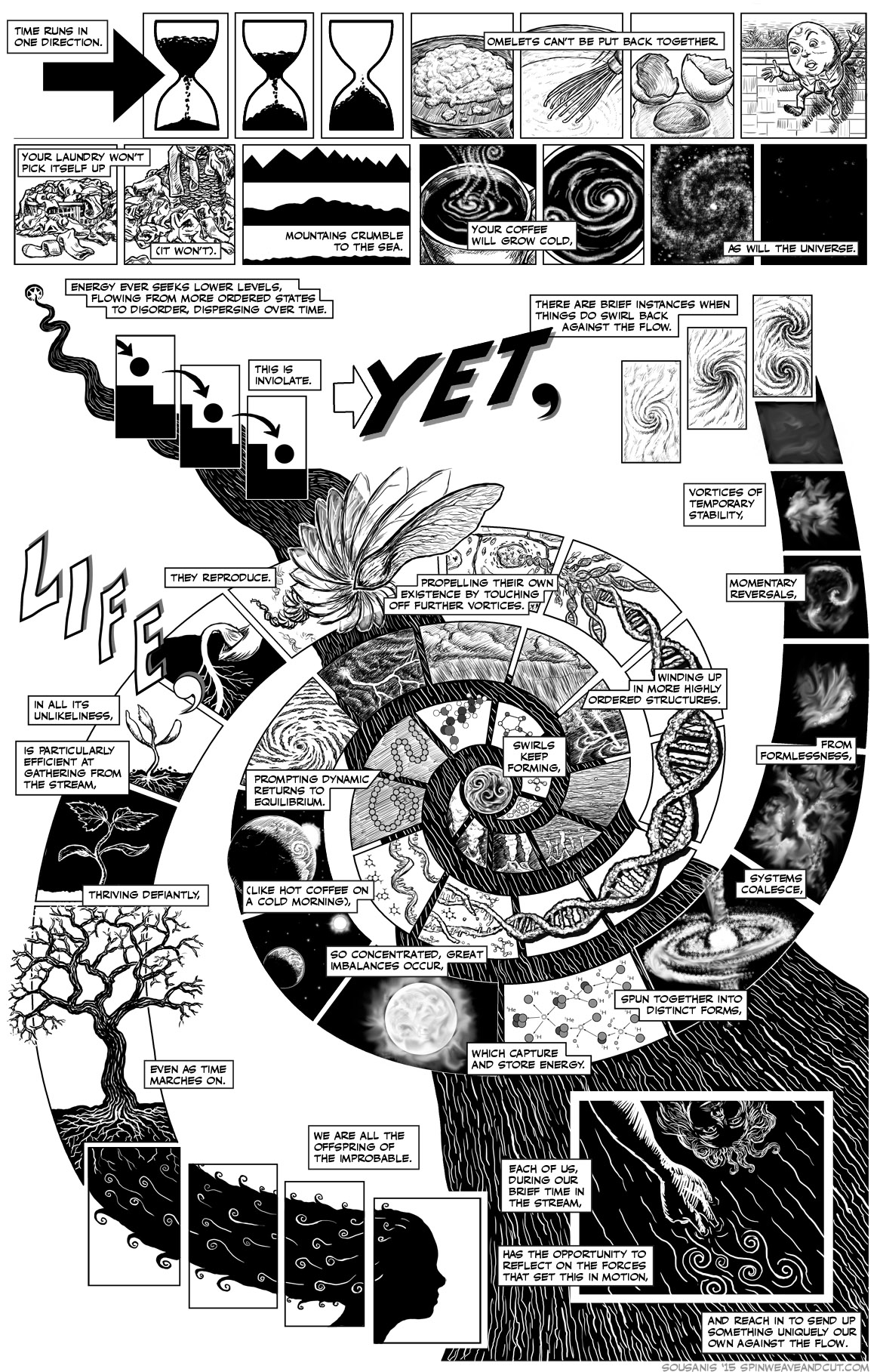 The piece came about from a conversation with my dad, a long time physics teacher, and a talk he gives to students connecting Robert Frost’s poem “West Running Brook” with the idea of entropy. I’d always loved the talk and his excitement about the idea of life springing up against the inevitable downhill flow of entropy – these brief little swirls. I recorded him talking about it a few years back and finally after doing my first piece for the Globe, this sprang to mind as the right sort of thing I could tackle in one page, that would bring together science, poetry, and could make a great idea to convey in comics. So the piece started with another conversation between my dad and me as i took notes and made sketches.
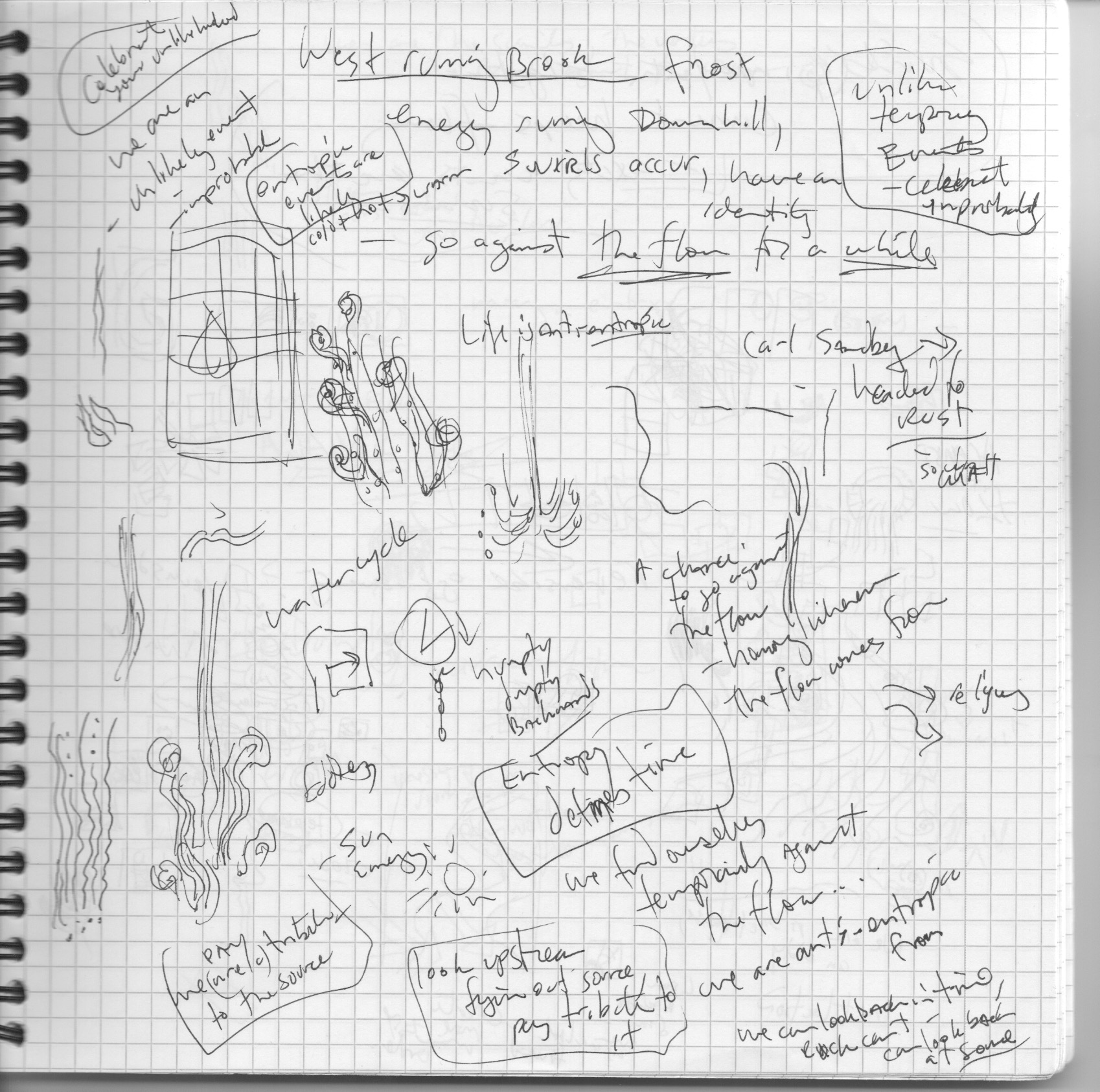

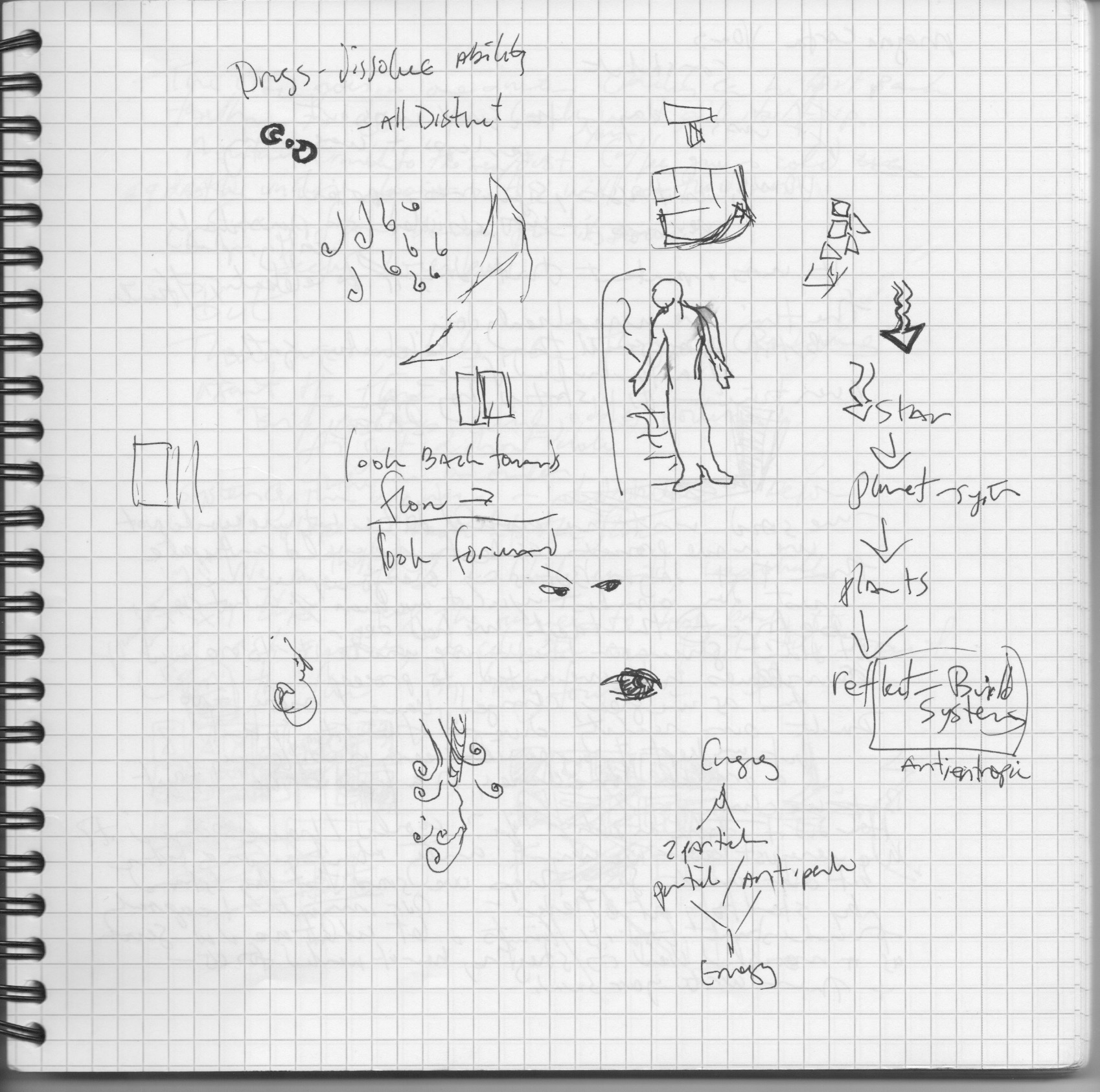
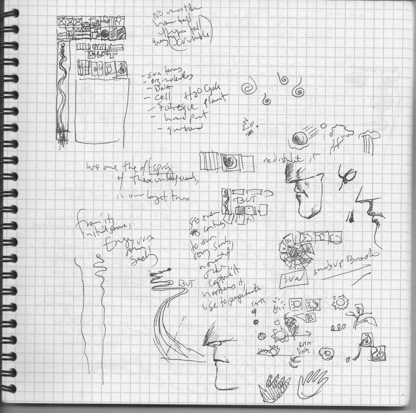
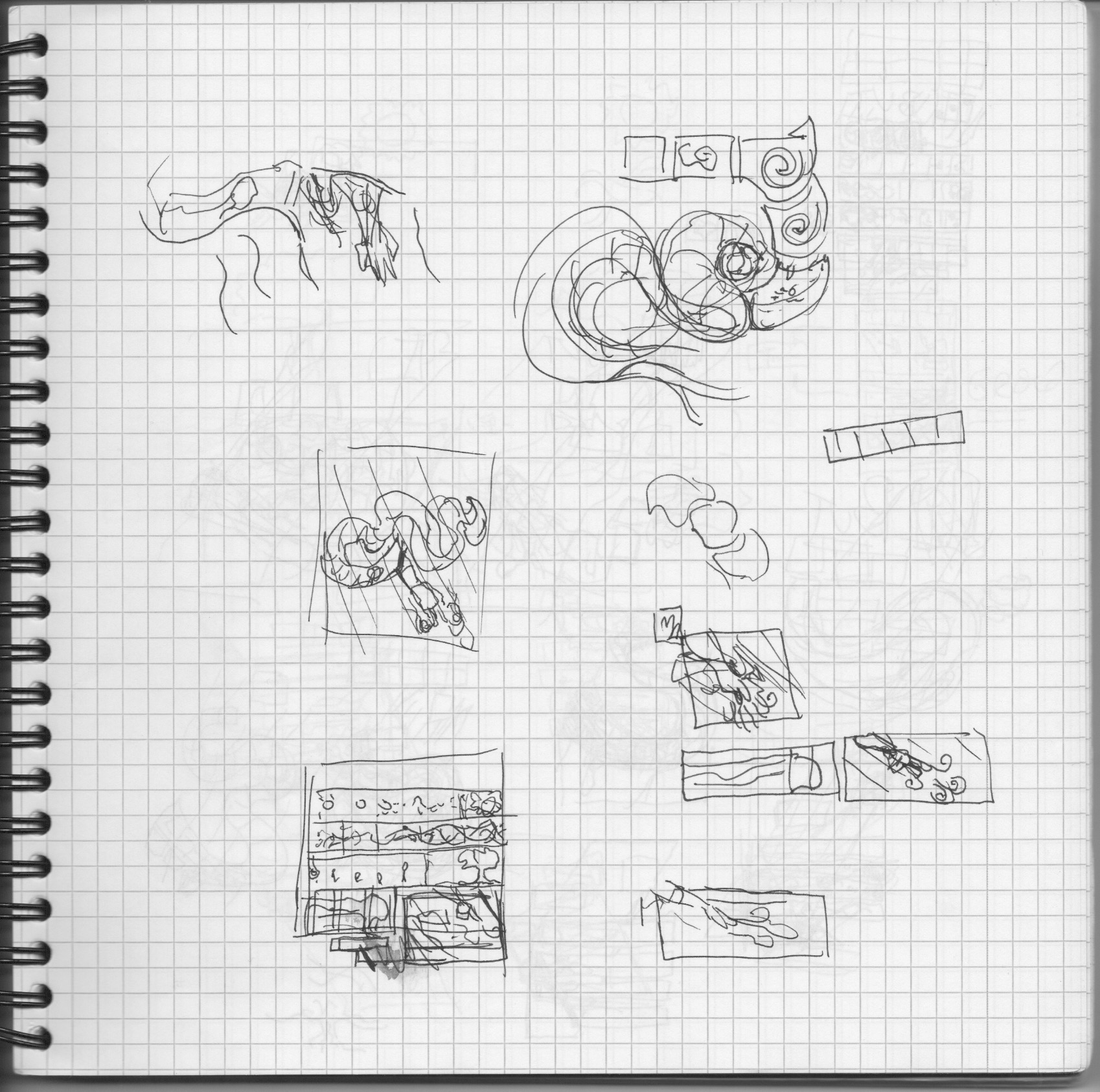
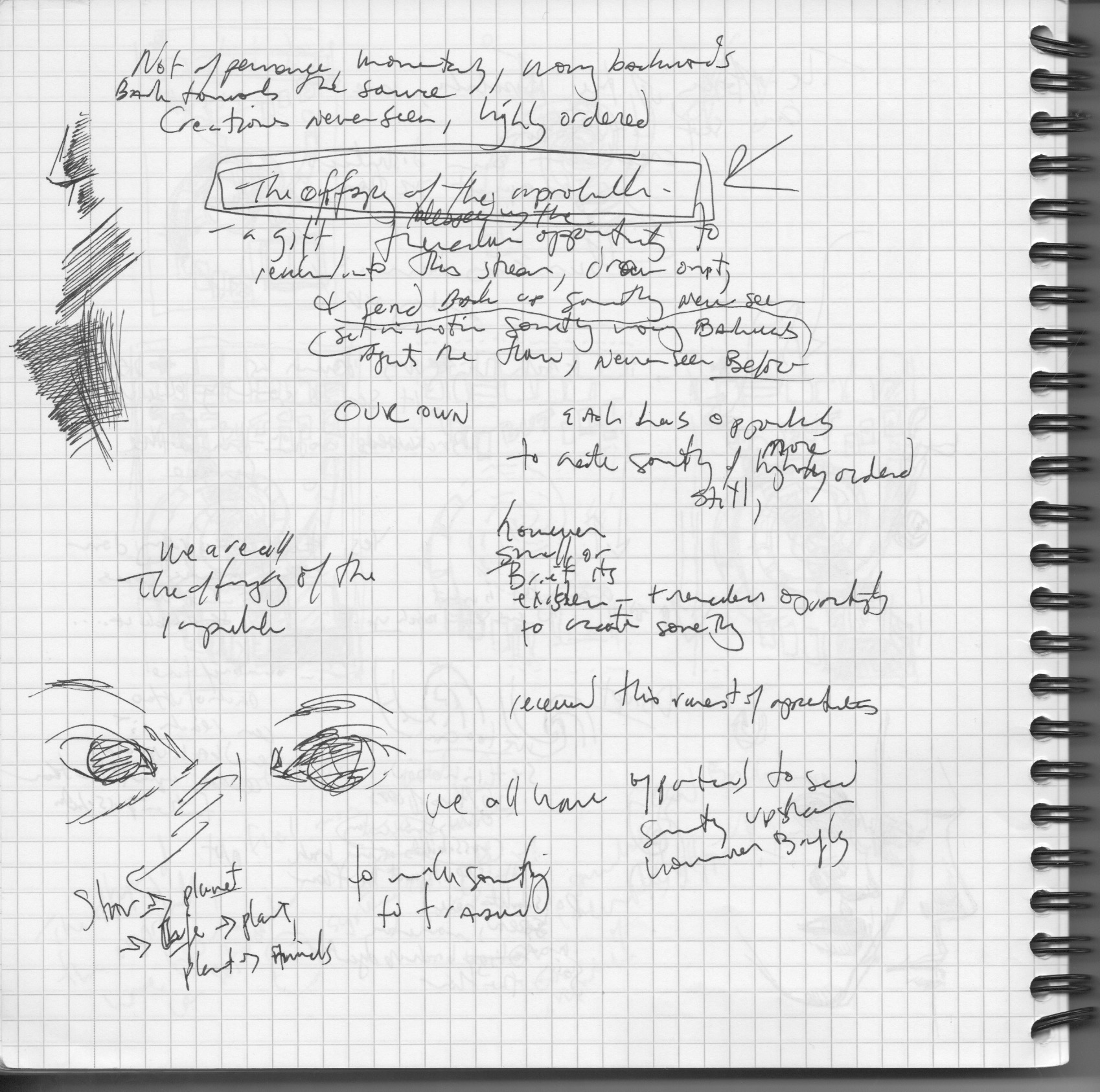
From there the process becomes a lot of reading and a lot of sketching – each investigation prompting the other. In reading on entropy I came across the work of MIT prof Jeremy England and his theory of life emerging from entropy. This basically talked about how the very nature of how the physics of the universe works makes life of some form or another somewhat inevitable. This was very recent work but there were precursors as well, this and this, as well as Schrödinger’s classic paper What is Life. From there my reading went all over – the birth of stars, how rivers meander, plant growth, maple helicopter seeds, and much more. A late addition to the reading was an article on physicist César Hidalgo’s work on multiplier effects in economics, which was dealing with the same stuff only in terms of information. It was a rich field to draw on as the drawings started to come together. My daughter’s singing of and acquisition of a Humpty Dumpty doll got in there too…


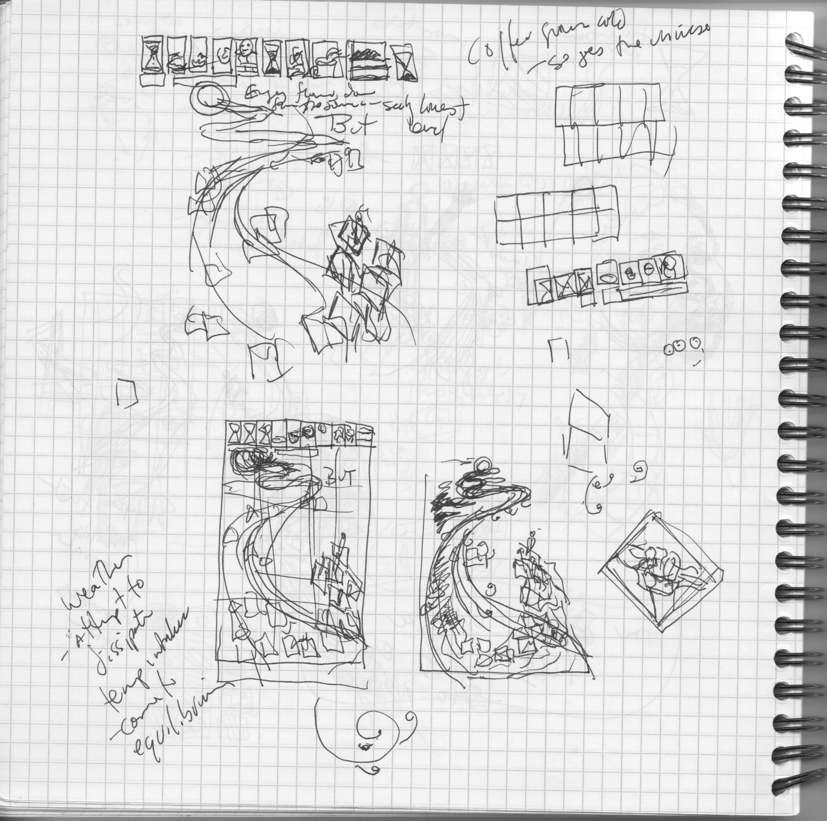


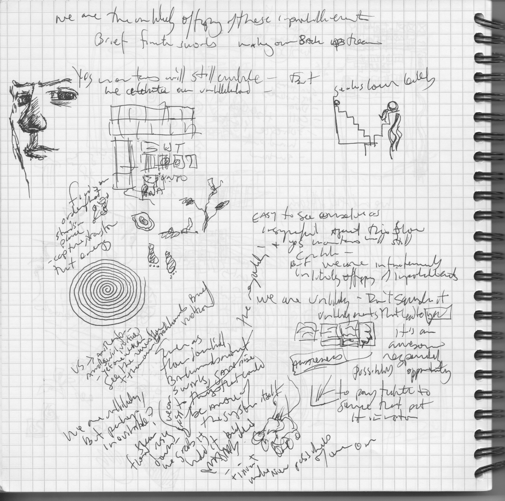
I wanted the page to flow but also move back against itself. As lately I keep ending up with full page compositions, I was really pushing myself to at least somewhat stick to a more traditional comics grid. This was a struggle the entire piece as will be evident. I am always interested in the way the shape of the page conveys the meaning and that had to drive things (you can more on this in the explanation to the grids and gestures activity).
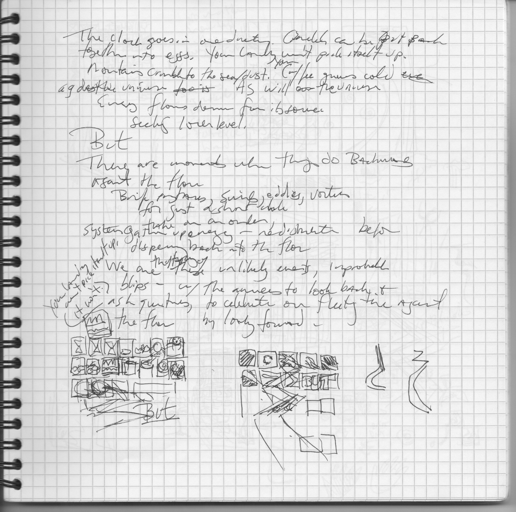
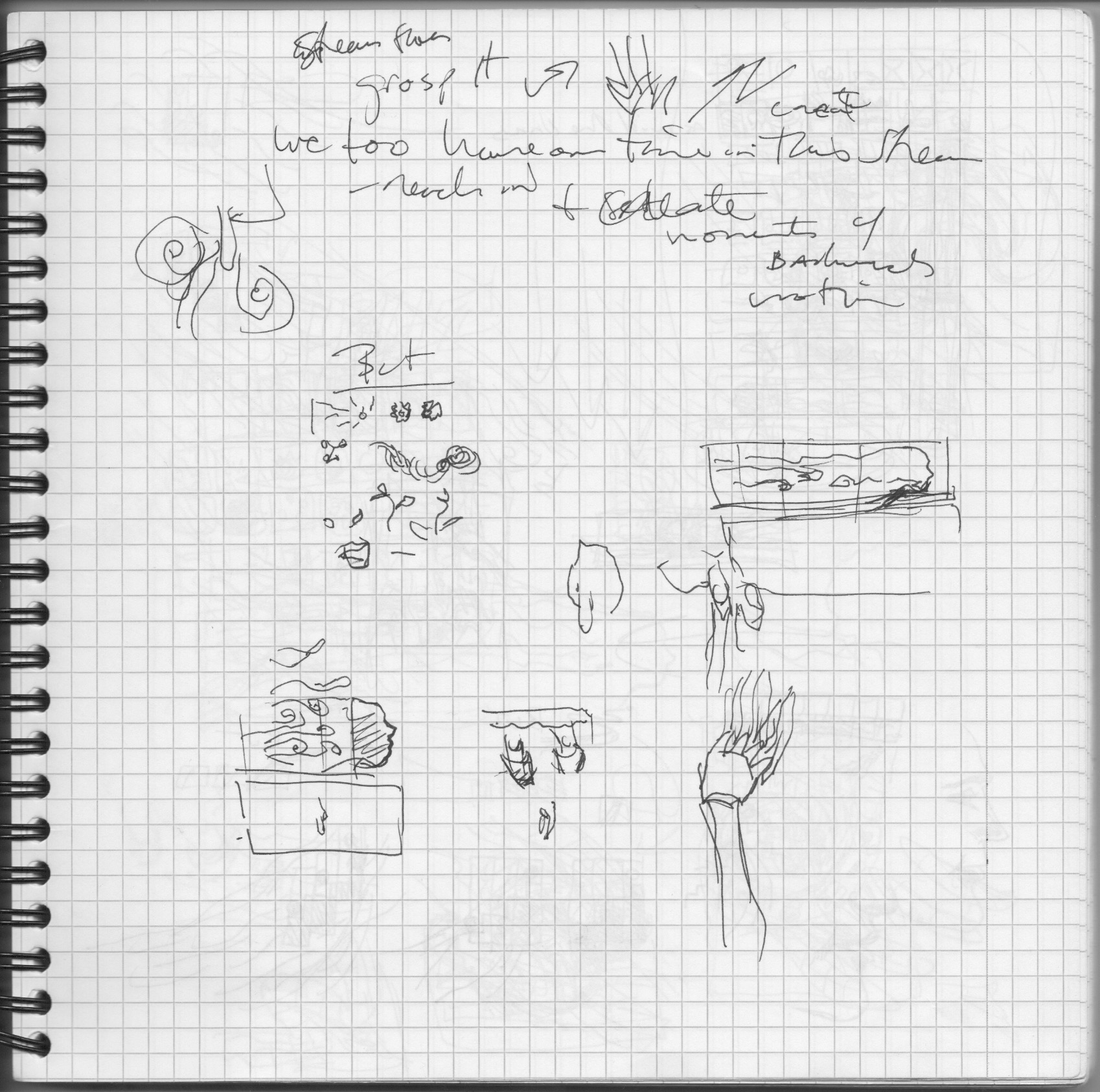
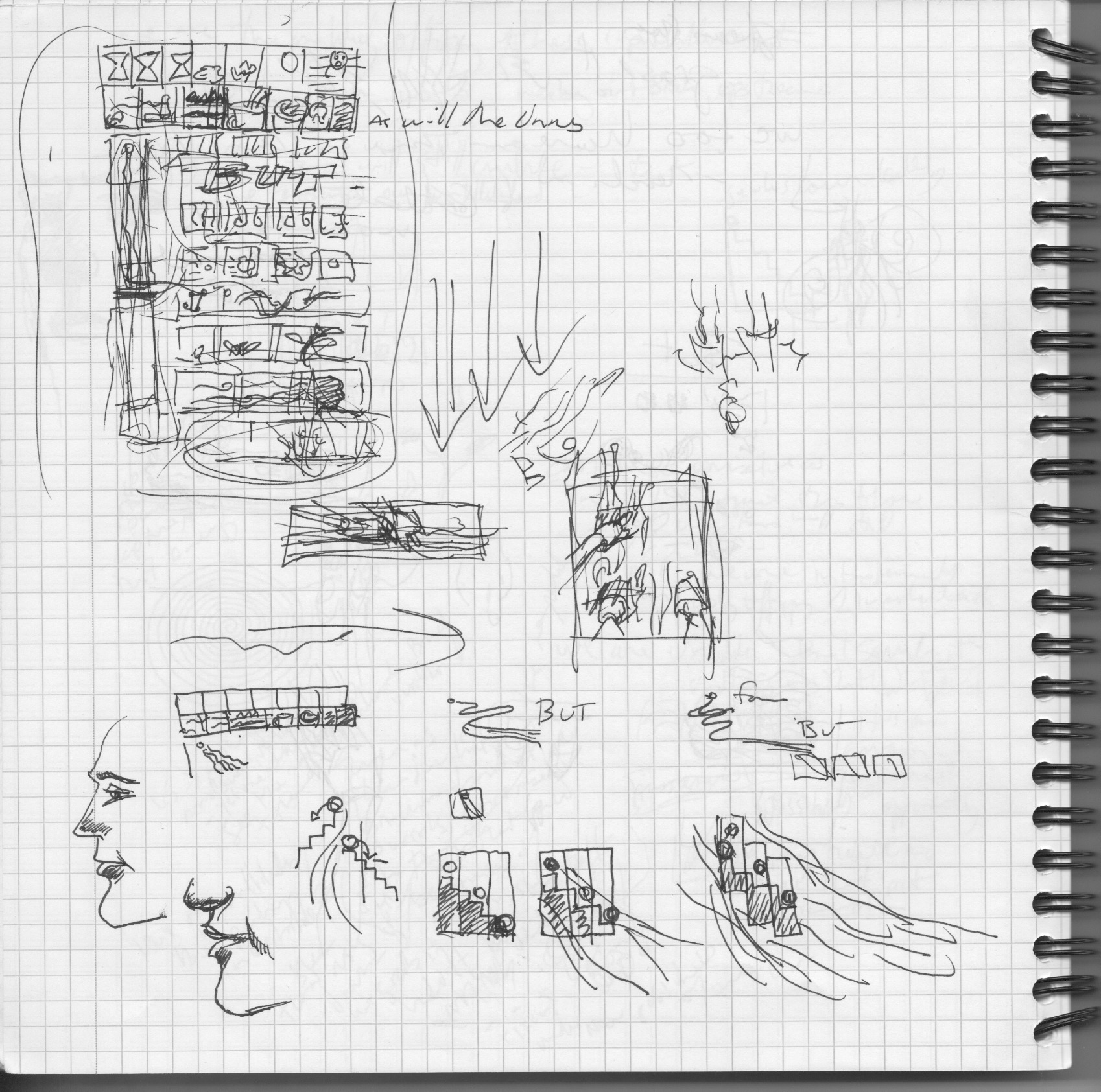

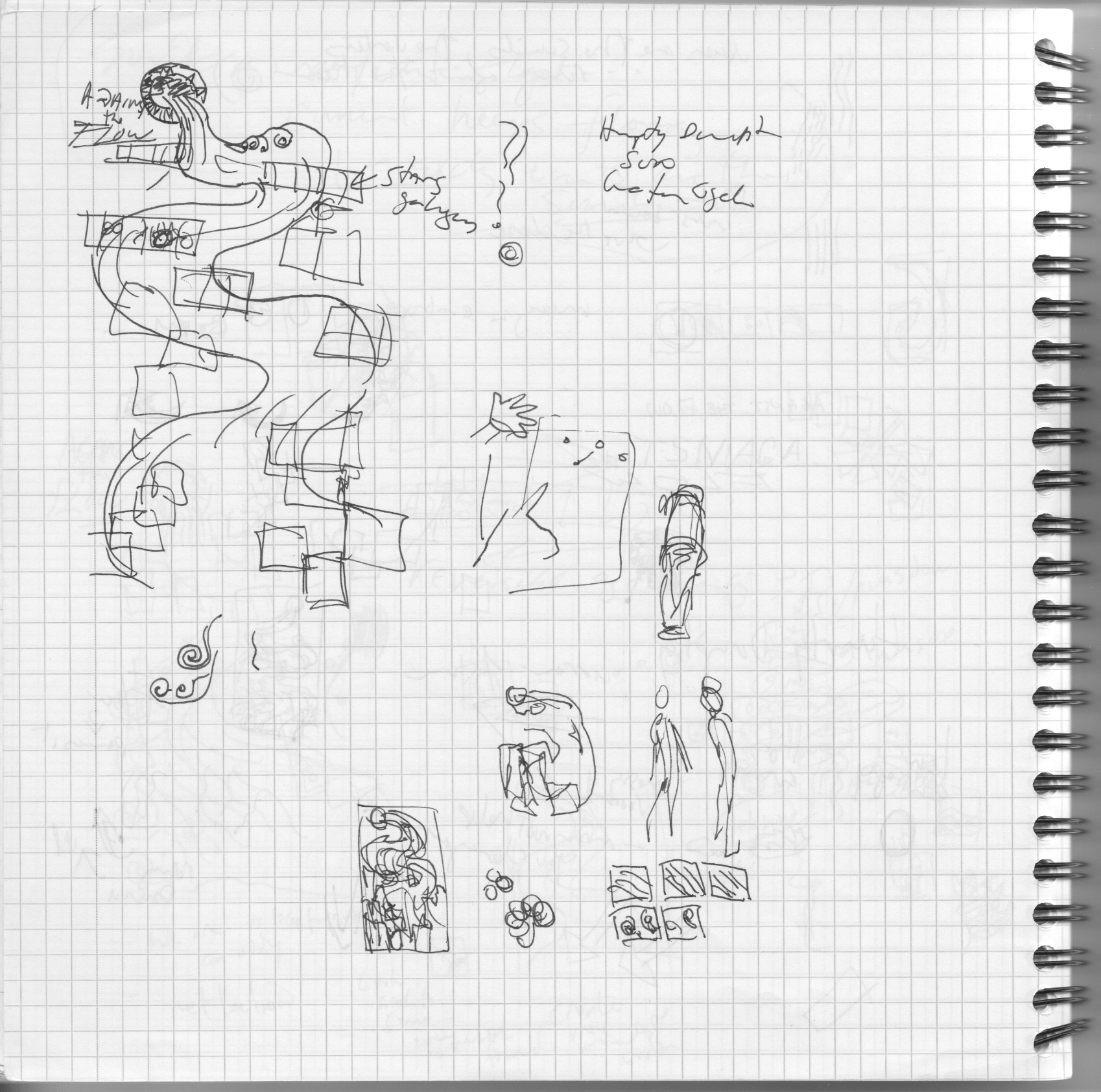
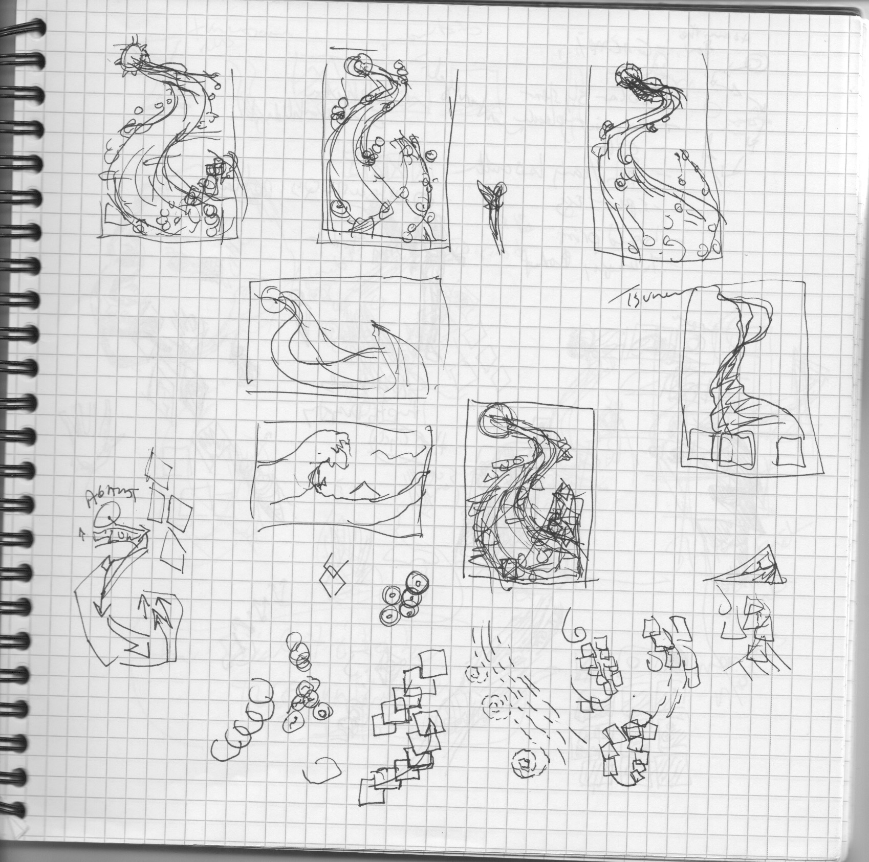
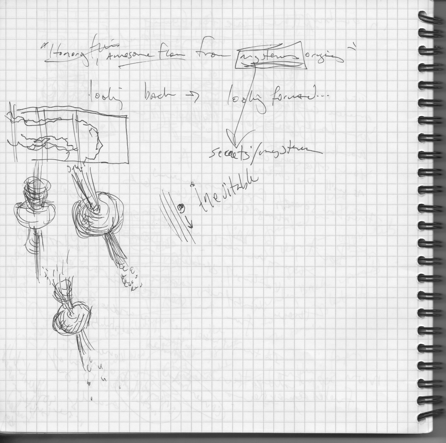
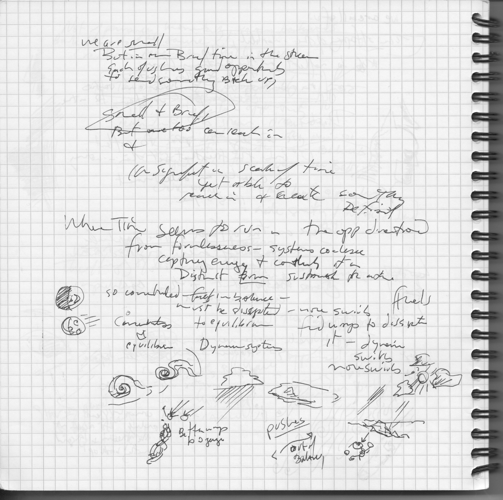
I’m trying to do things that spiral (which actually came up early and then I abandoned), movements that snake in various ways across the page. Each iteration helped figure out aspects I would later use, but nothing clear was emerging as to the pages entire structure. I fear entropy was winning for some time here.
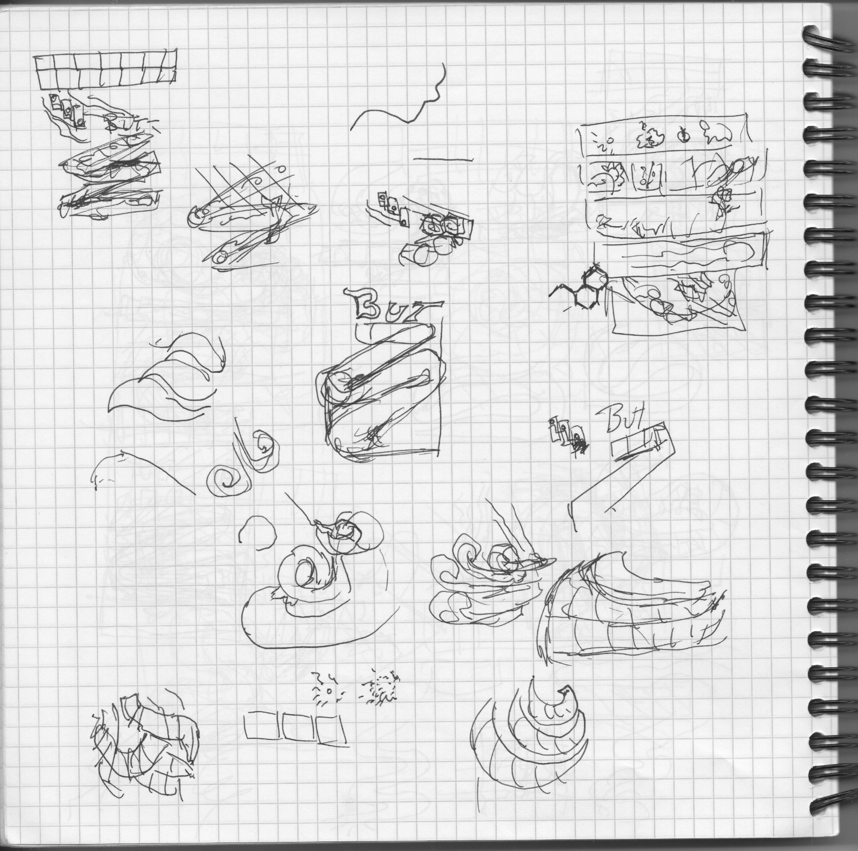
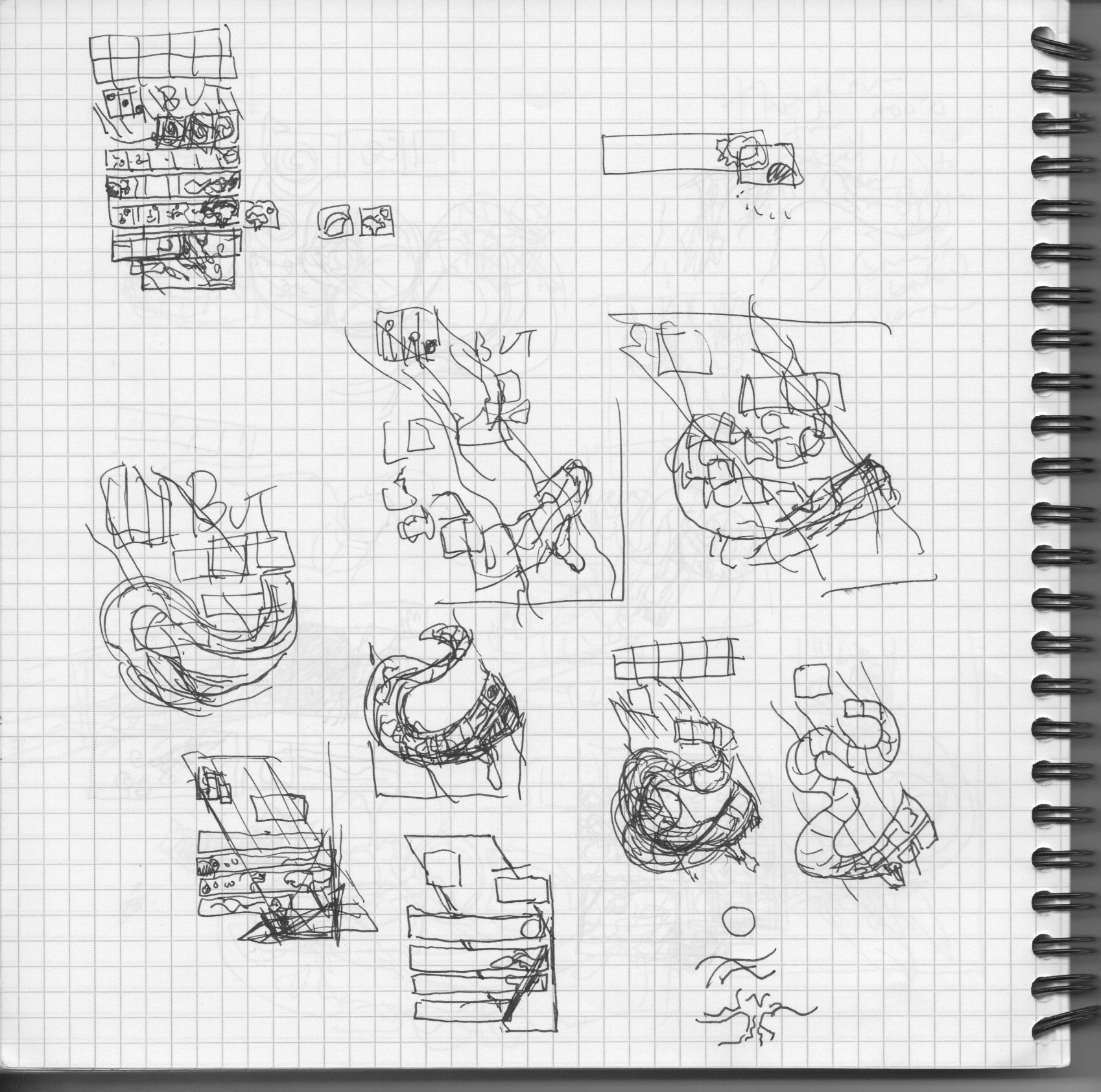
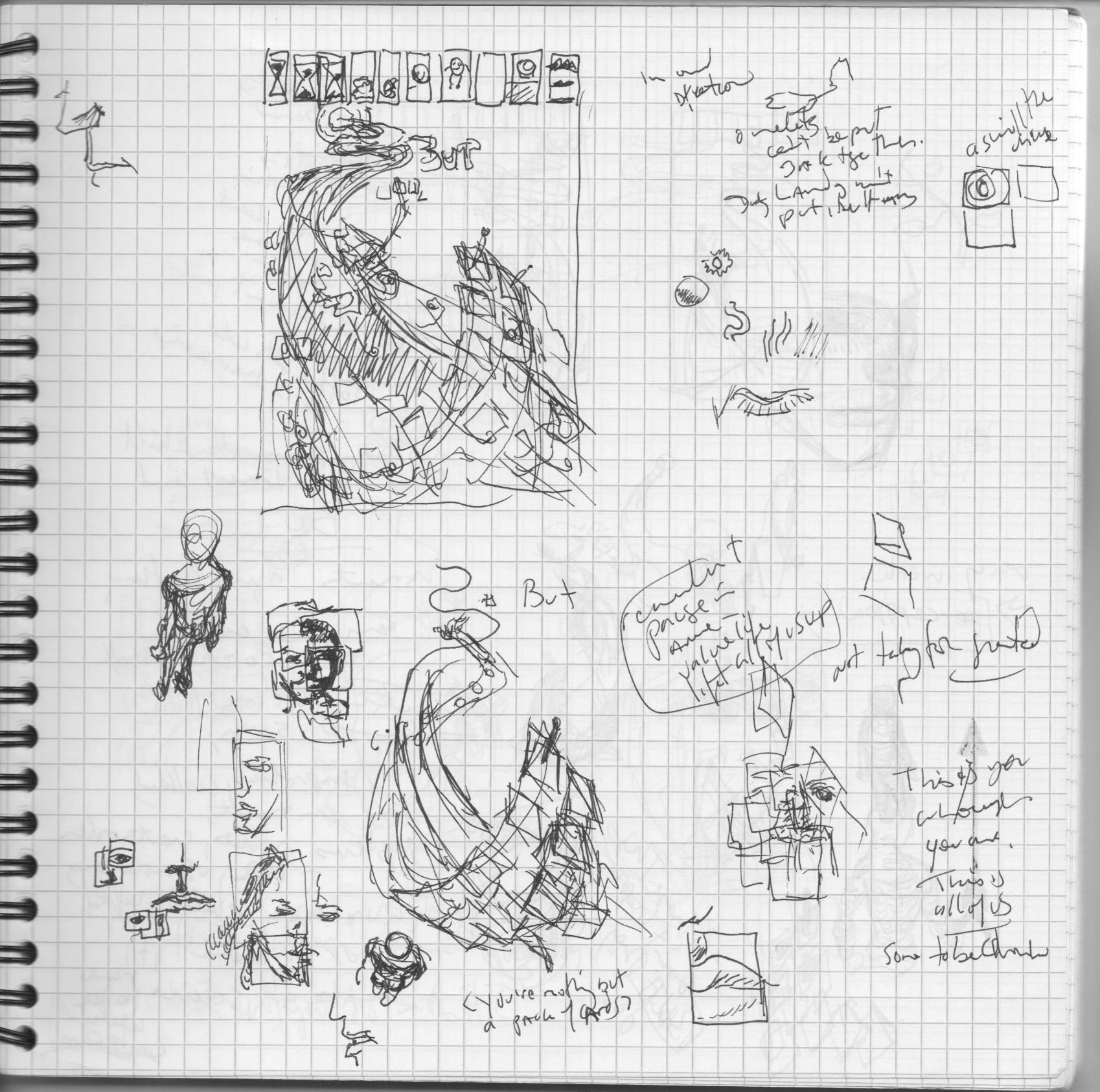
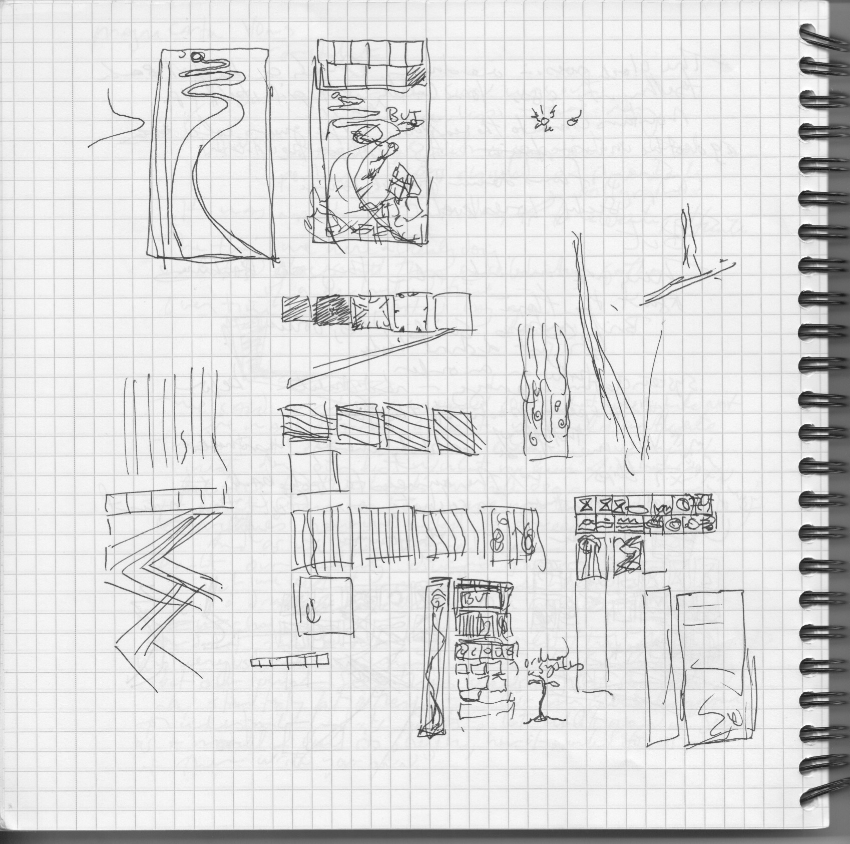
I tried vortices, undulating reading shapes – those did some things I liked but looked too much like intestines – wrong imagery here! I wanted the images to move sequentially – not make a carriage return at the end of the page and start over, but the snaking paths against the overall flow the page were fighting one another. One reason to not want carriage returns – the flow of the woman’s hair that stemmed from the tree roots. Having the tree emerge, and then have to go back to the left side of the page to start her hair lost something. I really wanted it to all tie together and have everything flow into the next thing.


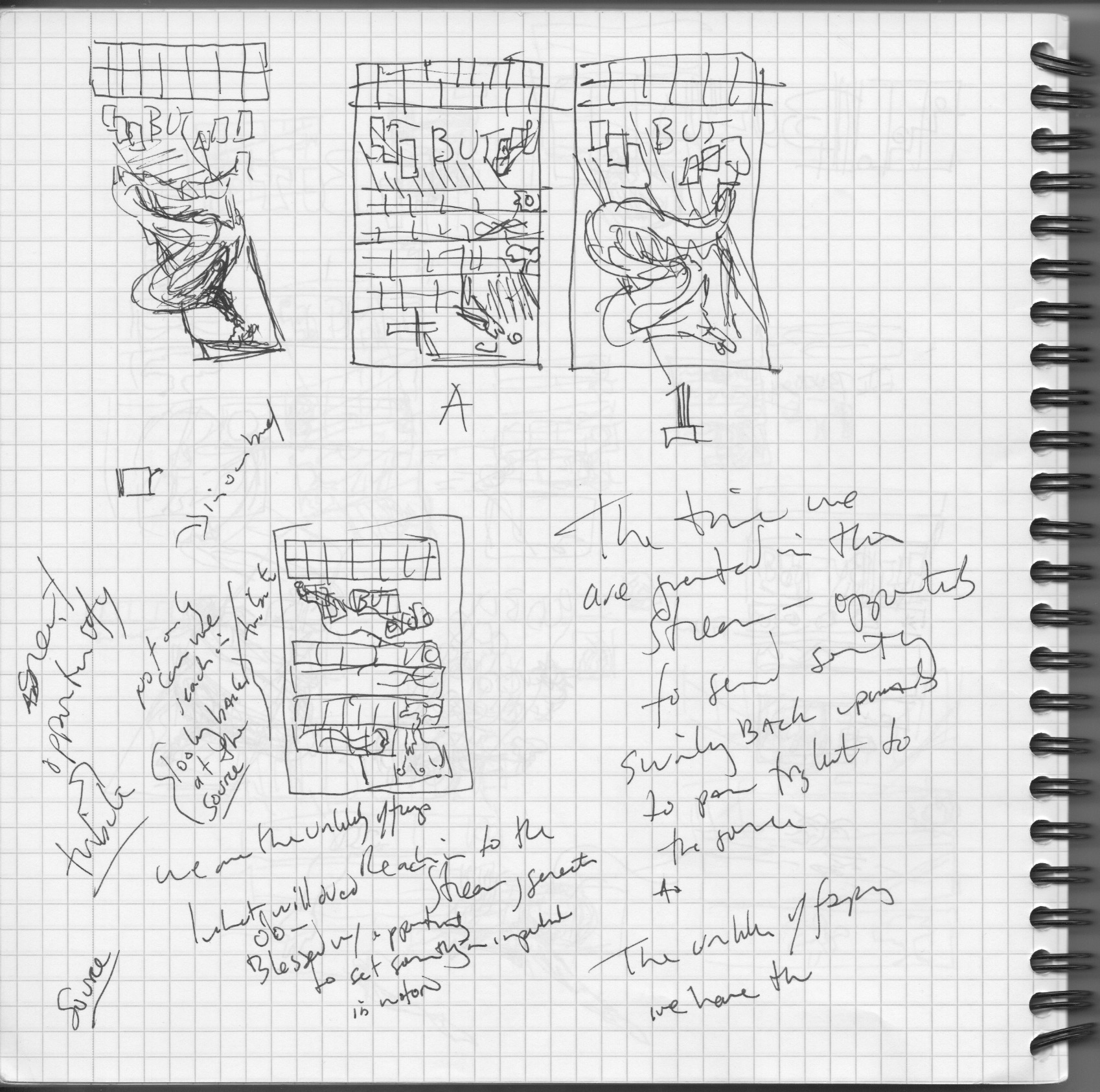
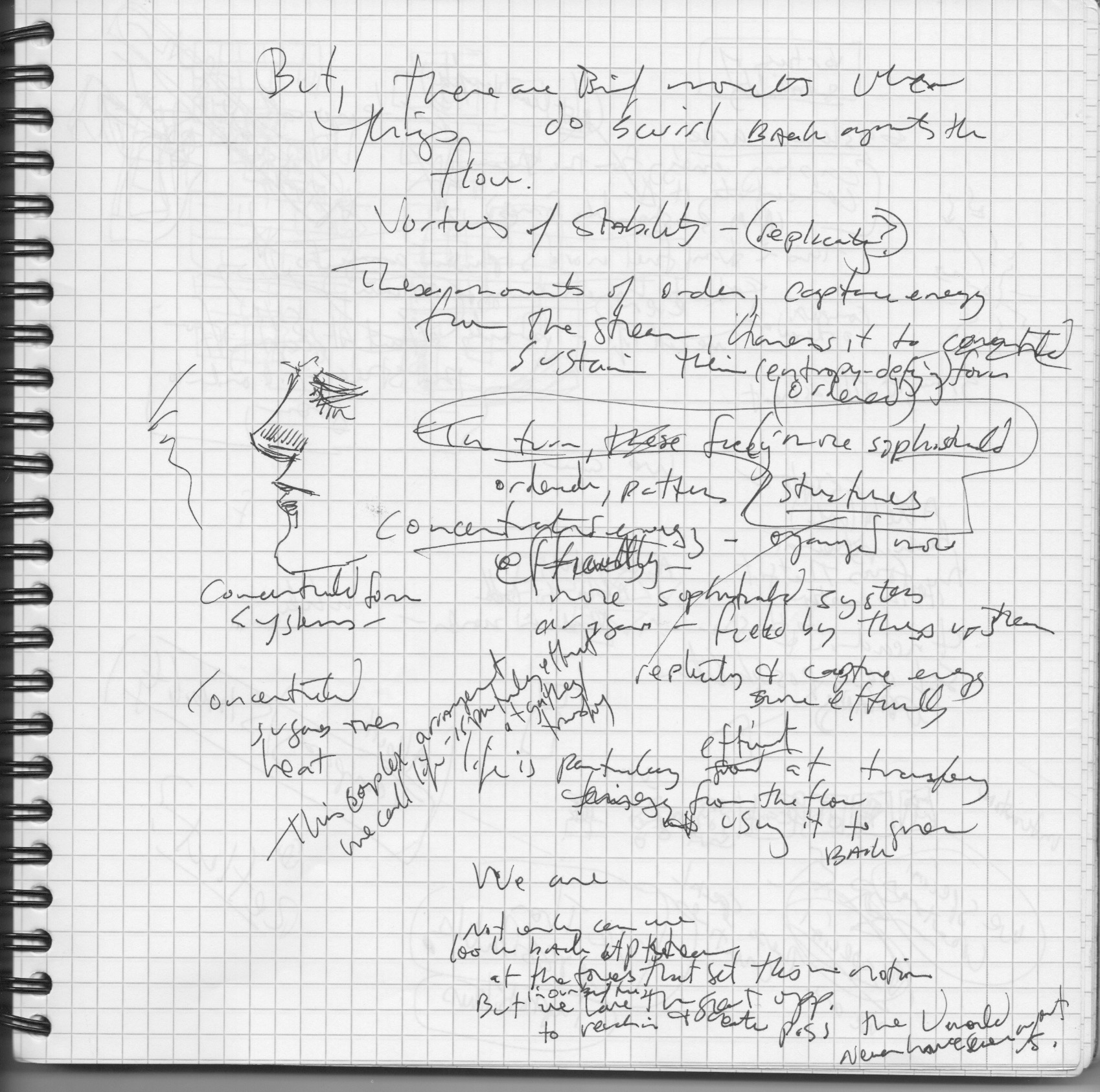

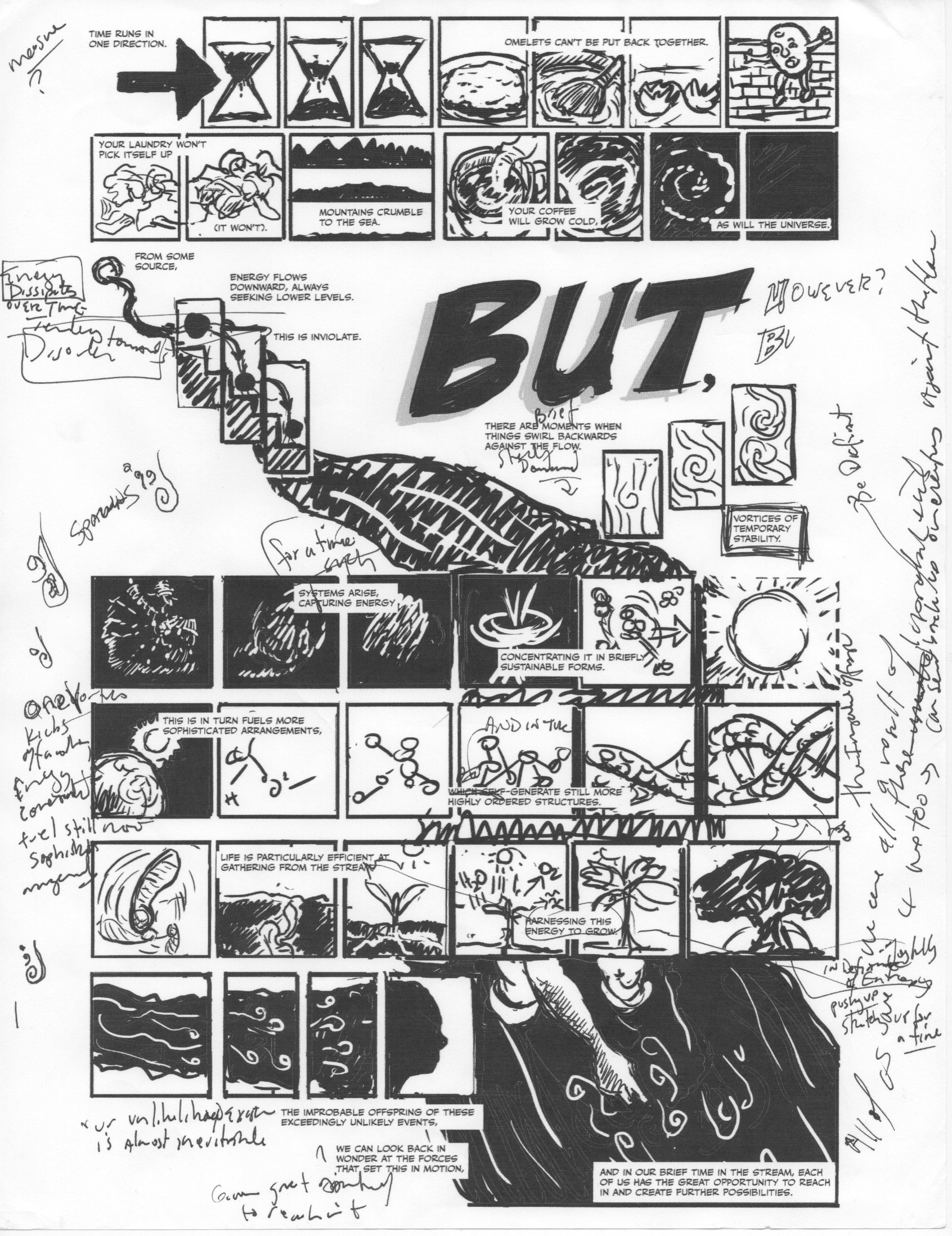
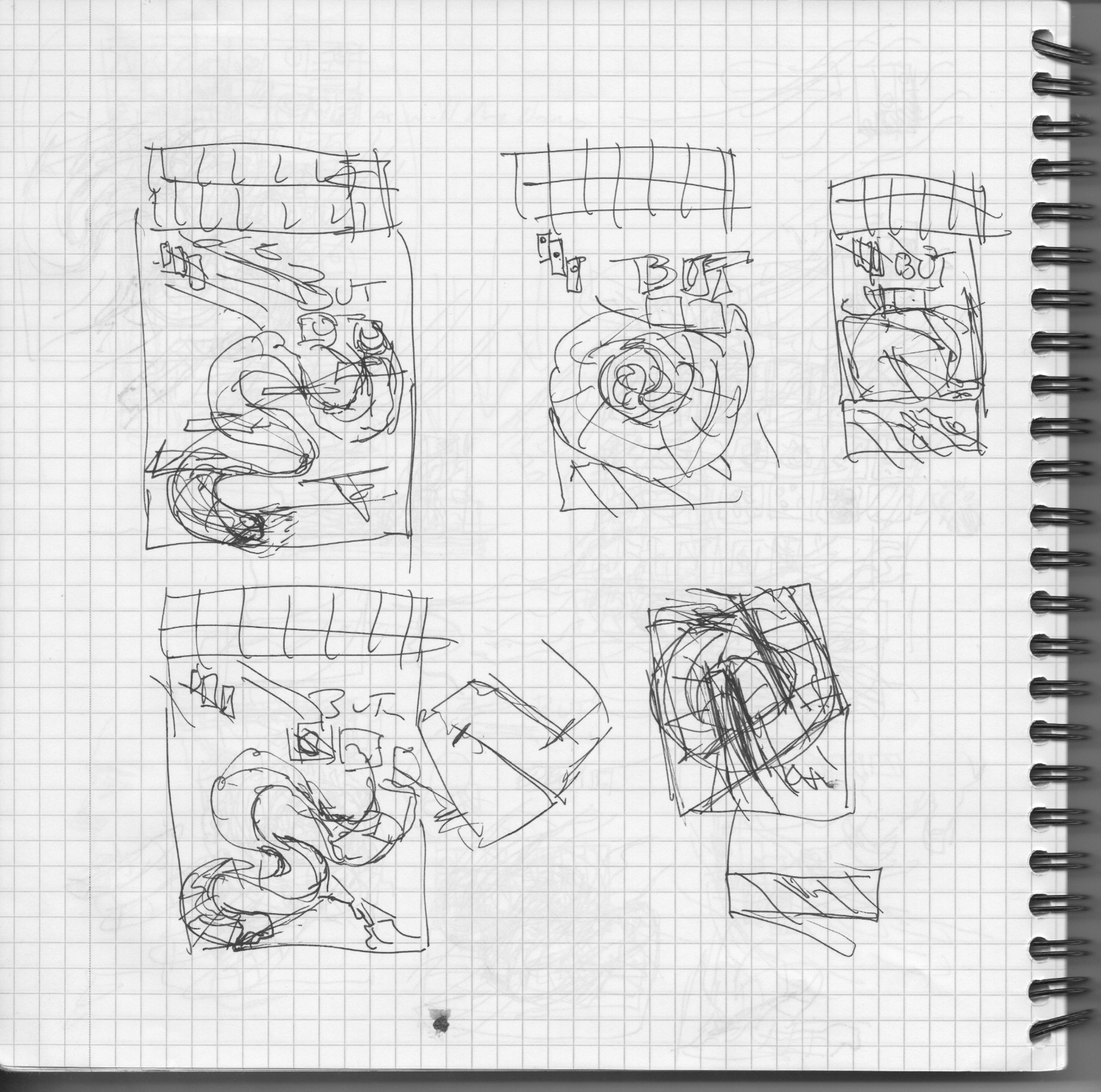
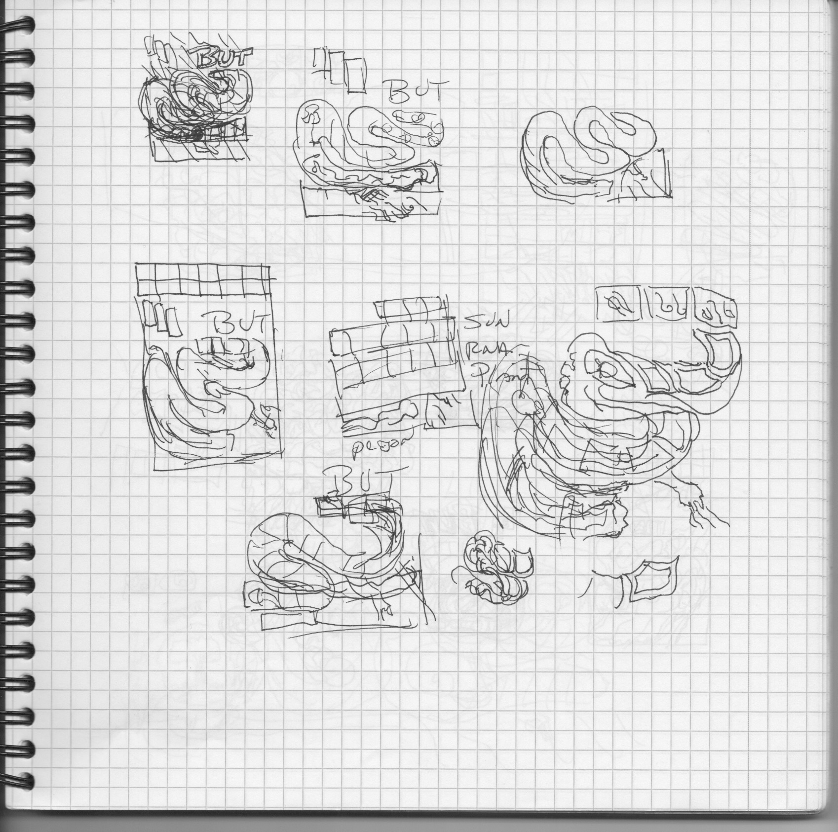
The sequence of events here is a bit lost – but at some point I was just convinced the less straightforward paths just weren’t going to work out. But I did have enough of the ideas together and I felt like it worked with a more traditional reading flow. So I sent a more readable rough sketch of it to my editor at the Globe, the wonderful Heather Hopp-Bruce, and her response indicated I probably wasn’t done. She saw too much in common with my earlier piece for them “Upwards”, and had some other responses that got me thinking again. And deciding to just try all sorts of things and see what shook out. I think the creation of this piece really speaks to the idea at hand – our creative process is anti-entropic, and I’m glad this one in particular is so well-documented. So a few more iterations…
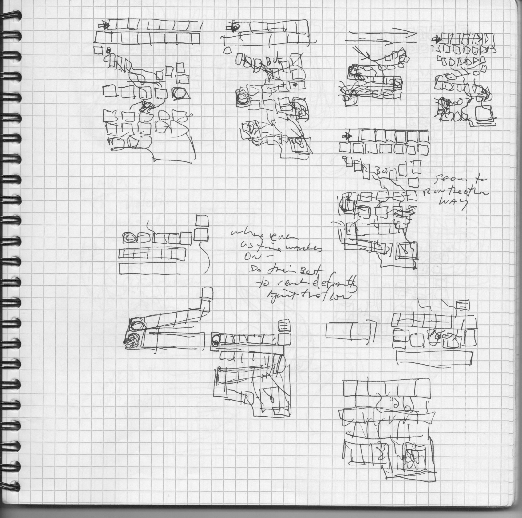
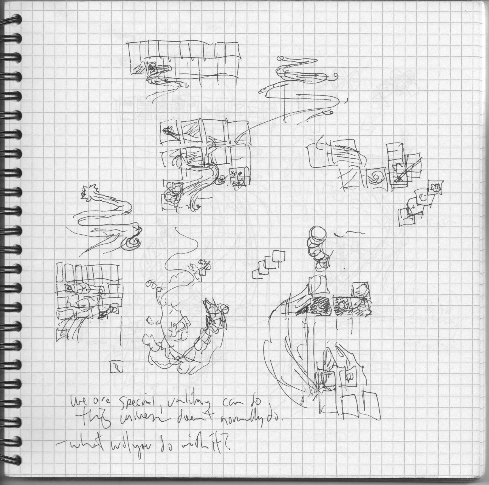
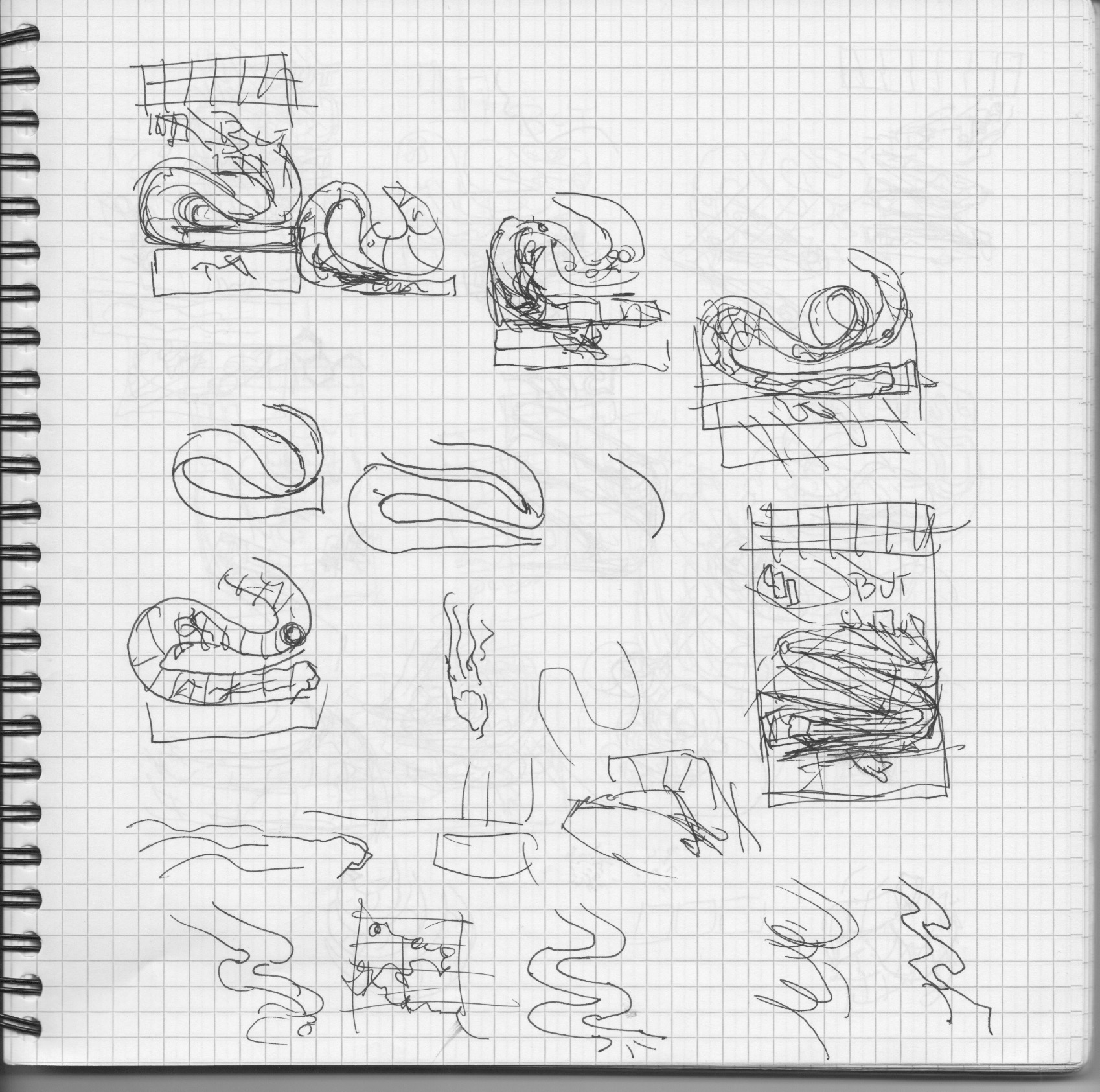
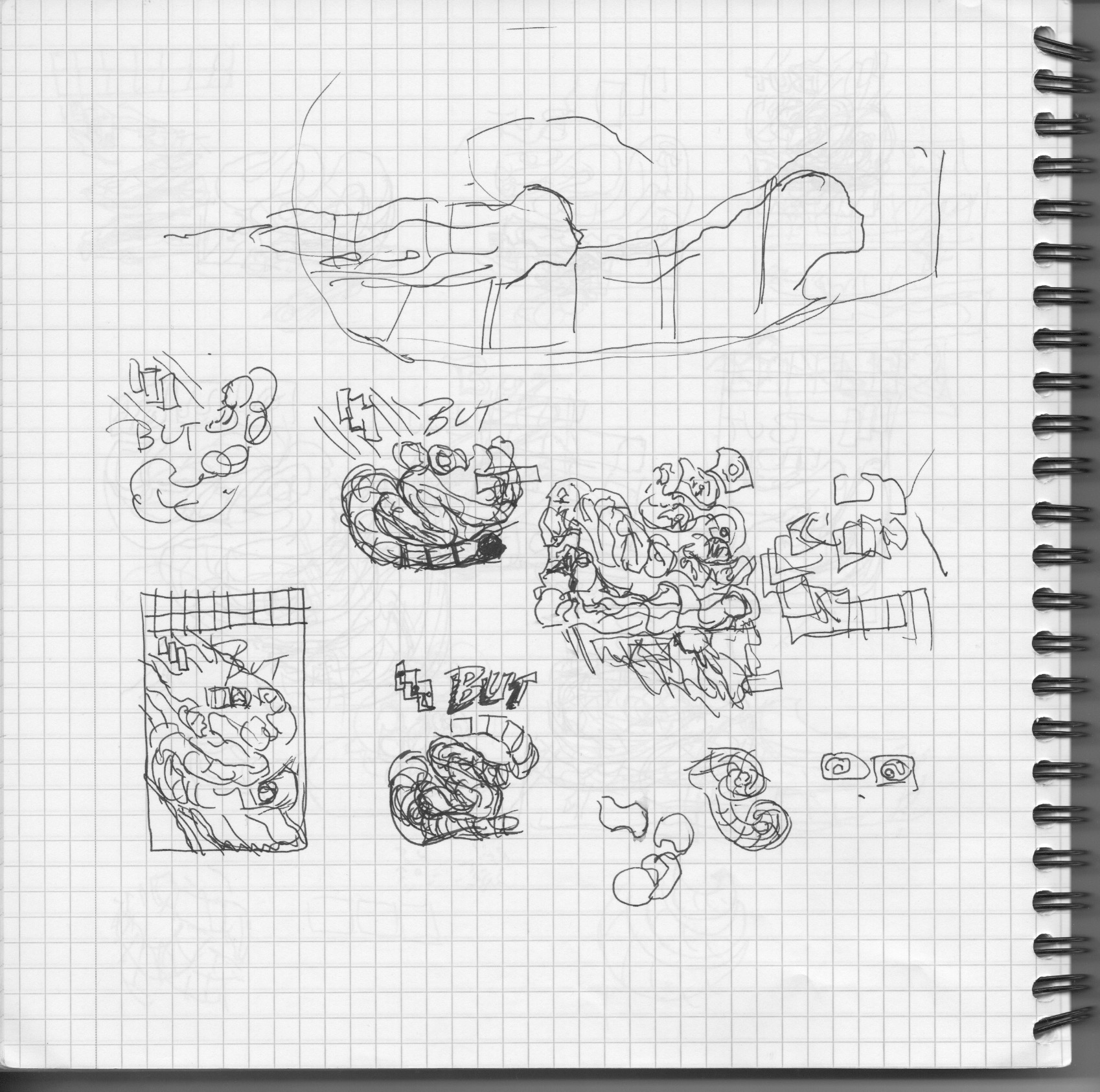
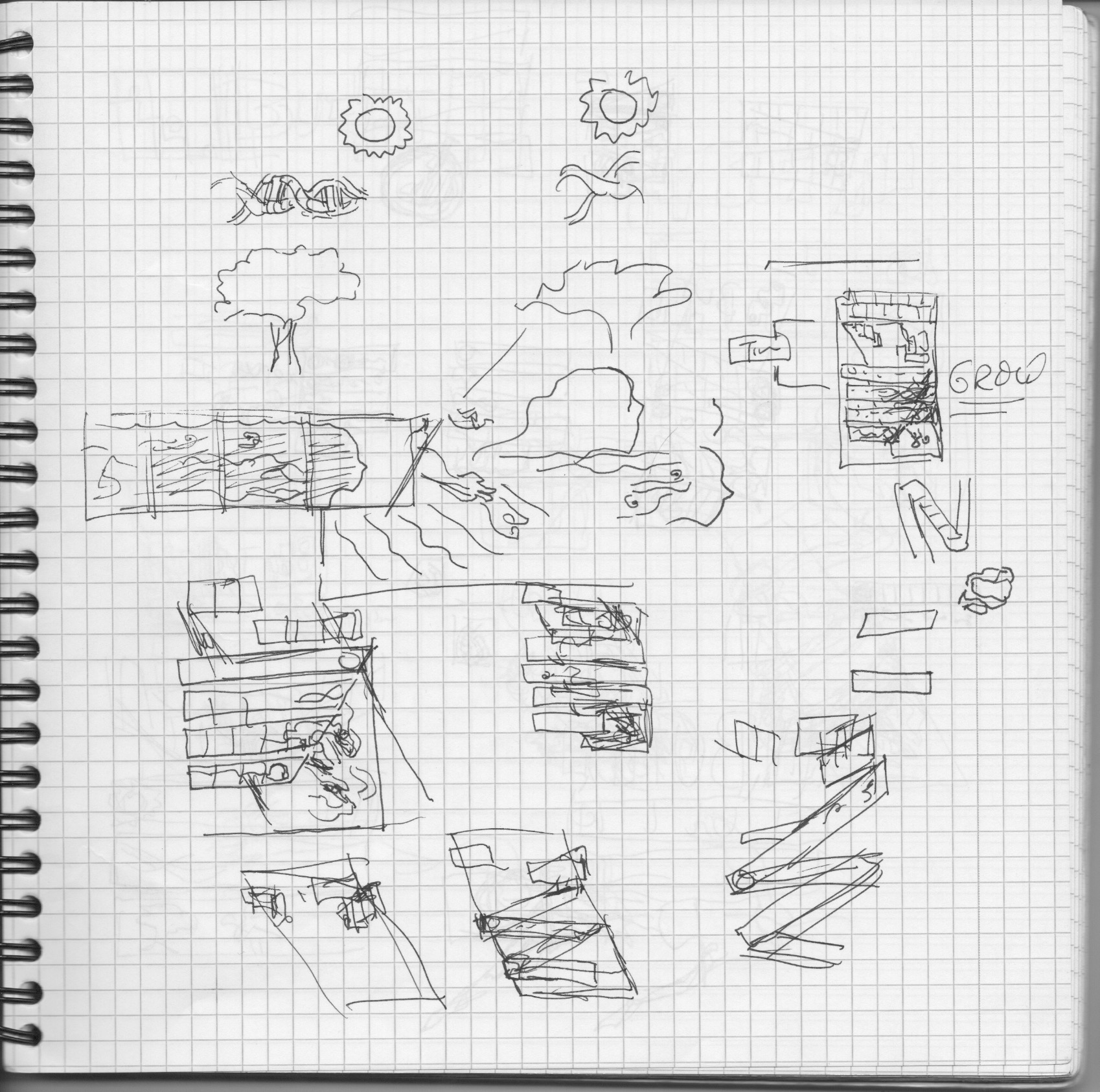
Somewhat more of the same but on the second page above, you can see i tried sliding the three different rows of panels over one another. And then next to that I thought that suggested winding them together. And then…

And now the piece is more or less done. I mean, except for all the drawing and stuff. 🙂 When I hit this point, it seemed in retrospect like a pretty obvious solution. But I had to go down so many paths to get here. A few more sketch iterations from my grid book, it’s Rhodia Reverse Book if you’re wondering. I did all of Unflattening in four of these with orange covers – I use the black covers for smaller projects… Also, for Unflattening and other multi-page projects, I typically work between my sketchbook and large newsprints where i can collect a lot of ideas, see them all at once, and then move back to the smaller notebook for more specific work. I didn’t here because it was a single page – but it might’ve helped.
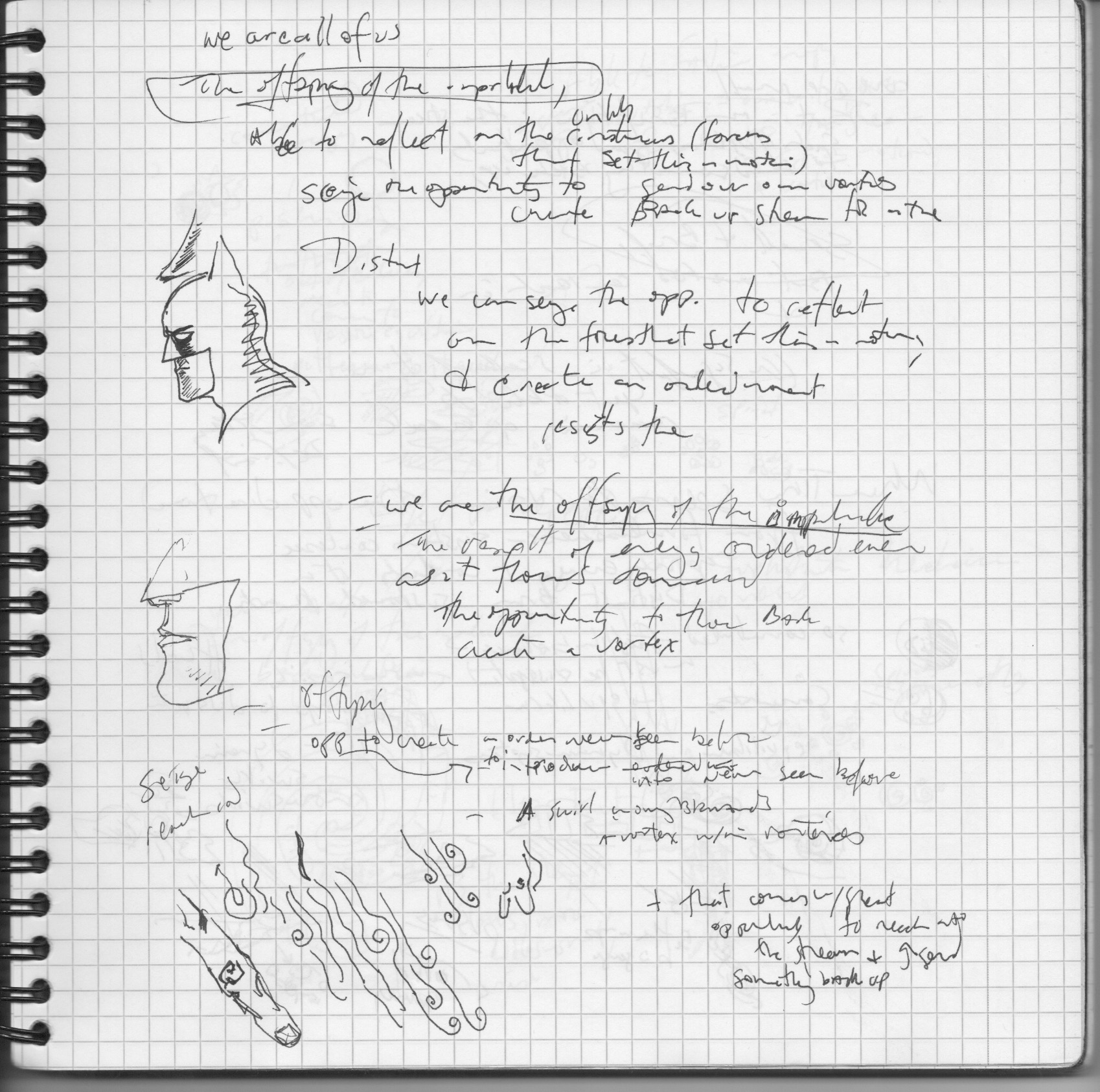
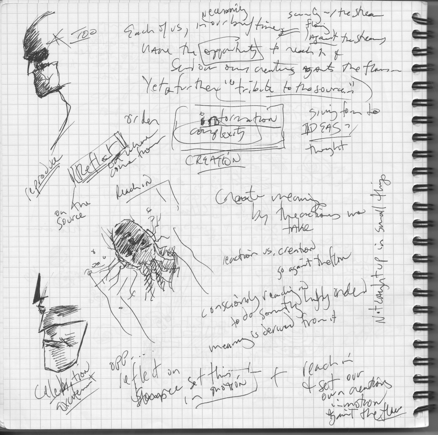


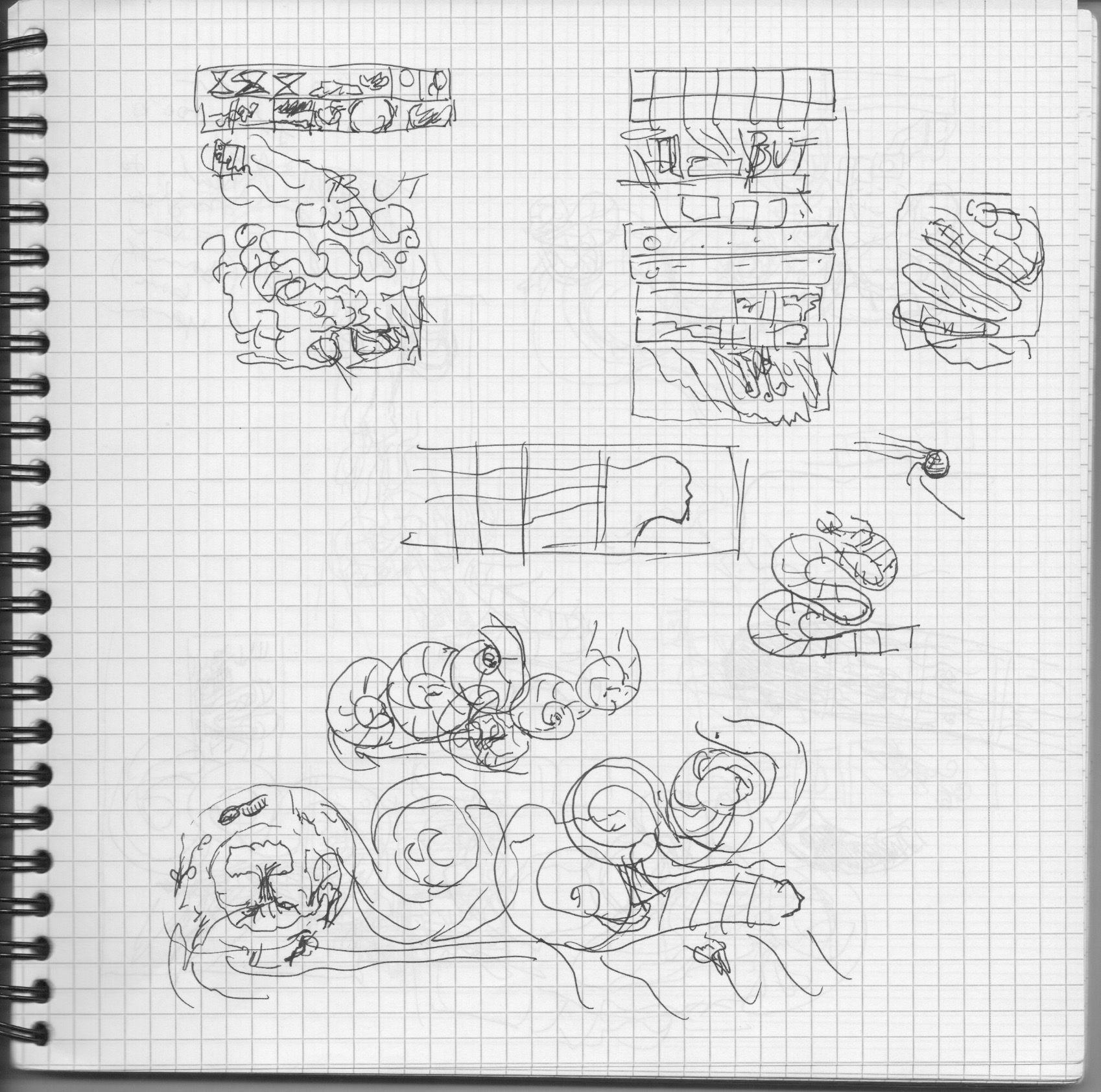
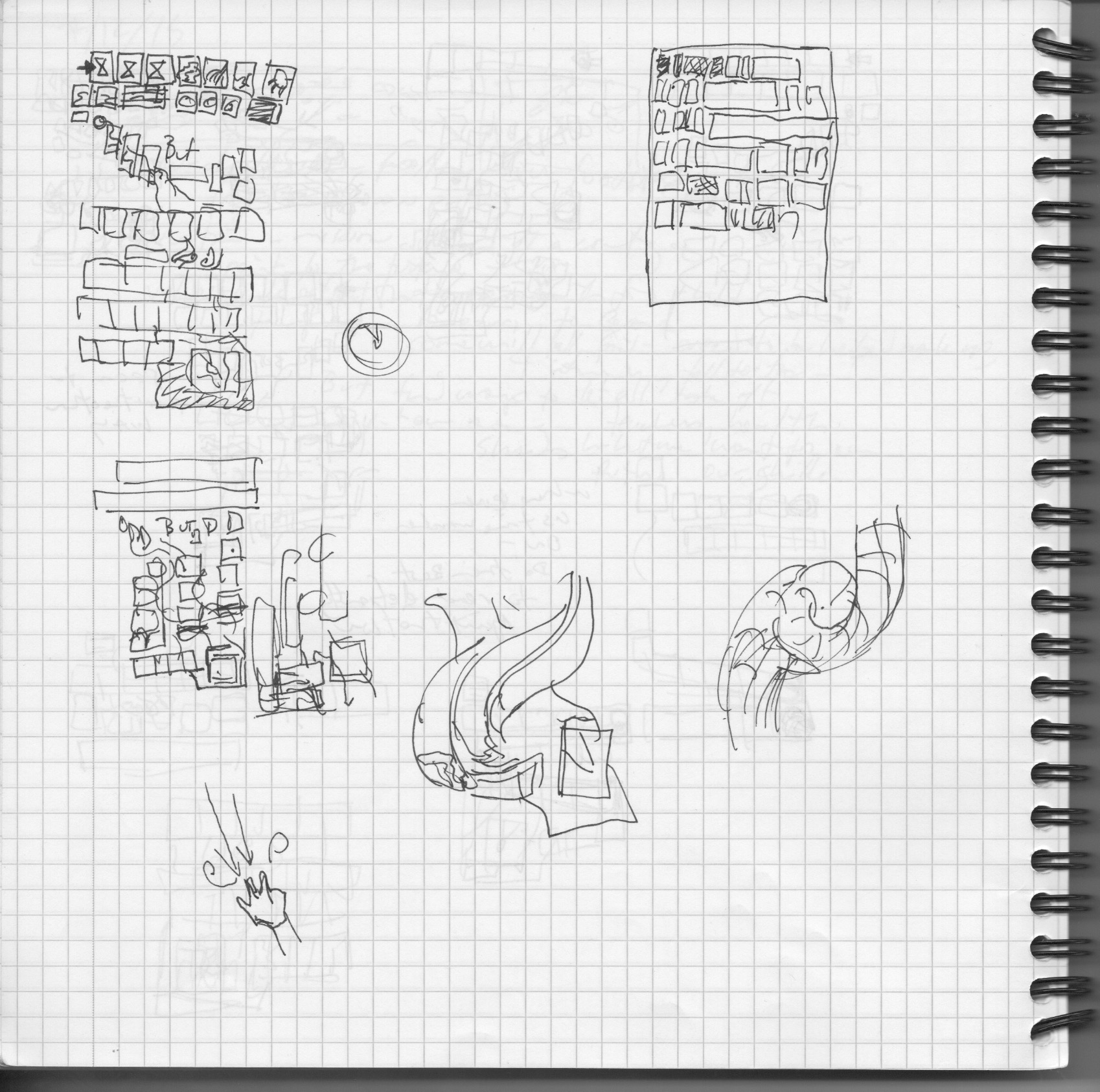
I suppose you’ll have noticed the occasional drawing of Batman or some other random figure or thing. I try to keep my working notebooks free of that, but when I’m stuck, old habits sneak in. This last bit is working more specifically on what goes in the boxes, how the text ties to it, how text prods images, images suggest different text. And then I switched over to drawing on computer again and working out the details in a back and forth between my printouts and working directly digitally – which is less well documented. I sent this first roughed out sketch below to Heather who responded very enthusiastically (yay!) and then I had to bring it home and draw all the details.
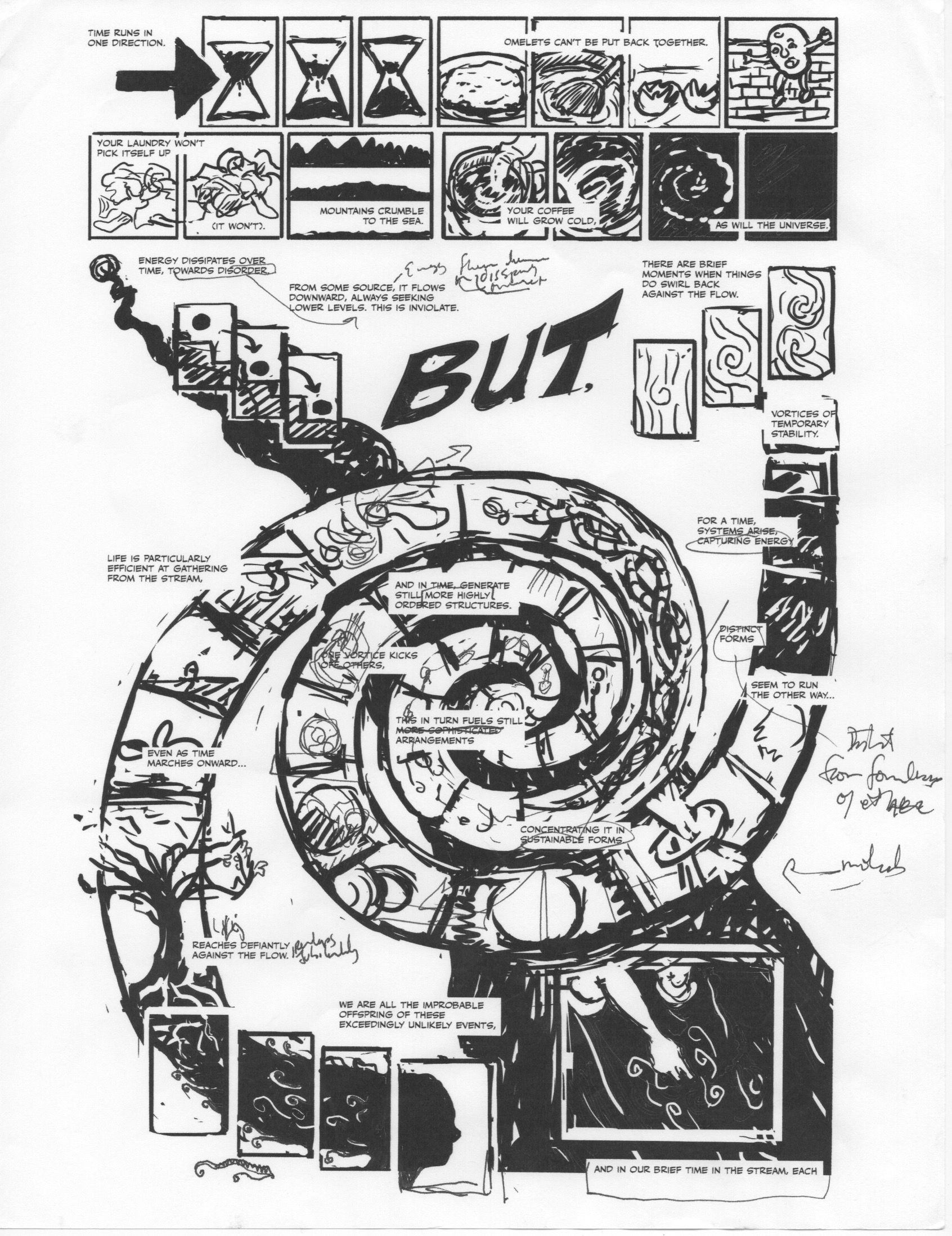
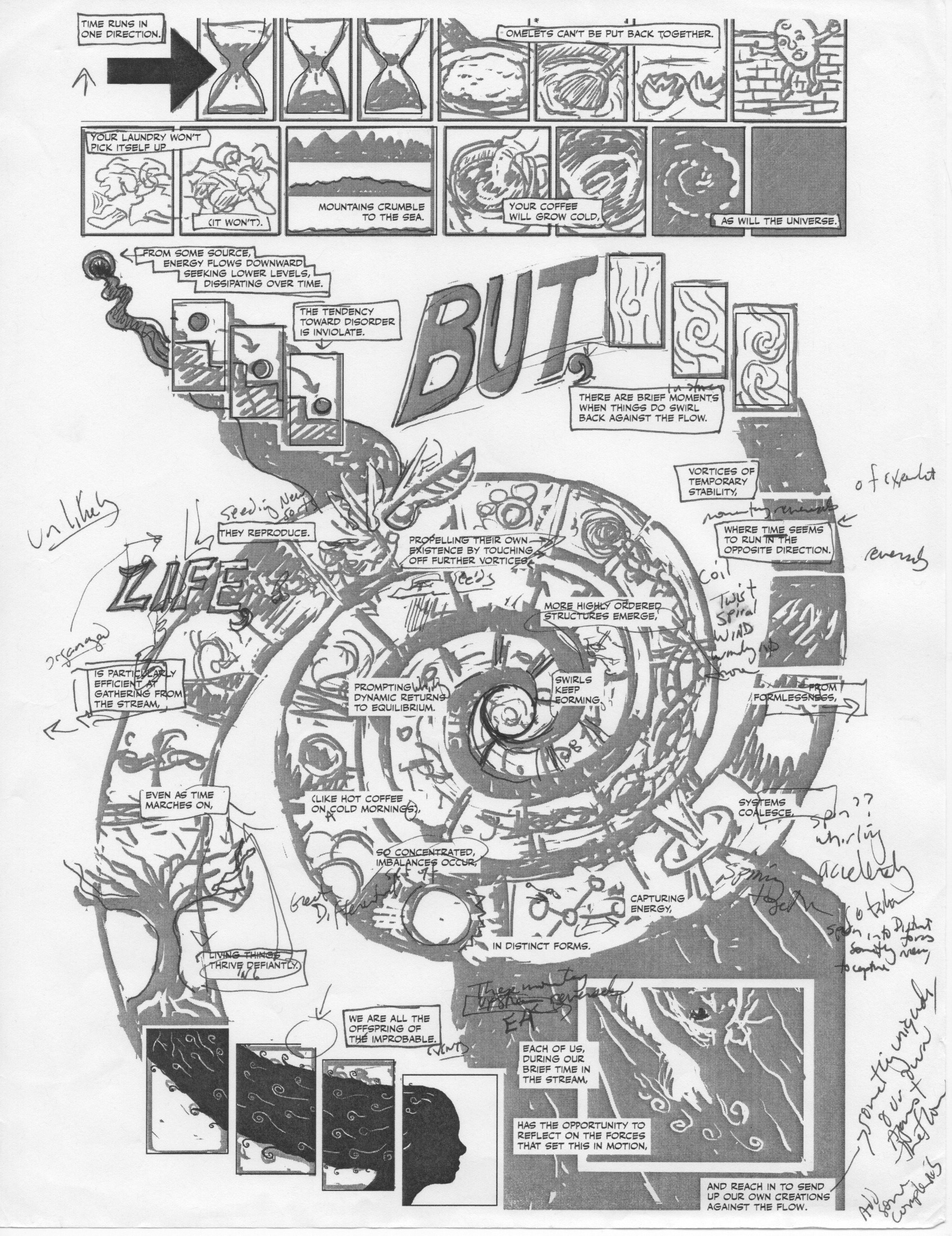
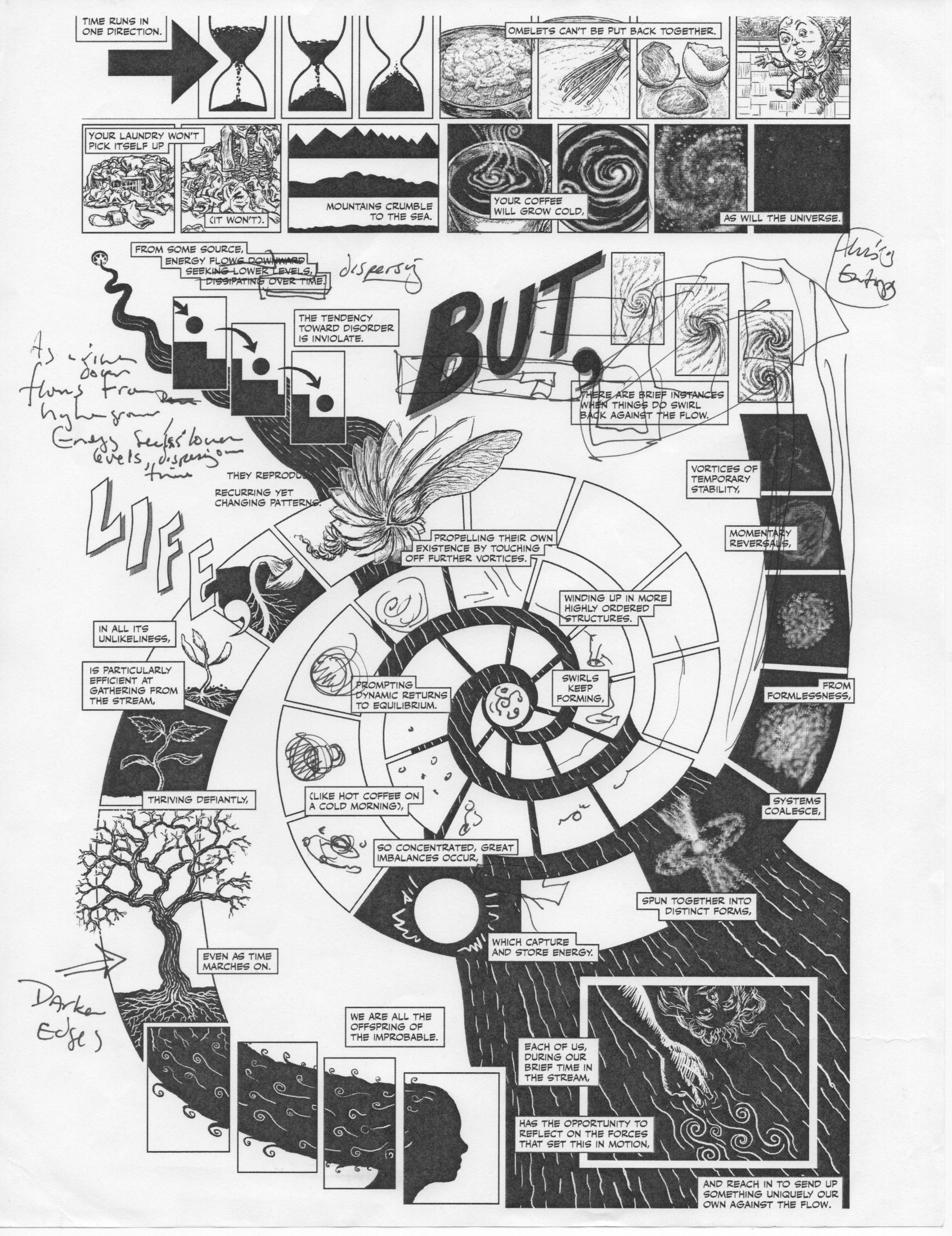
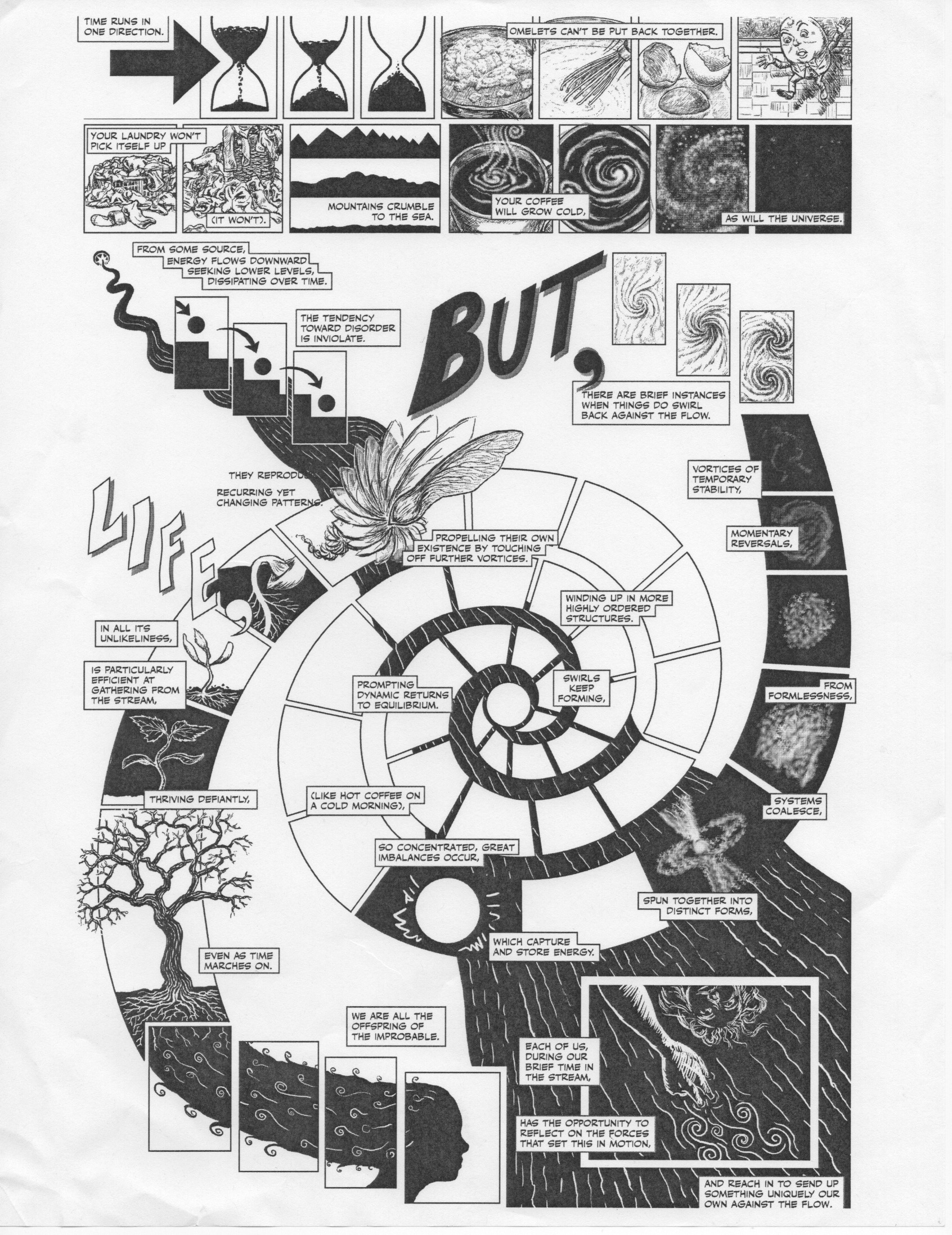
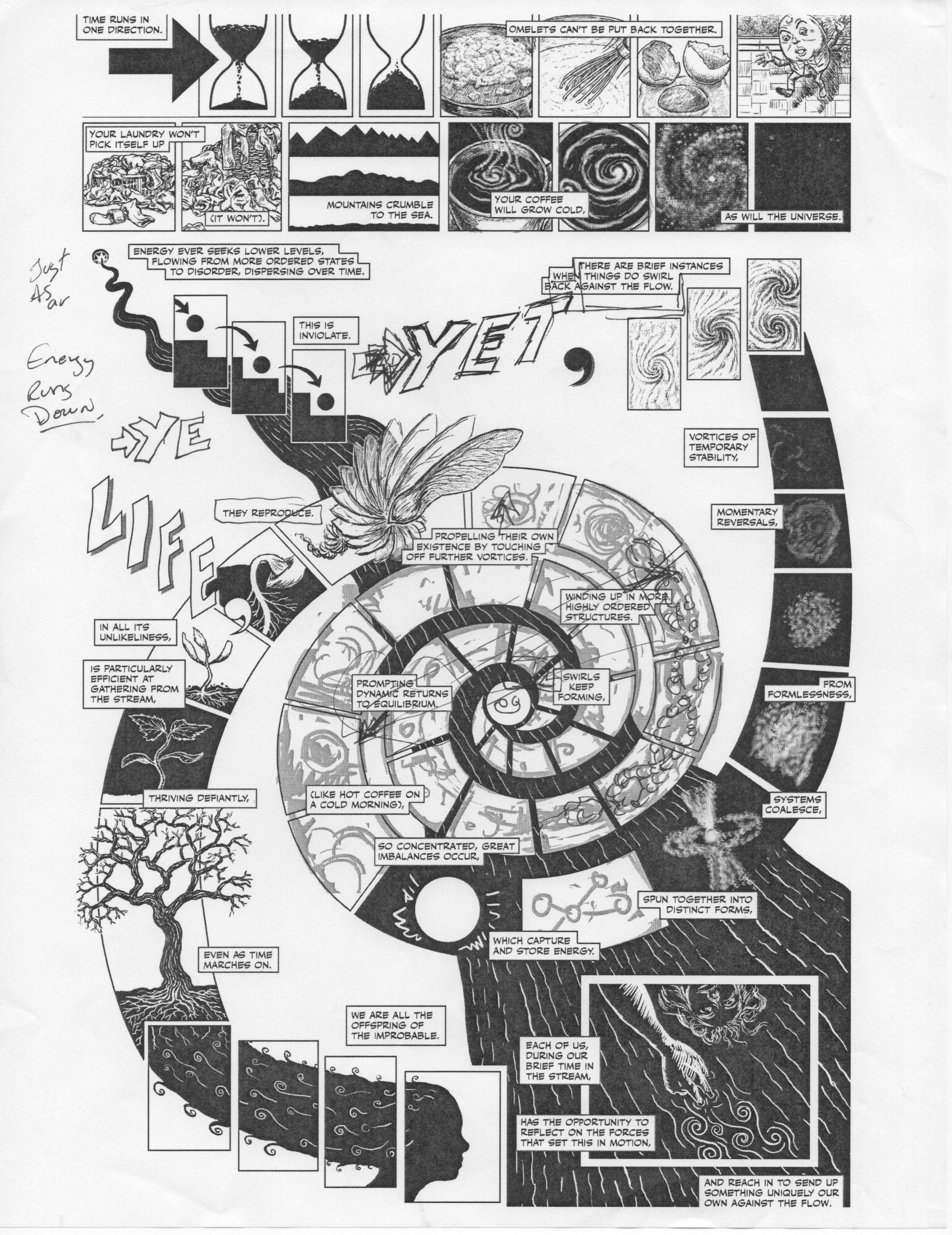
From the very beginning, I wanted to experiment a bit with lettering as more direct elements of the composition. The “But” was present in most of my iterations, and “Life” came up much later. “Yet” replaced “But” at the last minute – mostly on account of wanting an arrow to make sure I moved the reader’s eye upward and rightward and seeing how that fit into the branch of the “Y.” The commas became larger as I recognized their relation to the larger spiral of the page. I really liked how you could ignore all the regular words and just be left with “Yet, Life.” So there you have it – how an idea becomes a comics page – thanks for following along. -Nick
