Before I get to the main part of this post, on teaching with comics, some news. I’ve done a few Interviews on the
Chinese edition of Unflattening – each of them independently focused on the theme of noncomformity running through
Unflattening – which is not something I’m typically asked about and makes me quite intrigued about how the work has been received there… Check ’em out at
QDaily and
YangTze River Daily.
Also, in my last post, I shared news of the
Call for Papers for the forthcoming edited collection on teaching with
Unflattening across disciplines and educational contexts titled
Unfurling Unflattening. Details and info
here.
Ok, as I gear up for Fall classes, I want to share some things from previous classes. As always, I post my syllabi, student examples, and more resources on
the Education part of my site. This is updated as I come across new articles and other resources, or get a chance to share more from my classes. This time around, I’m sharing an activity that is a staple of my introductory courses that’s not a comics-making exercise…
Visual Analysis/Annotation Project
Comics are a visual medium (form, whatever your choice of terminology) and I think often in comics courses – discussions can end up centering around themes and story, and almost overlook the way that comics are their own thing. To keep the focus on the way comics are comics and do their thing their own way, I have students do, for lack of a better term,
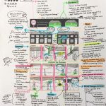
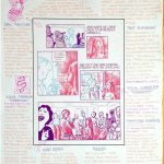
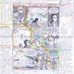
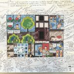
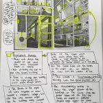
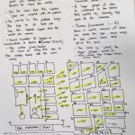
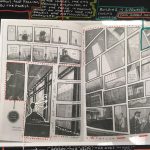
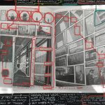
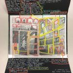
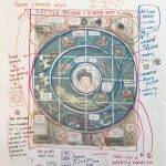
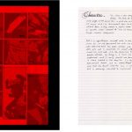
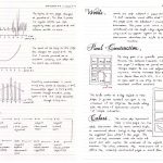
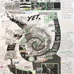
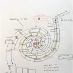
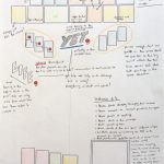
Visual Analysis/Annotation Projects. As the name indicates, students analyze and annotate comics pages. (Note, besides the examples posted here, the
PDF has far more examples and easier to read.)
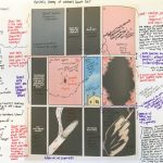
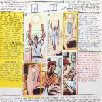
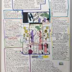
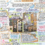
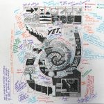
Its format is open – students trace, redraw, photocopy, layer over the page they analyze with acetate – anything in which they engage with the work in an intimate and visual way. Drawing directly on the page is key! This active interaction with the composition invites them to start noticing everything the author(s) employs to construct meaning. After students move their hand and eyes over a page for an extended period – I suggest at least half an hour – so much spills out as they discover all sorts of things about the maker’s choices and creative decisions not previously apparent. They find every square inch invested in meaning. Students develop their own coding strategies, diagram, work in multiple layers – the results are frequently this beautiful and insightful explosion of thinking. It’s not that doing analysis solely in writing can’t be extremely insightful (of course it can), but in my experience, this direct engagement of hand and eyes opens students to seeing in ways they couldn’t otherwise. (They can always turn their annotations into essays afterwards if so desired, but the thinking is in that direct spatial engagement.)
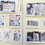
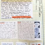
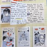
We do this regularly for each reading to help prompt class discussion, and I do a more involved version of it twice a semester (as a standalone and one-third of the midterm). For the more intensive versions (which are where the student examples I’m sharing here come from), I provide a selection of sample comics pages (usually with some unique formal compositional features, though sans any story-context unless they happen to recognize where the page came from) that they can choose from. Often, in addition to having them pick one from my list, I also have them do one that they find on their own. As I’ve been collecting these over the years, I now briefly share some past examples with new students, which has often led to attempts by students to outdo earlier classes, by being more inventive in their formats, and more exhaustive in all they bring to light. Note: In addition to the examples on the page, the PDF has MANY more. Some students use a lot of words, some draw a ton, some create elaborate constructions – some stick to a single, densely-filled, color-coded sheet of paper.
The complex pages I provide pretty much guarantees students will come up with something interesting – but as they get better at this, they are able to do the same with even the most straightforward composition in rather run-of-the-mill comics. Sometimes we turn this analytical spotlight on their own, relatively novice works. And while initially, they may think their pages will be of little interest, here too, it turns out that the student can bring to light a treasure trove of inspired decisions. To give them additional ideas outside of class, one source I frequently direct students to is Hassan Otsmane-Elhaou‘s brilliant comics analysis on his YouTube channel Strip Panel Naked, which I can’t recommend enough.
I can’t recommend doing this with students (and yourself) strongly enough. Some of them have chosen one of my pages – and they find things I didn’t realize I’d done. On pages that I’ve seen multiple versions over the years, I find they are able to reveal new things to me frequently – and that’s the goal: to bring to light something about the meaning, the construction, the author’s intent that we would never have been aware of without doing this. But now that we have done it – it makes us read the piece in a whole new light.
The instructions as I write them for students (which were further developed after co-teaching with Frederik Køhlert, while we were postdocs at the University of Calgary): For this assignment, you will choose from a set of instructor-supplied comics pages along with another of your choosing to visually annotate and analyze. This means that you will either trace the two pages on tracing paper, redraw in your own hand, or make photocopies. You will then annotate the pages with notes and diagrammatic elements, in which you explain the effect of the various stylistic and other creative elements of the page. In other words, you will need to offer analytical commentary about why certain interesting creative decisions seem to have been made, and what they do to your understanding of the comic. The emphasis here is on observation—how much can you notice?—and what you can deduce from everything you have observed. The assignment is designed to help you think about the construction of a comic—how is it made, why is it made in this way, and what is the effect of it being made this way?
In addition to the samples on this page, there are many more (55 pages worth) and easier to read in the PDF examples. Have a look and then test it out yourself! Feel free to share back what your students produce! And again, way more things on teaching comics on the Education part of my site. Onward! – N


