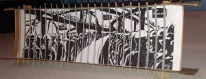
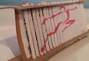
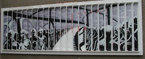
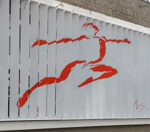
In April 2004, I installed a public art billboard along Woodward Avenue in Ferndale, Michigan just outside of Detroit. For the project, I sought to address and depict transformation by embedding two images – two concepts – in one piece. The primary image used space as standard, flat billboards do. On a series of equally-spaced slats, I encoded a second image, whose edges faced oncoming traffic such that they were nearly invisible. However, in coming alongside it, drivers would witness a fleeting transformation as the slats lined up to reveal the second image. The motorist’s own movement brought about the metamorphosis, a conceptual transformation whose imagery is well-described borrowing words from Herbert Marcuse (1991, 1964) and Maxine Greene (1998) respectively:
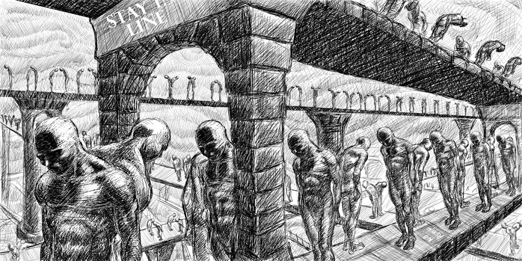
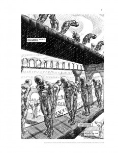
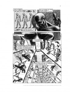
Of the seemingly endless rows of colorless sleepwalkers: “Thus emerges a pattern of one-dimensional thought and behavior in which ideas, aspirations, and objectives that, by their content, transcend the established universe of discourse and action are either repelled or reduced to terms of this universe.” (p. 12).
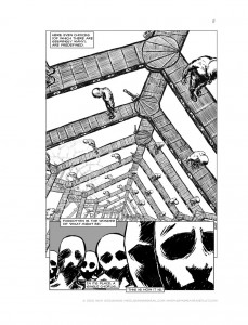
The red leaping figure offered an alternative: “To break with the ‘cotton wool’ of habit, of mere routine, of automatism, is … to seek alternative ways of being, to look for openings. To find such openings is to discover new possibilities – often new ways of achieving freedom in the world” (p. 2)
I grounded the work both physically and conceptually in Detroit’s history. The city’s hub-and-spoke street plan sees Woodward (the country’s first paved road) intersect cross streets at 60° angles making my optical transformation possible. The imagery alludes to assembly lines and the Motor City defined and ultimately deserted by the automobile. The sleepwalkers could be Henry Ford’s average workers, who, he said, “want to be led. They want to have everything done for them and have no responsibility” (Flink, 1975, p. 80). By asking, in my accompanying artist statement, “Can art awaken something dormant within us?” I sought to offer a rebuttal and a reminder of our complexity, intending for commuters, if but briefly, to open their eyes, as I wrote then, to “a glimmer of possibility often obscured.”
The original post about “Spring,” which was on view for about four months the summer of 2004 can be found here. The images shared here are from the actual installation as well as the preparatory cardboard mockup that sits on my desk today.
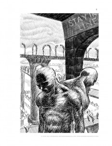
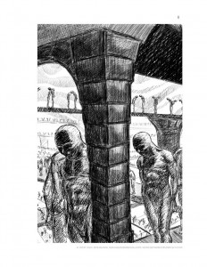
As I was figuring out what I meant by “unflattening” and thinking on “the importance of seeing double” enfolding two perspectives at once and comics as an amphibious medium holding two modes of thinking in the same space, this past work sprung to mind as a means of two forms in one, as showing transformation, and the imagery made its way into the dissertation. Visually both the billboard and the current work drew heavily on Piranesi’s “le carceri” (the prison) etchings, a bit of Anton Furst’s designs for Tim Burton’s Batman film, and plenty of other things. The opening is intended to be triptych, though for formatting requirements won’t appear as such in the dissertation itself.
Ok, that was a lot of words – hope you enjoyed a bit of the backstory, onward into Chapter Three! – Nick


