Suddenly, I’m participating in a flurry of conversations around comics/my work in a 20 hour stretch February 21st and 22nd! An accessible version of Unflattening, with visual linguist Neil Cohn in the UK, and back at Teachers College – on alternative scholarship…
The Messy Work of Making a Visual Medium Accessible: Tactics and Techniques for Audio Describing Unflattening: Join Unflattening artist/author Nick Sousanis in conversation with a panel of blind access experts as they explore three audio description translations of his work. We will learn out loud together about the tough choices and strategies for making complex visual comics accessible to blind and low vision readers.
-
- Wednesday February 21, 4-5:30pm PT / 7-8:30pm ET
- Panelists: Georgina Kleege, Joshua Miele, Silvana Rainey
- ASL/CART provided, Audio Description samples provided in advance to all registrants.
- Register here: https://sfsu.zoom.us/webinar/register/WN_AcTxv-NAQPSNmXCcAHCHjQ#/registration
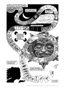
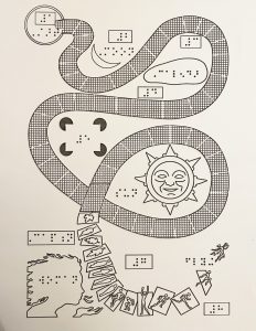
To accompany my description of the sequential art/game board page – I also created a tactile diagram to help the listener orient where they are on the page. I put my description of that page down below – but everyone who registers will be given access to the full descriptions and audio of all the versions.
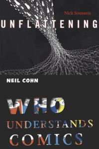
This conversational talk will draw from the far-reaching disciplines of cognitive science, linguistics and epistemology, bringing together two world-leading comics scholars. Comics are often perceived as solely a narrative form, and yet the ways in which disparate elements work together on the page offer a capacity for meaning-making that transcends presenting illustrations for written narrative. Both broadly concerned with the burgeoning study of “visual thinking,” Nick Sousanis and Neil Cohn will discuss the integration of comics into their scholarly practice and the impact this has had on their research and teaching. Their work is testament to the power of comics to defy traditional modes of thinking and knowledge generation. Register here.
Thursday, February 22, 2024, 5:00 – 7:00p
Smith Learning Theater, Teachers College
Format: Live (with audience) and live-streamed Registration (via eventbrite)
Academic publishing is undergoing an evolution as more scholars embrace multimodal forms of knowledge production and dissemination. This panel brings together key voices to discuss the changes and challenges around publishing multimodal scholarship.
Panelists: Lesley Bartlett, former Editor, Anthropology and Education Quarterly; Professor, University of Wisconsin, Madison; Esther Jackson, Scholarly Communication Technologies Librarian, Columbia University; Nick Sousanis, Author of Unflattening (Harvard University Press); Associate Professor, San Francisco State University
Moderators: Nancy Lesko, Executive Editor, Teachers College Record; Maxine Greene Professor, Teachers College, Columbia University; Lalitha Vasudevan, Vice Dean for Digital Innovation, Teachers College, Columbia University
When I was writing the description for this page, I realized there was no way a reader not seeing the page could keep track of where to orient where they were on the page. So I thought I’d try a simplified tactile version and traced my page, and we had it printed on Swell raised paper (by good folks at Lighthouse). I’m not sure that it will add anything, but we wanted to at least try. Here is my extensive description, and again, you can check out the whole event here.
Page 61 of Unflattening – description by Nick Sousanis
This is at once a single page image – a snaking, looping gameboard of sorts, but the gameboard is comprised of individual panels (like spaces on the board) that depict a series of wordless narratives taking place across changing seasons from winter to spring to summer and culminating in fall. There are drawn elements outside of the gameboard path that also play with and speak to the primary imagery and the captions through their particular juxtapositions, and we’ll be moving back and forth between the path and these other elements. In an attempt to help in navigating this, I made a schematic tactile diagram detailing the reading path across the page that also indicates where you encounter each caption and the major elements that lie off of the path.
At top, captions 1 and 2: “To unravel the form’s capacities, let’s begin with Scott McCloud’s consideration of the sequential as its defining aspect: ‘Juxtaposed pictorial and other images in deliberate sequence.’” (The quote is separated off into Caption 2) The first of the panels is a lone circular panel, drawn to look like the board game Sorry’s starting position, complete with matching “START” font and arrow that loops out from it into the panels that start the narrative. These first panels (which meander a bit to the right and then move downward), zoom in from above the clouds showing the outline of the state of Michigan to move close on top of a young man and dog walking in the snow. We stop zooming – the man looks up – his gaze is directed out of the strip of panels at a crescent moon in an otherwise black background that makes up the top of the page (the moon fits within the downward curve of the path). The panel imagery comes from his perspective now – his hands up watching snow fall, zooming again closeup on the structure of a snowflake. There’s a shift in location (and the panels rise up before turning down at the upper right corner of the page), and a sequence of panels showing in slow progression the setting of the sun – which ultimately centers on Stonehenge. It is the winter solstice. Caption 3 reads: “The passage of time is written in space.” Outside the panel strip directly below the setting sun images – a redrawing of a paleolithic lunar calendar that had been scratched into bone. The primitive notation shows the moon in different phases from full to crescent to new winding path on the horizontally oriented bone. The path ancient observers plotted then is not too dissimilar from the way the panels move around this page. While this calendar is not exactly a comic book, the way its creators made spatial notations to make sense of something that changed over time – is quite like how comics handle time. We return to the ribbon path (which having descended from the upper right corner, is starting to circle back to the left and just slightly upward as it goes) – man and dog again, still walking in the night – now they look up at a clear night sky – patterns of stars give way to a diagram of the constellation Orion and one more drawing where Orion is drawn as he looks in Greek stories. Caption 4 above reads “In connecting the dots,”. The next panel shows icicles on a tree branch, this image repeats as the icicles drip and diminish. Now it’s raining (the path has reached the left side of the page and now bends down and will start to descend towards the right), and we get a view of crocus buds emerging from the snow – and coming into bloom – it is springtime. Just outside the path, four black circles are arranged in a square with right angles cut from them, so each of these “open mouths” faces towards the center of the invisible “square” they’ve created. In fact, while no boundary line is drawn, it is nearly impossible to not imagine seeing a box created by the negative space – this is a classic example of a gestalt illusion. Placed right within this box (just as with a typical caption), Caption 5 reads: “traversing the gaps between fragments and stitching them together — a meaningful whole emerges.” Back to the path – a robin is exploring the earth, discovers a worm to eat. Next panel, a branch with fresh buds on it – and here a curious thing happens as a later part of the path has looped around and crossed over the current path – that will be described when we get to it – but in brief it also shows this branch now with leaves. Following our path, the tree has grown leaves. In the next a snake wriggles through the grass – but something strange is happening here too. The snake has wriggled into the path of panels from outside, and was in fact also a part of a series of totems of carved stone animals circling a Mayan sun calendar idol. This sun face sits within and fills the space where the path is now looping around itself to make a circle (the rays of this sun actually stretch beyond the edges of the path in some places). Back to the path – a crawling monarch caterpillar. Kids playing in a lake. Flowers in full bloom. It is summer. The monarch caterpillar has gone to chrysalis. A bee pollinates a rose (near identical image to a rose from the previous page), a grasshopper. The monarch butterfly emerges from its chrysalis and takes flight – along with many many others. Geese making their classic v-formation flying south together, pumpkins fully grown. It is fall. The leaves on the tree (the tree we’ve seen before) are now darkening and begin to fall (as we go over the earlier loop of the path). Now, not only do we watch a single leaf fall, but the panels have come loose from the gameboard, as if they too are falling. As this leaf falls its silhouette shifts subtly – and it looks more like a human figure (perhaps drawn as you would find as a simplified symbol on a bathroom door). Outside of the now falling apart path – caption 6 reads “It’s a participatory dance, an act of the imagination,” in the lower left corner of the page, a black silhouette of a female figure has raised her hand below her chin and is appearing to blow perhaps stardust or fairy dust towards the falling person. Touched by this dusting, the person becomes more solid, then moves, rises, stretches beyond the panels and takes off in a run before leaping out of the panel and into winged flight rising back up the page. The final two captions (7 and 8) read: “in which the reader animates and transforms the static into the kinetic… and brings it to life.”


