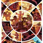
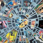
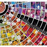
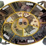
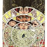
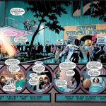
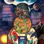
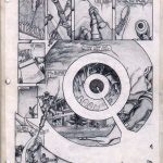
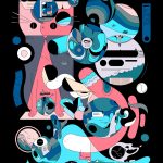
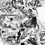
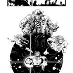
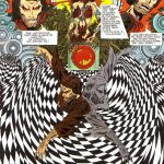
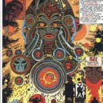
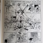
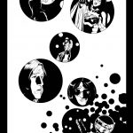
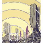
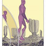
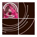
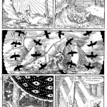
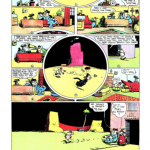
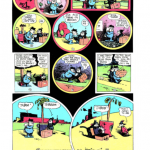
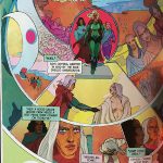
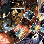
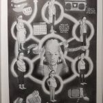
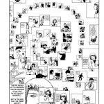
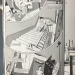
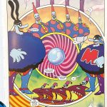
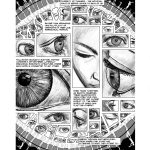
Like my earlier collection of Hexagonal Compositions, this page gathers together comics page layouts that use circles in some way as the organizing principle for page composition. This is for use for my classes, my own work, and shared here for anyone’s interest. These were gathered from my own knowledge and responses to a query on Twitter. Feel free to send more my way if you have recommendations! I’ve now added a page of Representational compositions and Word-based compositions.
In no particular order – here we go… (Author and title info in captions when you click on thumbnails (if I had it)) (And see this collected by Nicolas Verstappen on spreads w/inset panels)
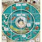
- Santiago Valenzuela Las aventuras del Capitan Torrezno La estrella de la mañana
- Santiago Valenzuela
- Holy West drawn by Daniel Irizarri written by Seth Jacob Circular page
- Sergio Garcia Sanchez Alice in wonderland circular composition
- Juan Cabral Guardians of Galaxy
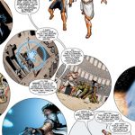
- Hayden Sherman Wasted Space
- Not a comic but Manuel Lima’s The Book of Circles is a great resource!
- The Dregs Thompson, Nadler, Zawadzki, Cuniffe
- Mike Deodato Vicious Circle
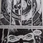
- Charles Burns Black Hole
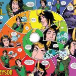
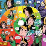
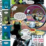
- Squirrel Girl
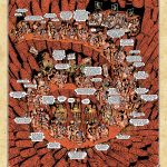
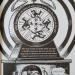
- Jerry McRoswell spiraling composition titled Hell
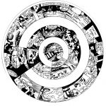
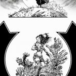
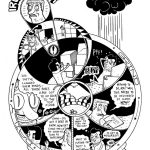
- Javier Olivares black and white, concentric circles/spiral comic composition
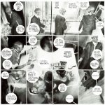
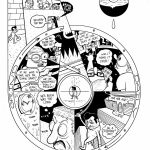
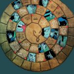
- Florent Ruppert and Jérôme Mulot phenatiscope design, with images moving around the circular disc
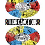
- Florent Ruppert and Jérôme Mulot phenatiscope-esque page – gridded top row with phenatiscope lower two-thirds – a figure dancing if it were to be spun
- Brent Anderson Strikeforce-Morituri 12 Nov 1987
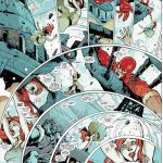
- JH Williams Promethea
- JH Williams Promethea
- JH Williams Promethea
- JH Williams Promethea
- JH Williams Promethea
- JH Williams Sandman
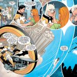
- JH Williams Batwoman
- Hieronymus Bosch The_Seven_Deadly_Sins and the_Four_Last_Things
- Moore Sienkiewicz big numbers
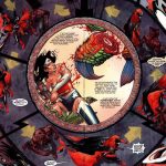
- Hayden Sherman Absolute Wonder Woman spread
- Hayden Sherman Absolute Wonder Woman
- Hayden Sherman Absolute Wonder Woman
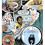
- Bissette, Totleben Swamp Thing
- Bissette, Totleben Swamp Thing
- Bissette, Totleben Swamp Thing
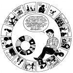
- Scott McCloud Understanding Comics
- Scott McCloud age 16, w/Kurt Busiek
- Naughty Pete Charles Forbell
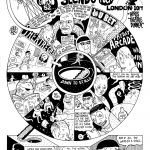
- Chris Ware circles comic
- Chris Ware Rusty Brown excerpt
- Chris Ware Rusty Brown
- Ori Toor Gibberish Explorations
- Ori Toor Gibberish Explorations
- Ori Toor Gibberish Explorations
- Ori Toor Gibberish Explorations
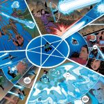
- Liam Sharp Green Lantern
- Liam Sharp Green Lantern
- Liam Sharp Green Lantern
- Liam Sharp Green Lantern
- McElvie Young Avengers
- Stuart Immonen X-Men
- Mahmud Asrar X-men
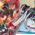
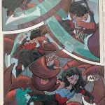
- Mahmud Asrar Spider-Man
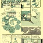
- Kevin Huizenga The River at Night
- Kevin Huizenga The River at Night
- Kevin Huizenga The River at Night
- Kevin Huizenga The River at Night
- Kevin Huizenga The River at Night
- Kevin Huizenga The River at Night
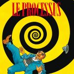
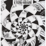
- Marc-Antoine Mathieu
- Marc-Antoine Mathieu
- Marc-Antoine Mathieu
- Marcos Martin Spider-Man
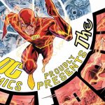
- Francis Manapul Flash
- Eleanor Davis Secret Science Alliance
- Kuper Kafka circles
- Erica Henderson Squirrel Girl
- R Crumb
- Osamu Tezuka Phoenix V6
- Osamu Tezuka Phoenix V6
- Karl Kerschl Flash Wednesday Comics
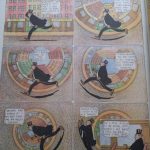
- Winsor McCay Little Nemo
- Coin-Op Little Nemo Homage
- Dave Chisholm Little Nemo Homage
- Paolo Rivera Little Nemo Homage
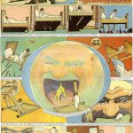
- Winsor McCay Dream of Rarebit Fiend – grid page, but background collapsing into a circle inside each panel
- Jack Kirby Fantastic Four
- Druillet Lone Sloane
- Druillet Lone Sloane
- Hollanders?
- Ivar Timewalker
- Ivar Timewalker
- Ivar Timewalker
- Ivar Timewalker
- Ivar Timewalker
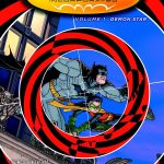
- Chris Burnham Batman Inc
- Chris Burnham Batman Inc
- Yannick Paquette Batman
- Green Lantern
- Jesse Lonergan Expanding Man
- Jesse Lonergan Expanding Man
- Jesse Lonergan
- Gary Panter
- George Herriman Krazy Kat
- George Herriman Krazy Kat
- Christian Ward ODY-C
- Aco Midnighter
- Aco Nick Fury
- Blanco Midnighter
- Ryan Claytor
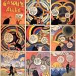
- Gasoline Alley by Frank King
- Lord Hurk
- Lord Hurk
- Lord Hurk
- Lord Hurk
- Marco Rudy
- Marco Rudy
- Marco Rudy
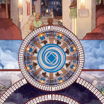
- Marco Rudy – circular composition for wonder woman with greek key as round panel structure
- Marco Rudy – circular composition for wonder woman with greek key as round panel structure
- Greg Capullo Batman
- Bitter Root 1
- Paul Duffield
- Cancer Vixen Marisa Acocera
- Ian Williams Bad Dr.
- Ian Williams Bad Dr.
- Shintaro Kago
- Que no que no me muero Maria Hernandex-Marti Javi de Castro
- Que no que no me muero Maria Hernandex-Marti Javi de Castro
- Johnny Hiro by Fred Chao
- Relativité by Audrey Hess Editions rutabaga
- Relativité by Audrey Hess Editions rutabaga
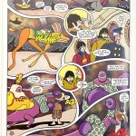
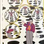
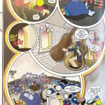
- Bill Morrison Yellow Submarine
- Bill Morrison Yellow Submarine
- Bill Morrison Yellow Submarine
- Bill Morrison Yellow Submarine
- Bill Morrison Yellow Submarine
- Bill Morrison Yellow Submarine
- Bill Morrison Yellow Submarine
- Bill Morrison Yellow Submarine
And two from me that are sort of close to what I had in mind… But many more such ahead. – N
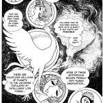
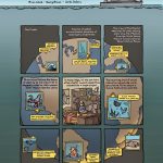
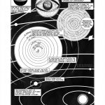
- Nick Sousanis from Unflattening
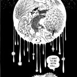
- Nick Sousanis from Unflattening


