

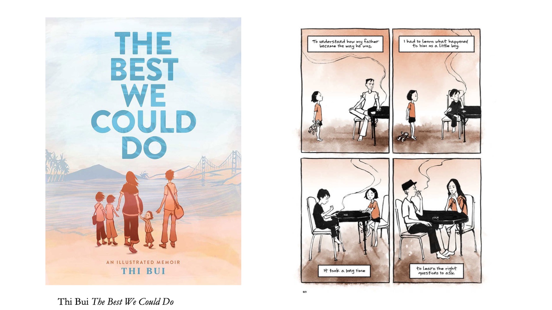
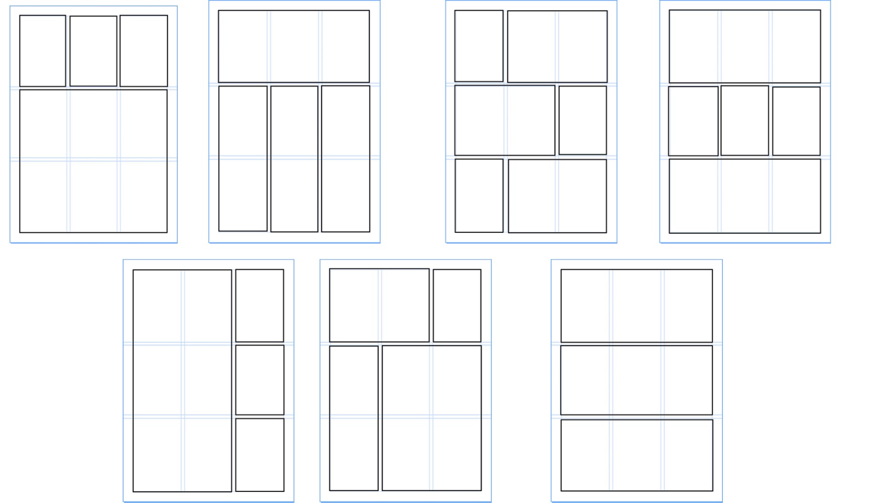
This page gathers comics page layouts that use regular grids as their general organizing structure – 3by3s, 4by4s, and others. It is a companion page to the ones I’ve assembled with Circular Layouts, Hexagonal Layouts, and Representational/Word-Based Compositions. I use all of these with my classes, as reference for my own work, and share here for anyone’s interest. Feel free to send more my way if you have recommendations! – Nick
(Note: these were from slides, so some may appear clipped in the thumbnails, but will show in full when clicked on.)
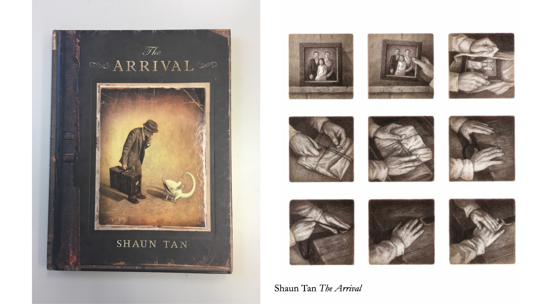
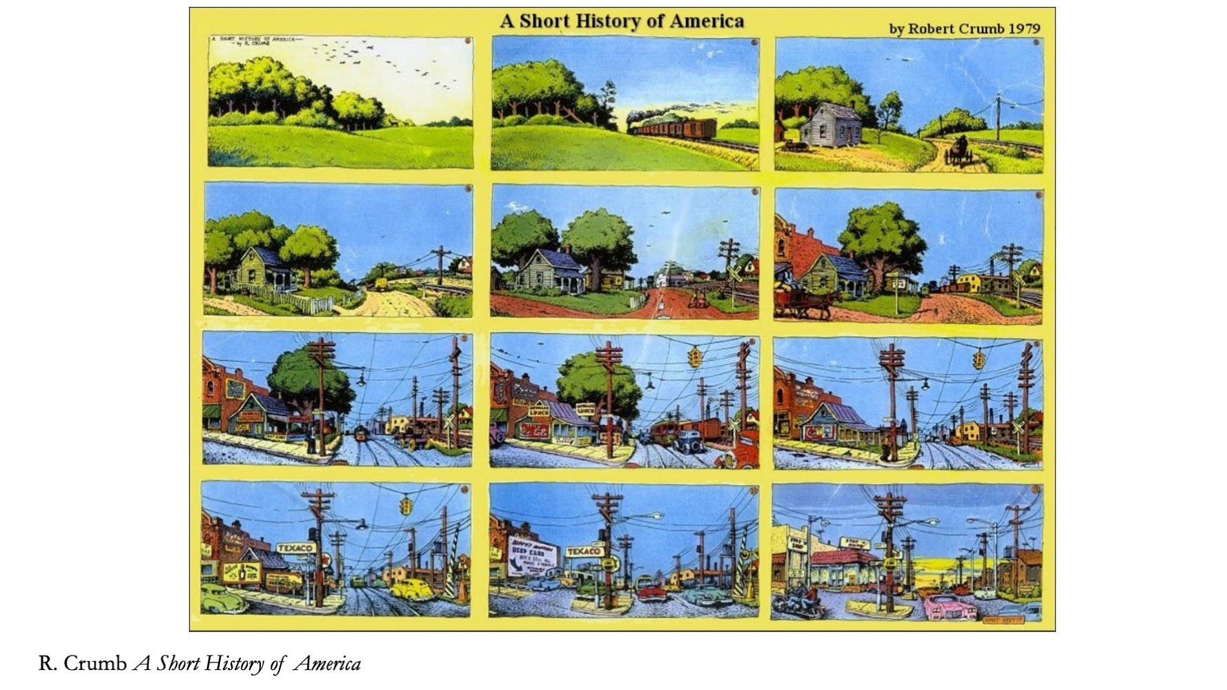
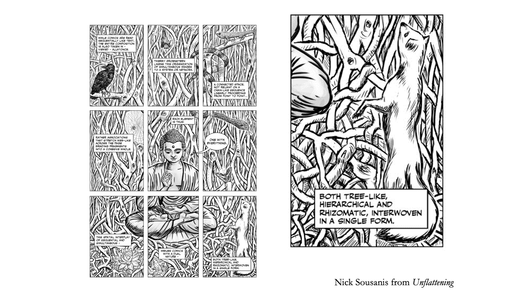
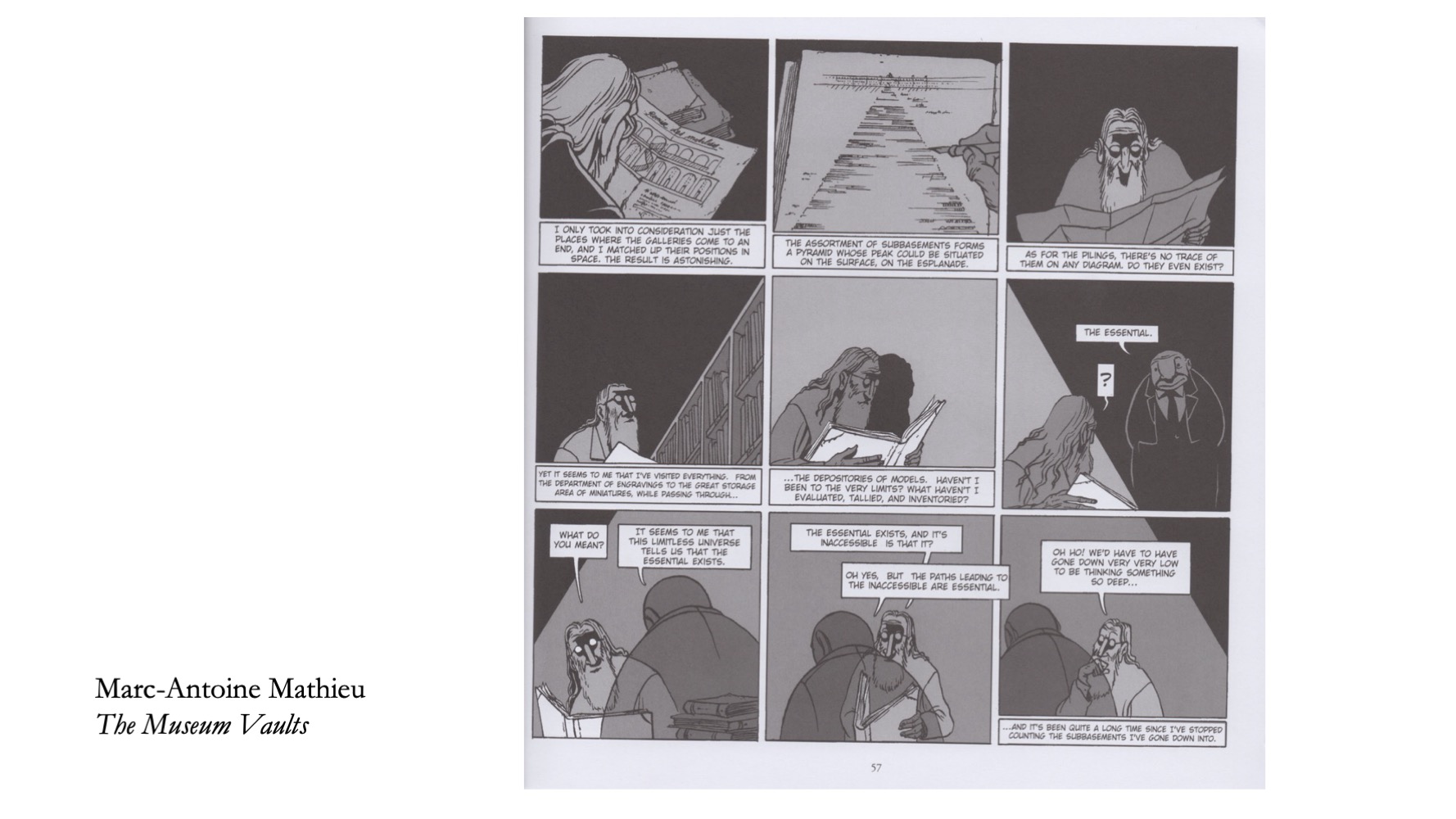
Set the stage here with showing how regular grids can be used – to show time passing and such. The idea of the Waffle Iron and regular grids, how that’s been used intentionally for Watchmen, I mirrored that in the page from Unflattening here, and other strong examples.
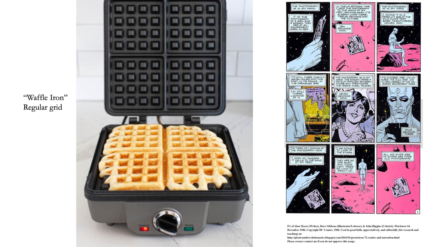
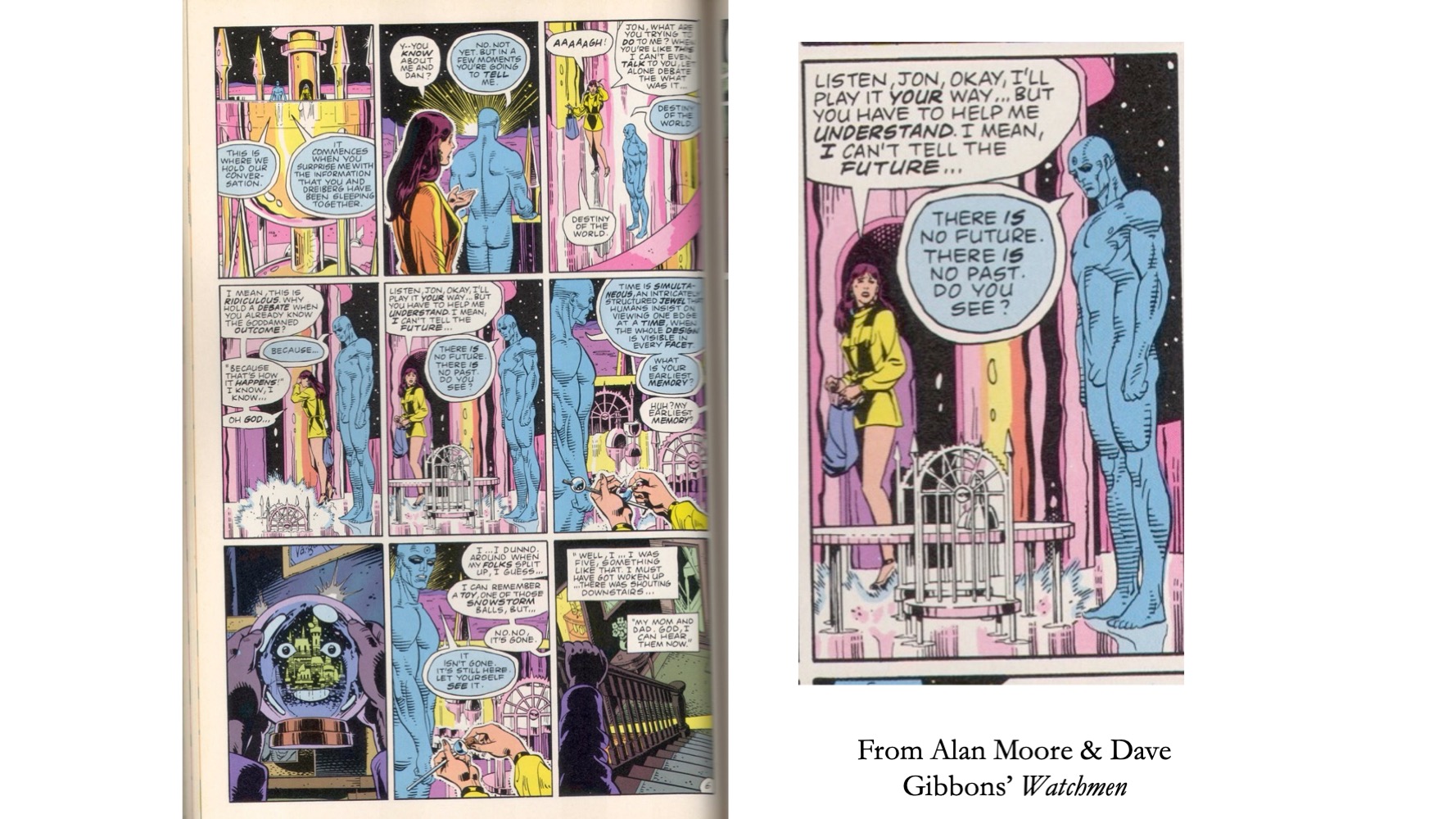
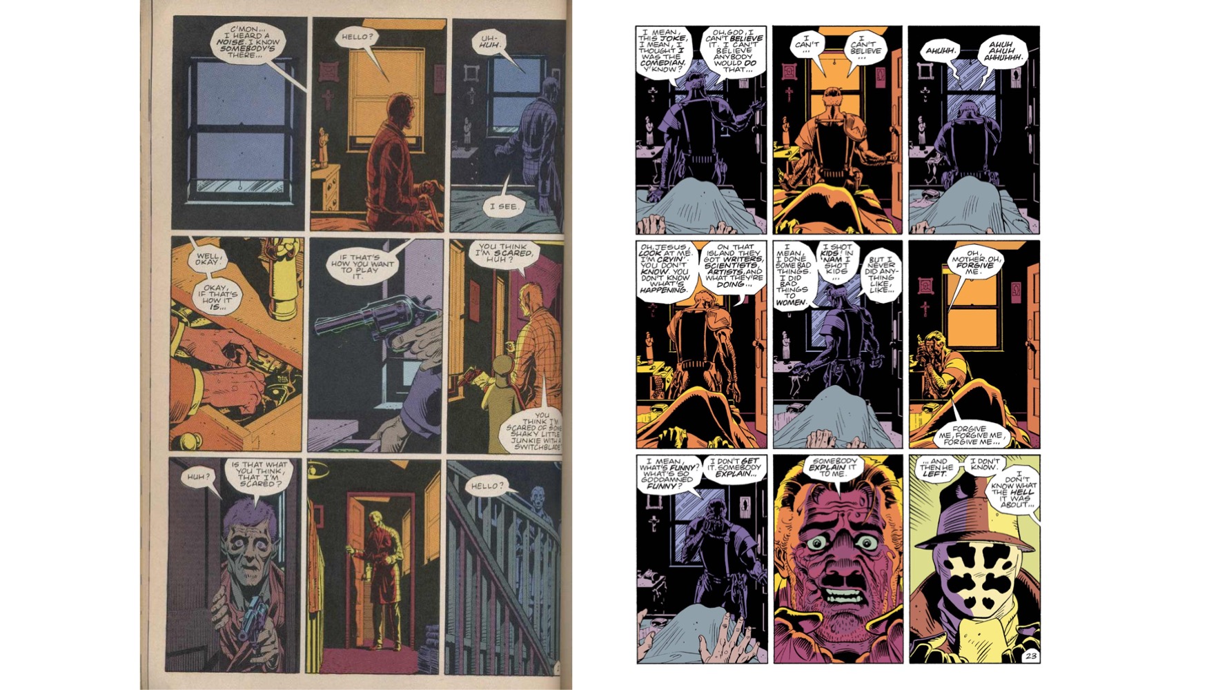
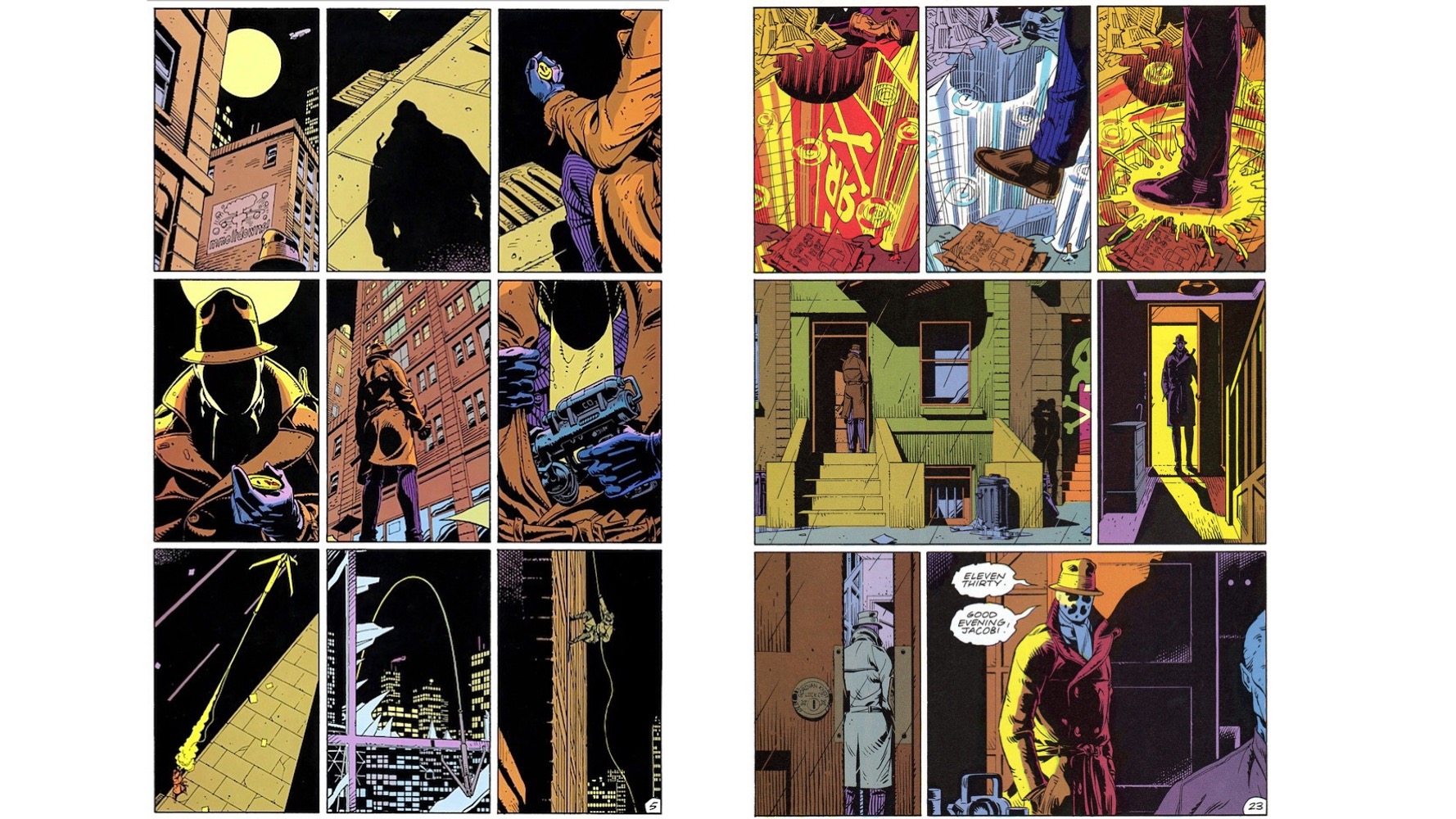
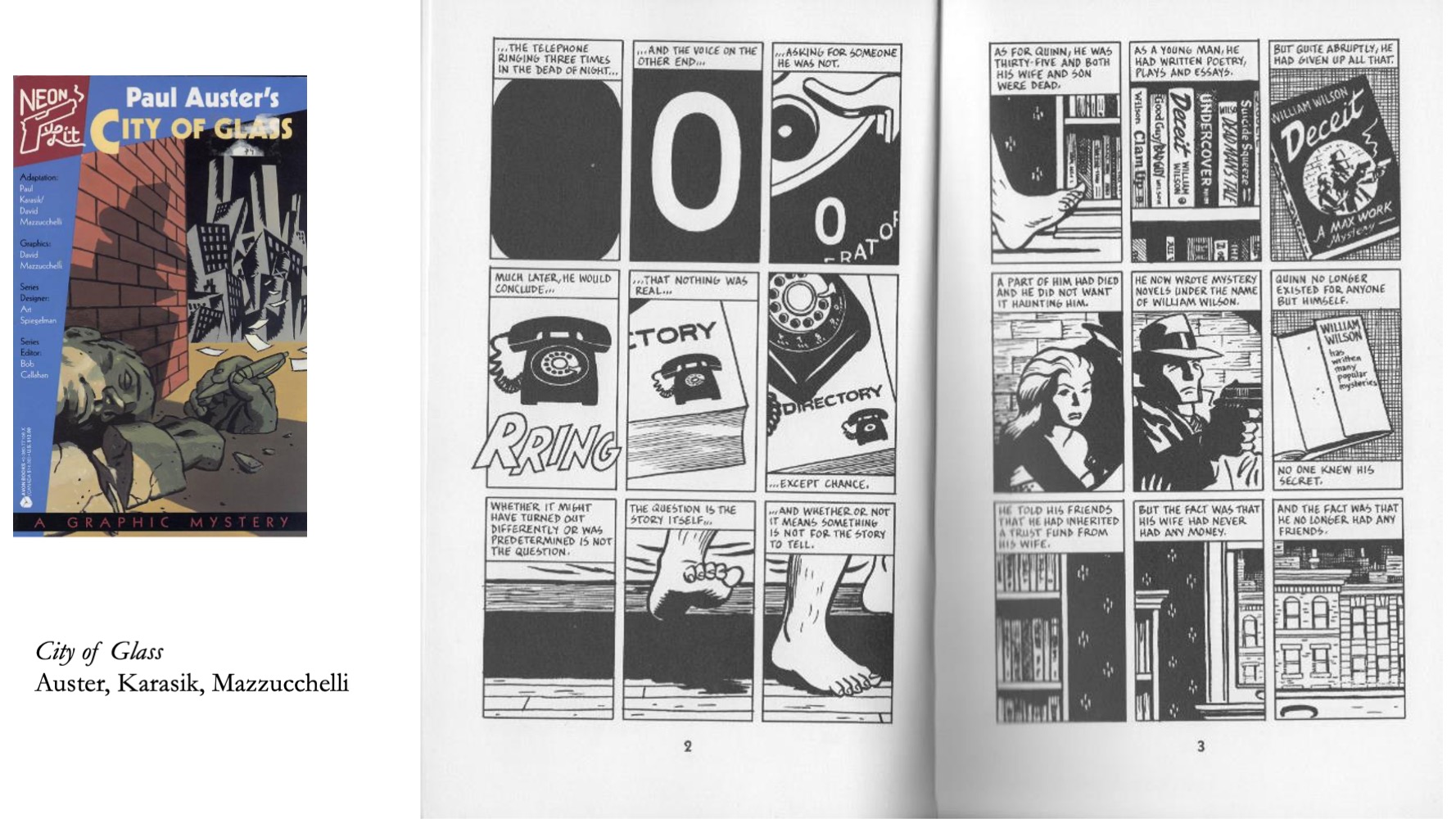
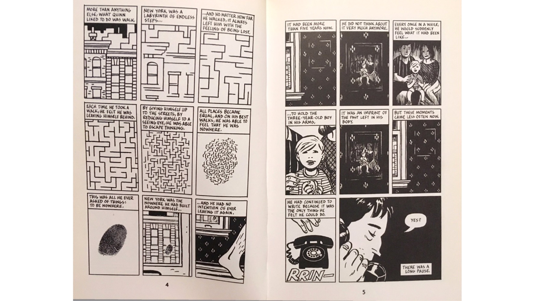
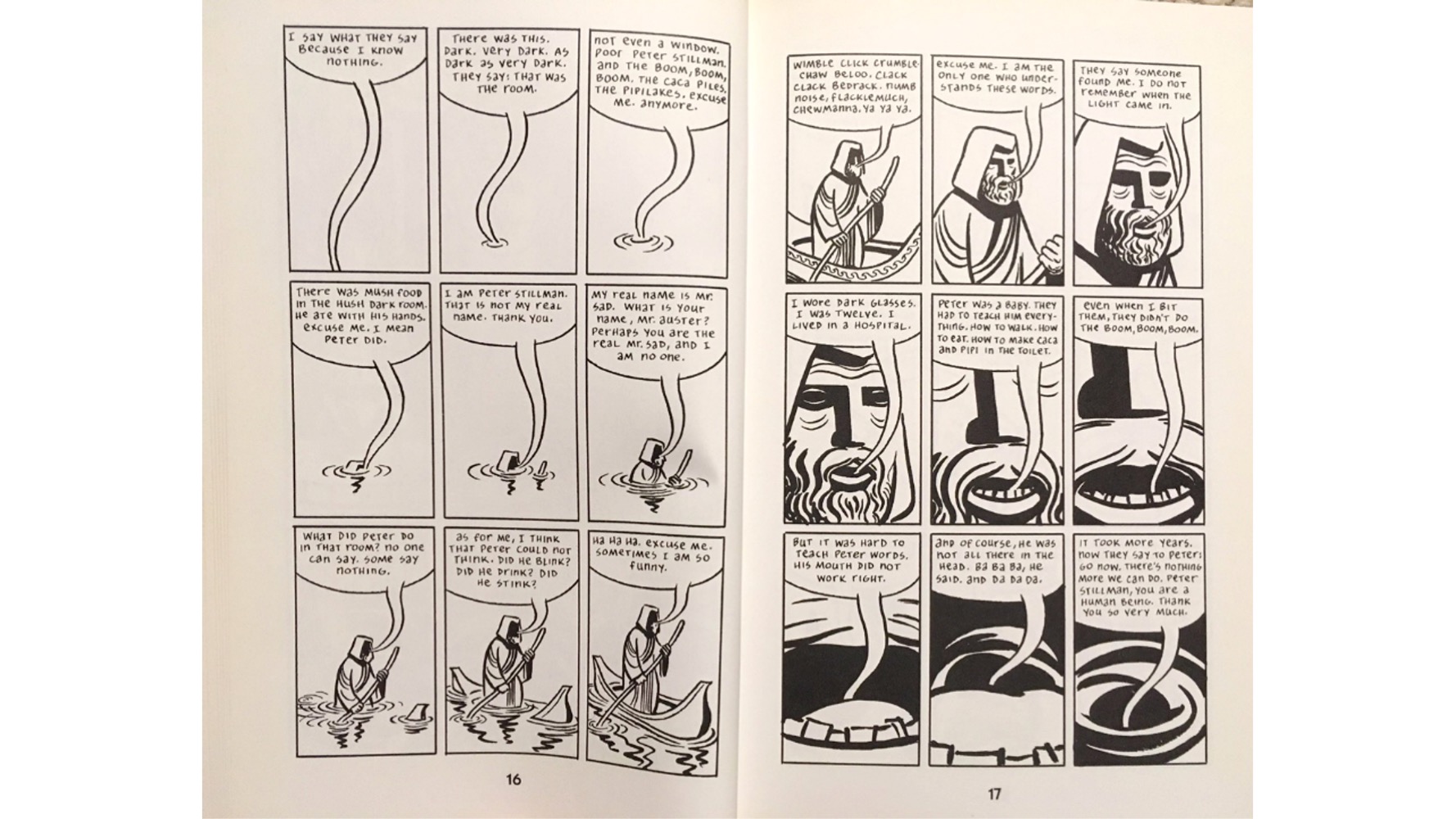
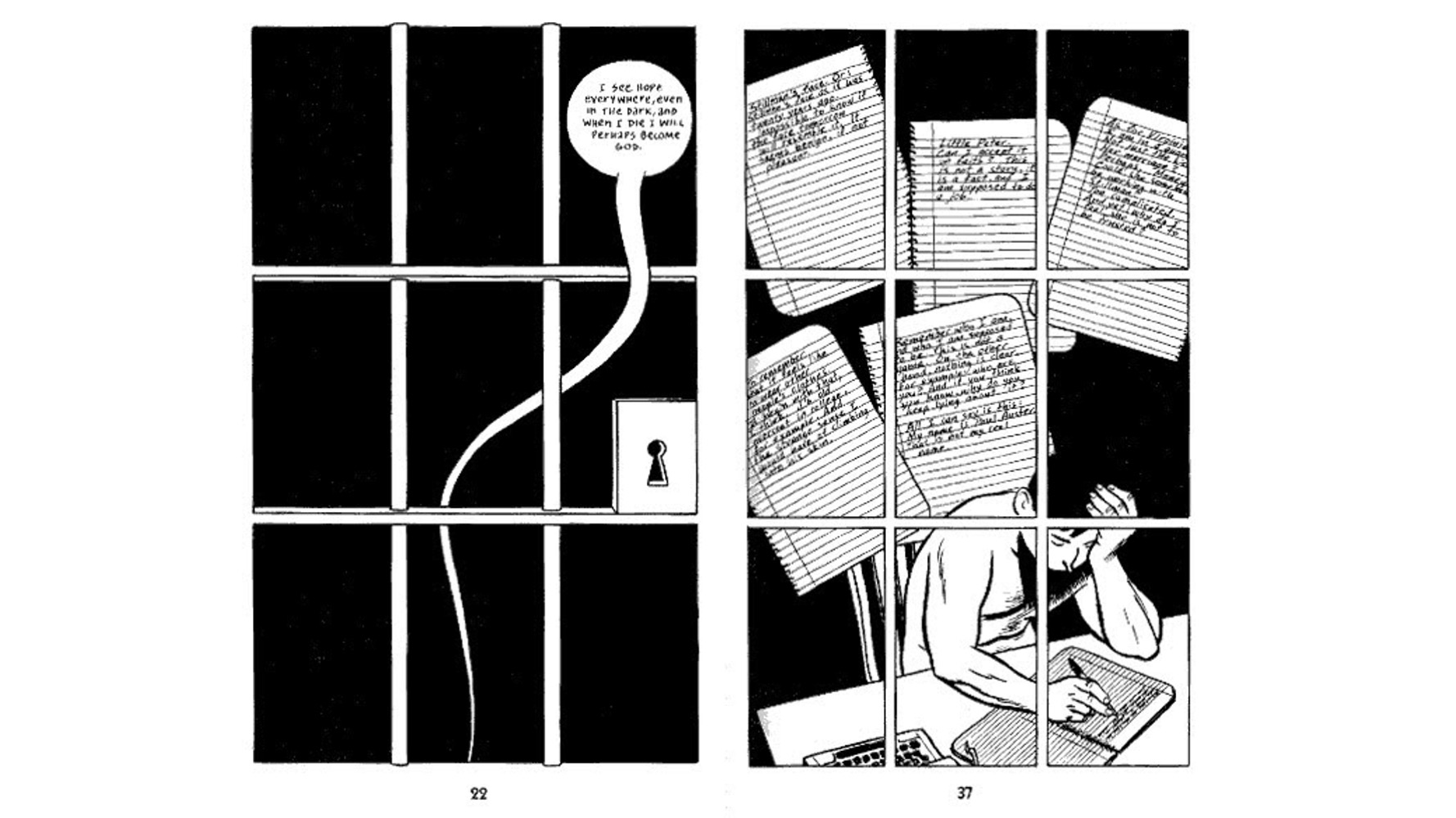
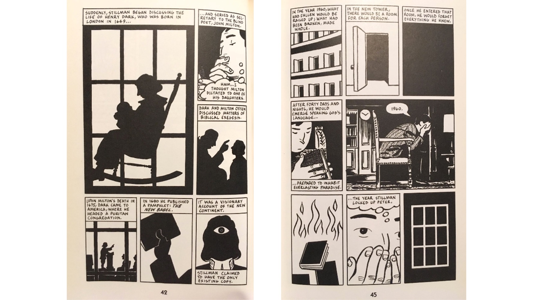
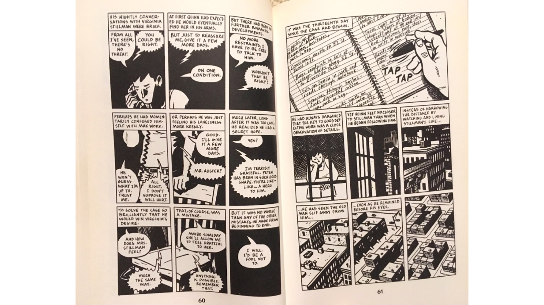
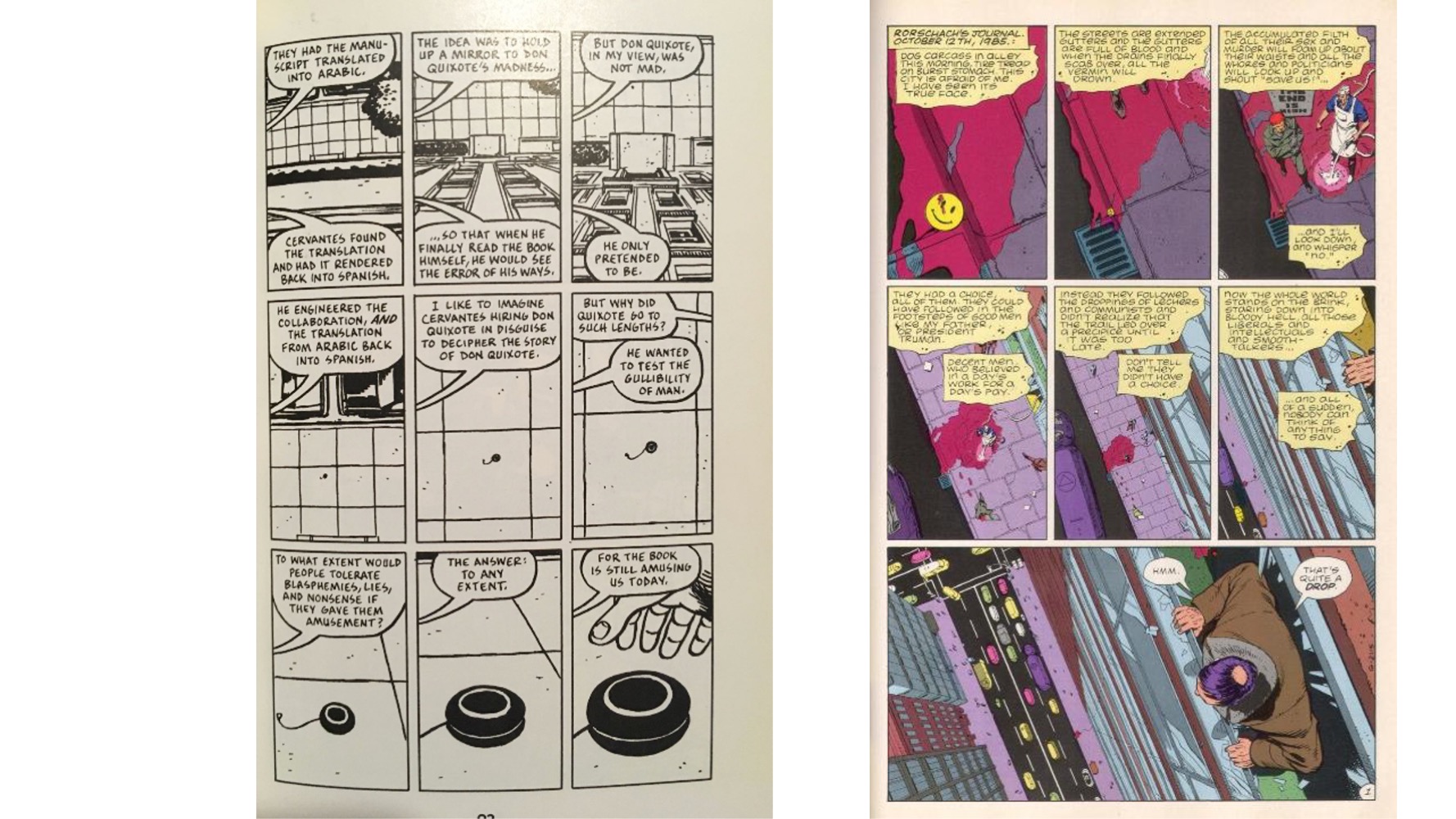
As Watchmen makes such celebrated use of its 9-panel grid, sharing a bunch here to show how this constraint can be so generative. And then also from City of Glass, which also uses the grid relentlessly – and makes it part of the narrative directly as well.
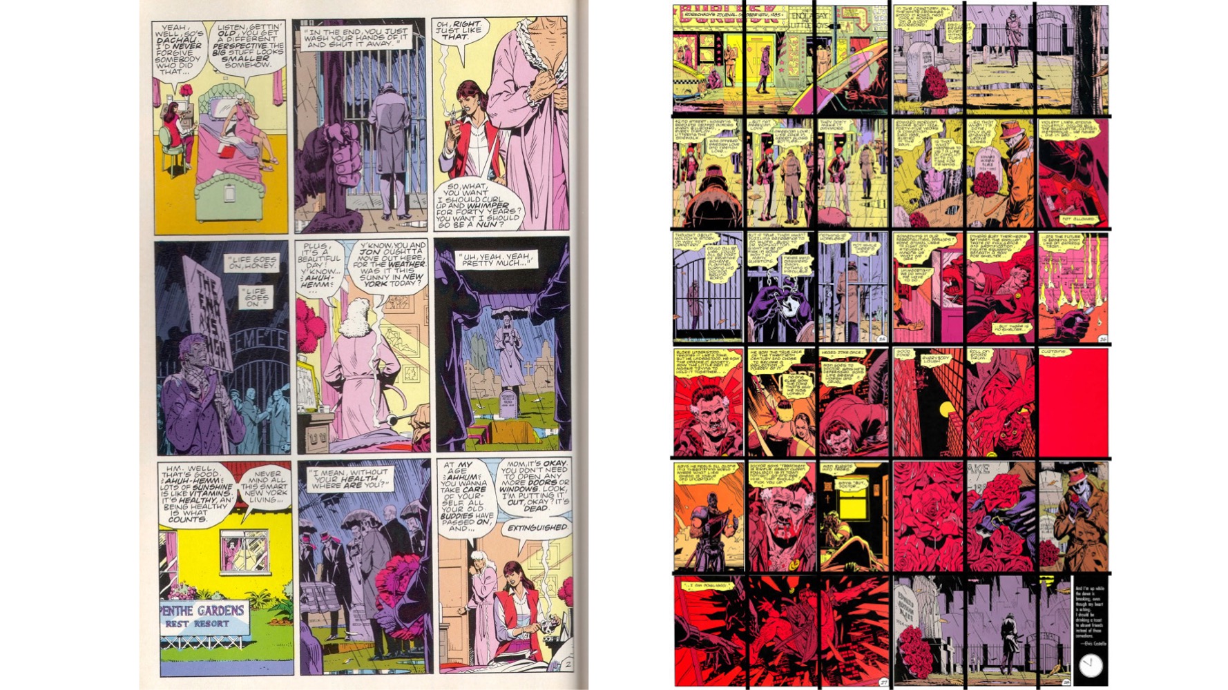
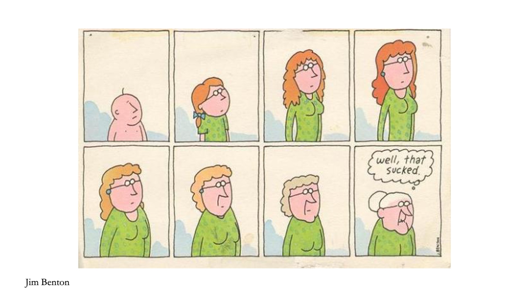
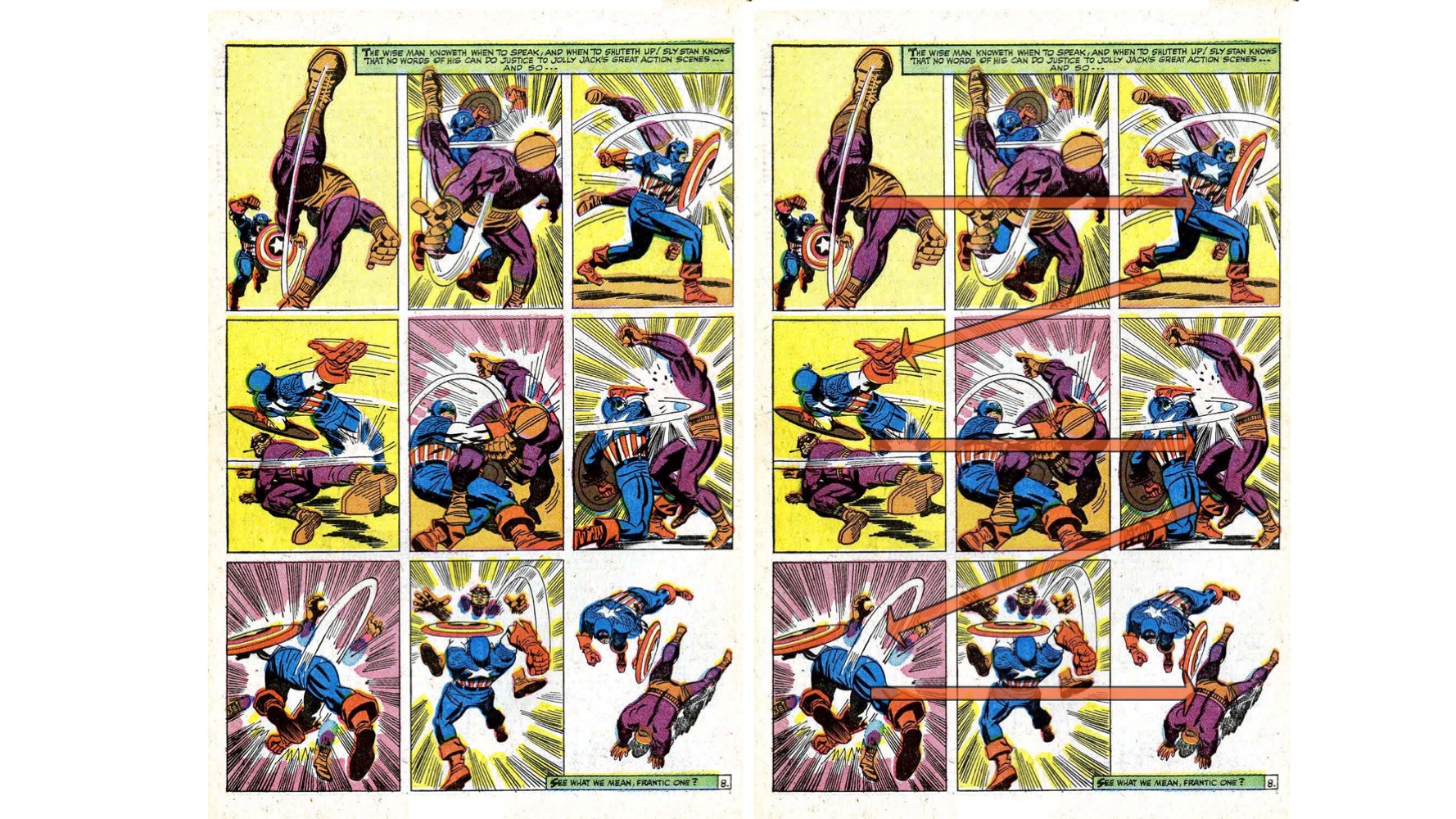
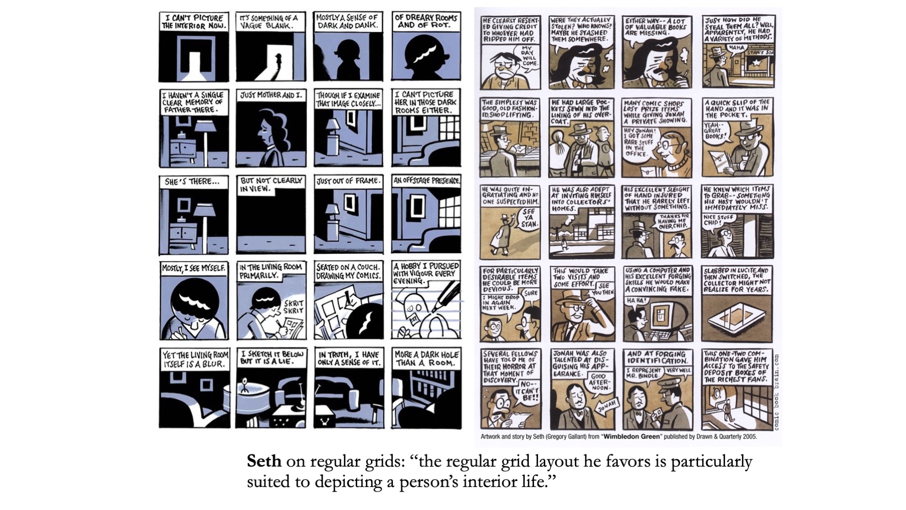
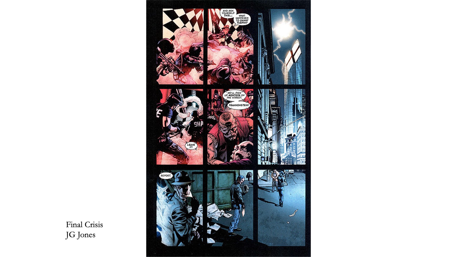
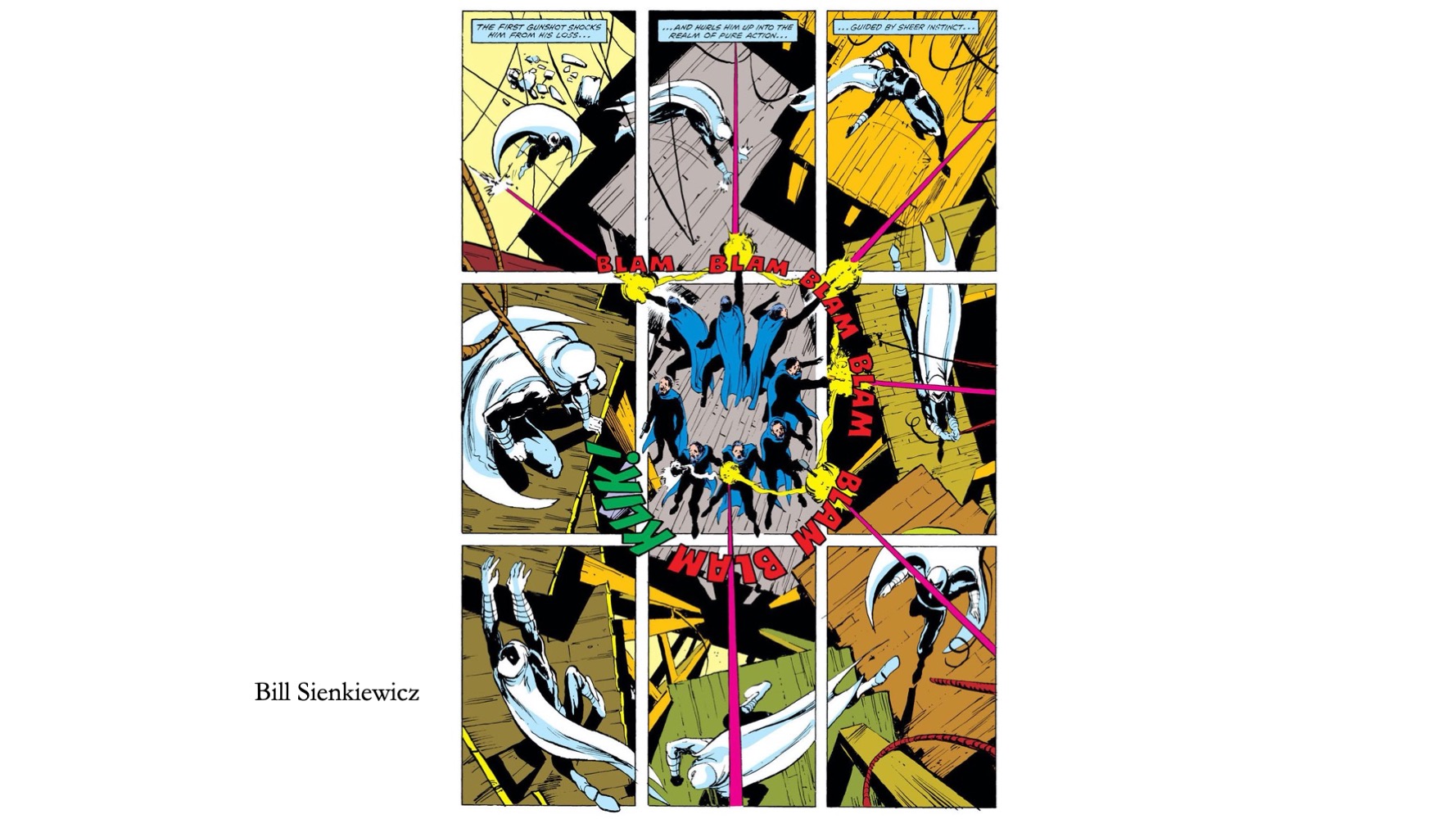
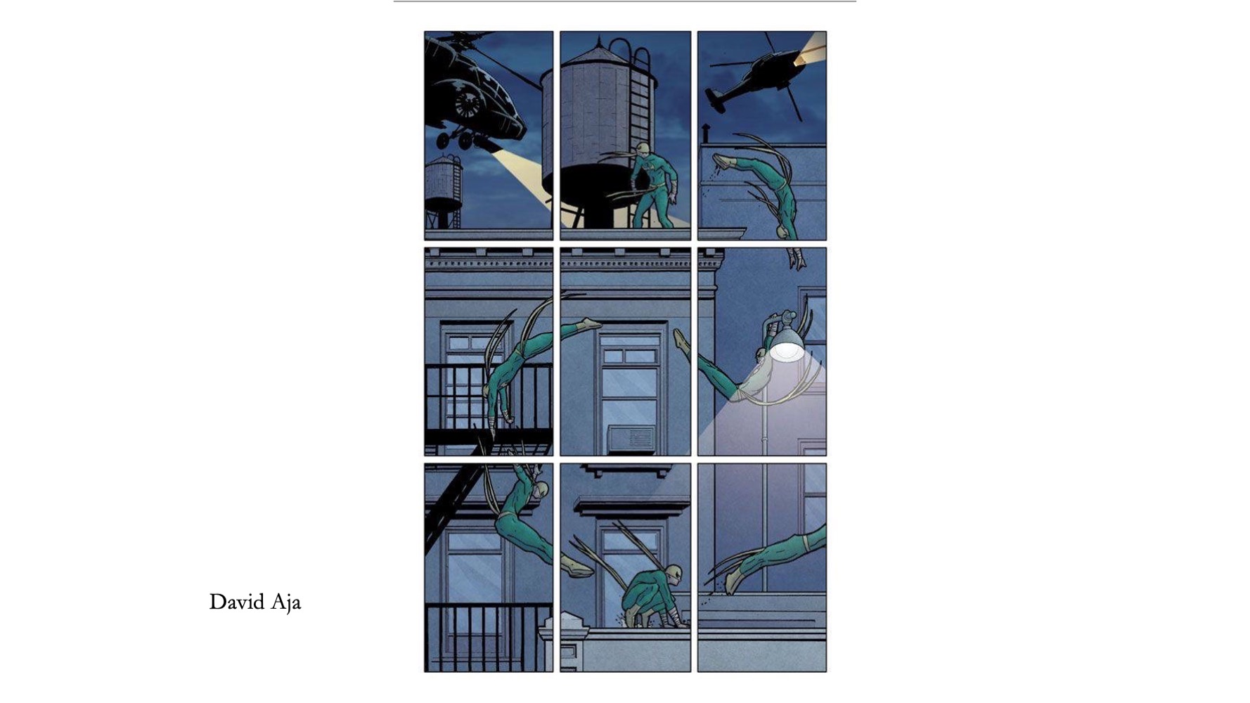
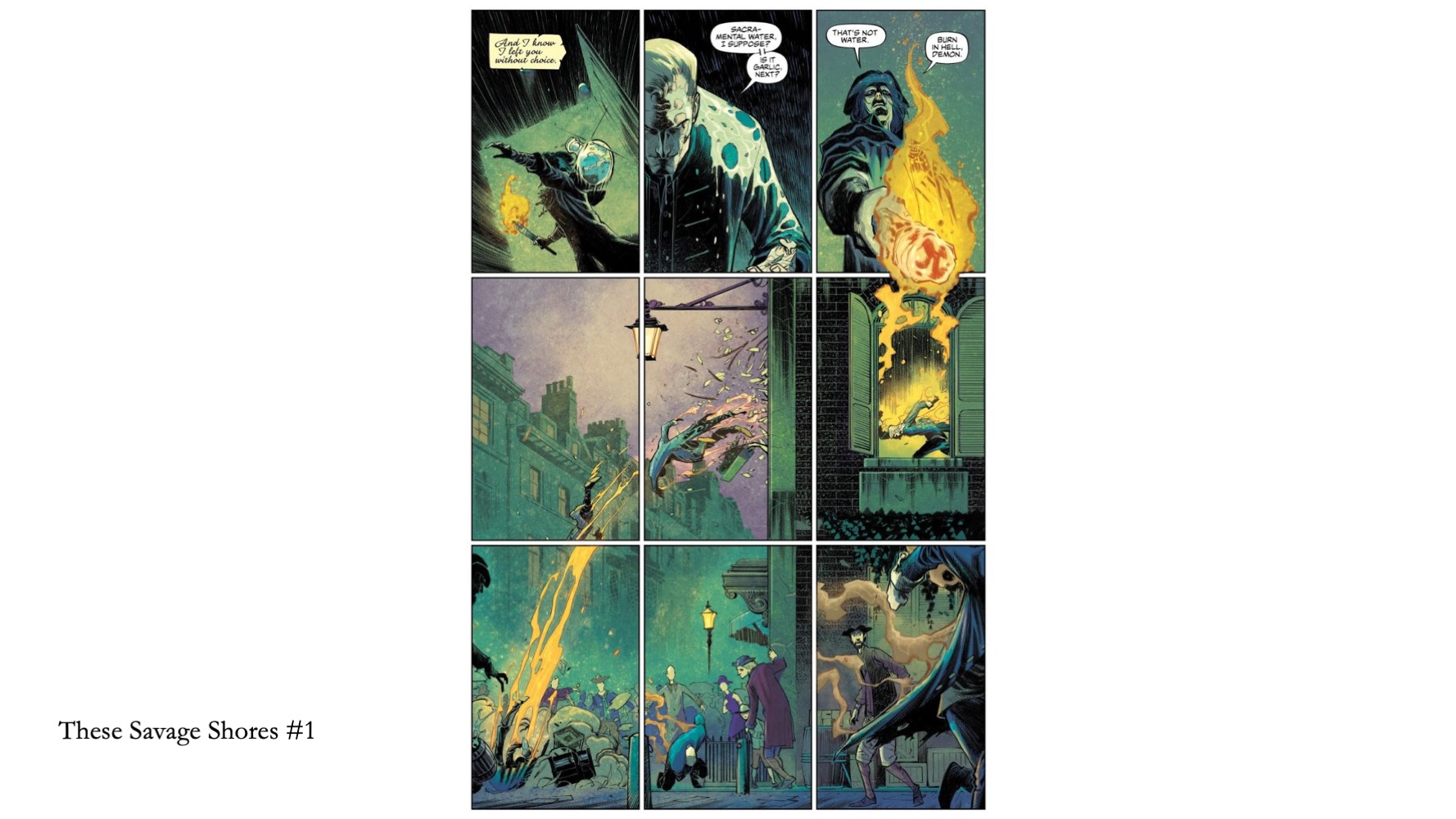
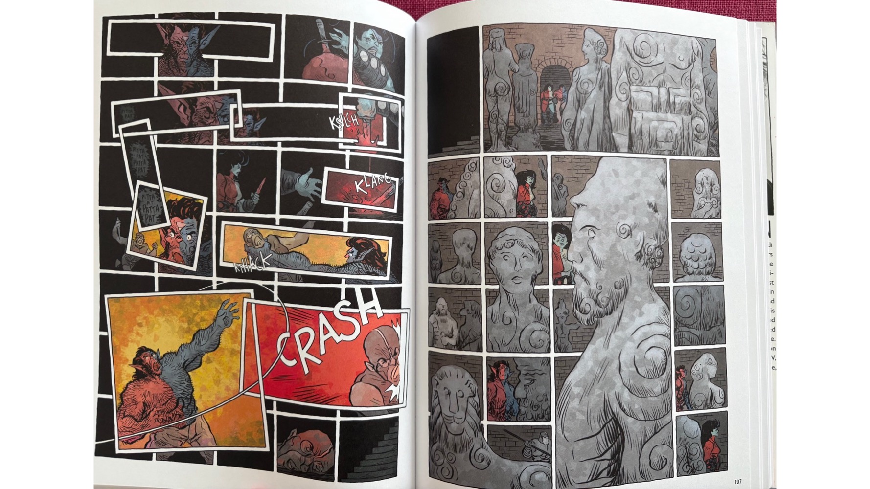
Some other cool 9-panel examples that also challenge the way we read them. Sure, LR top to bottom reading is typical with 3by3, but some of these subvert in really interesting ways…
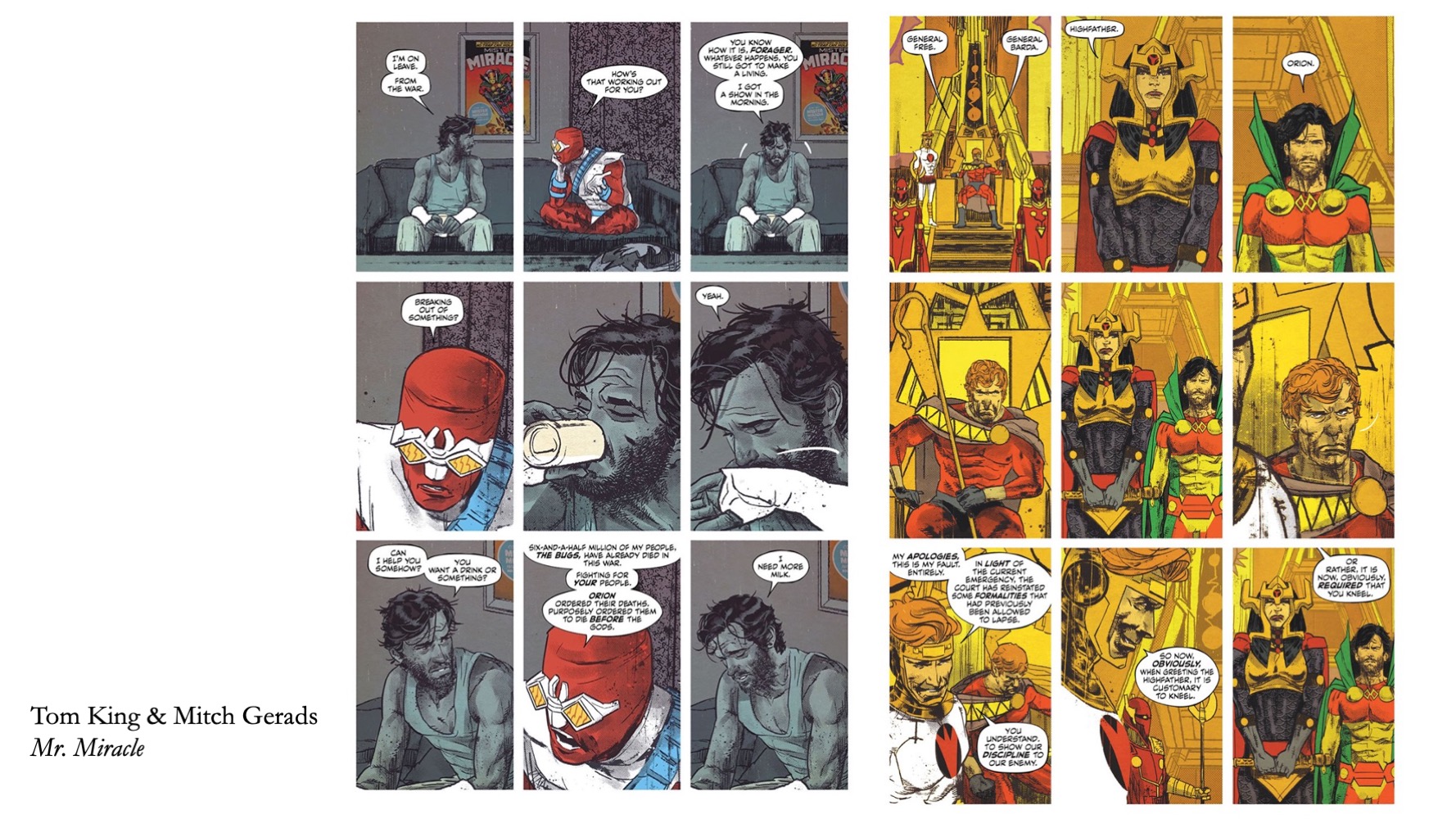
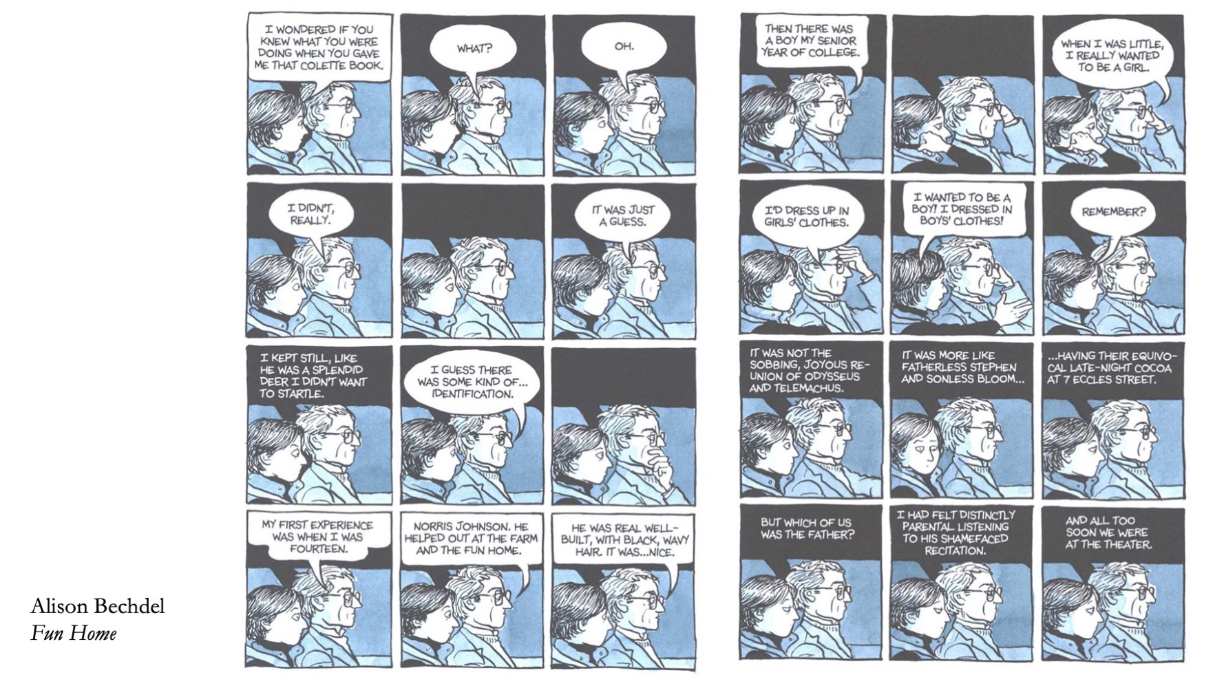
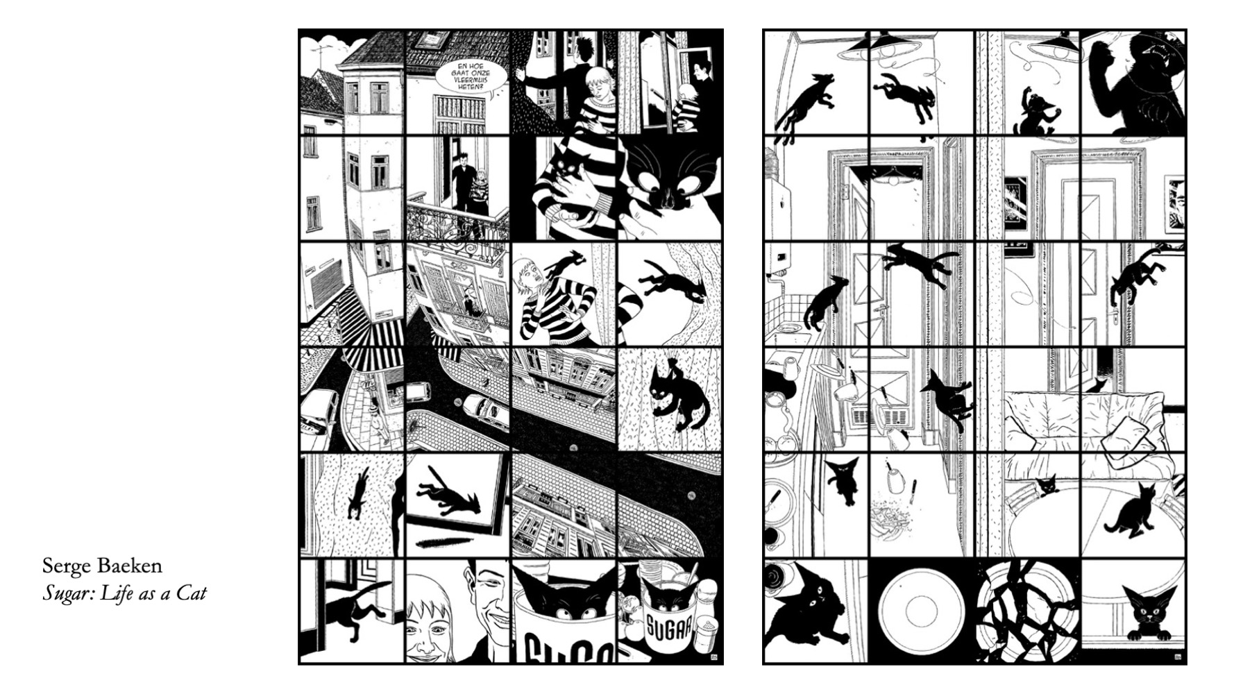
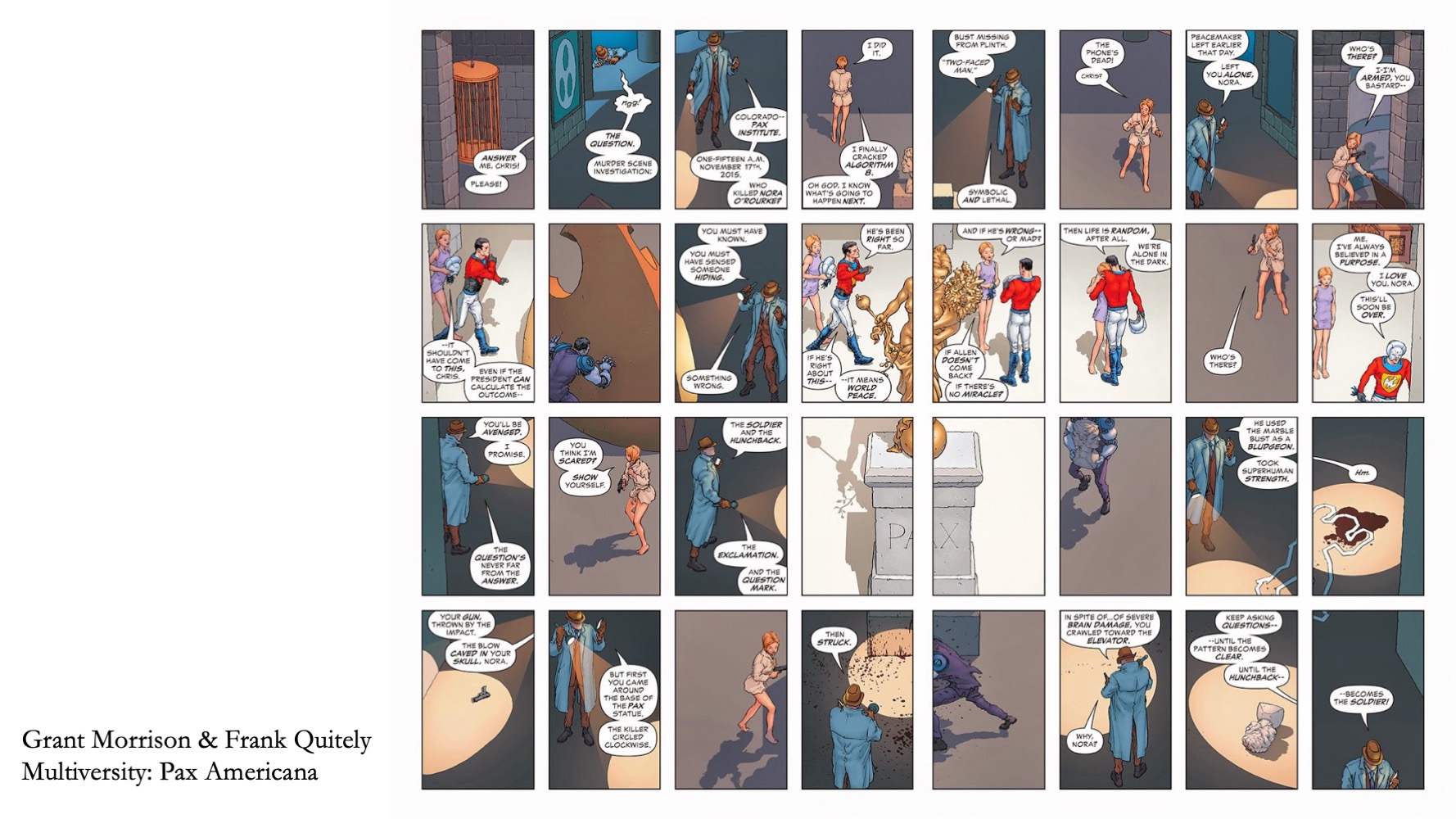
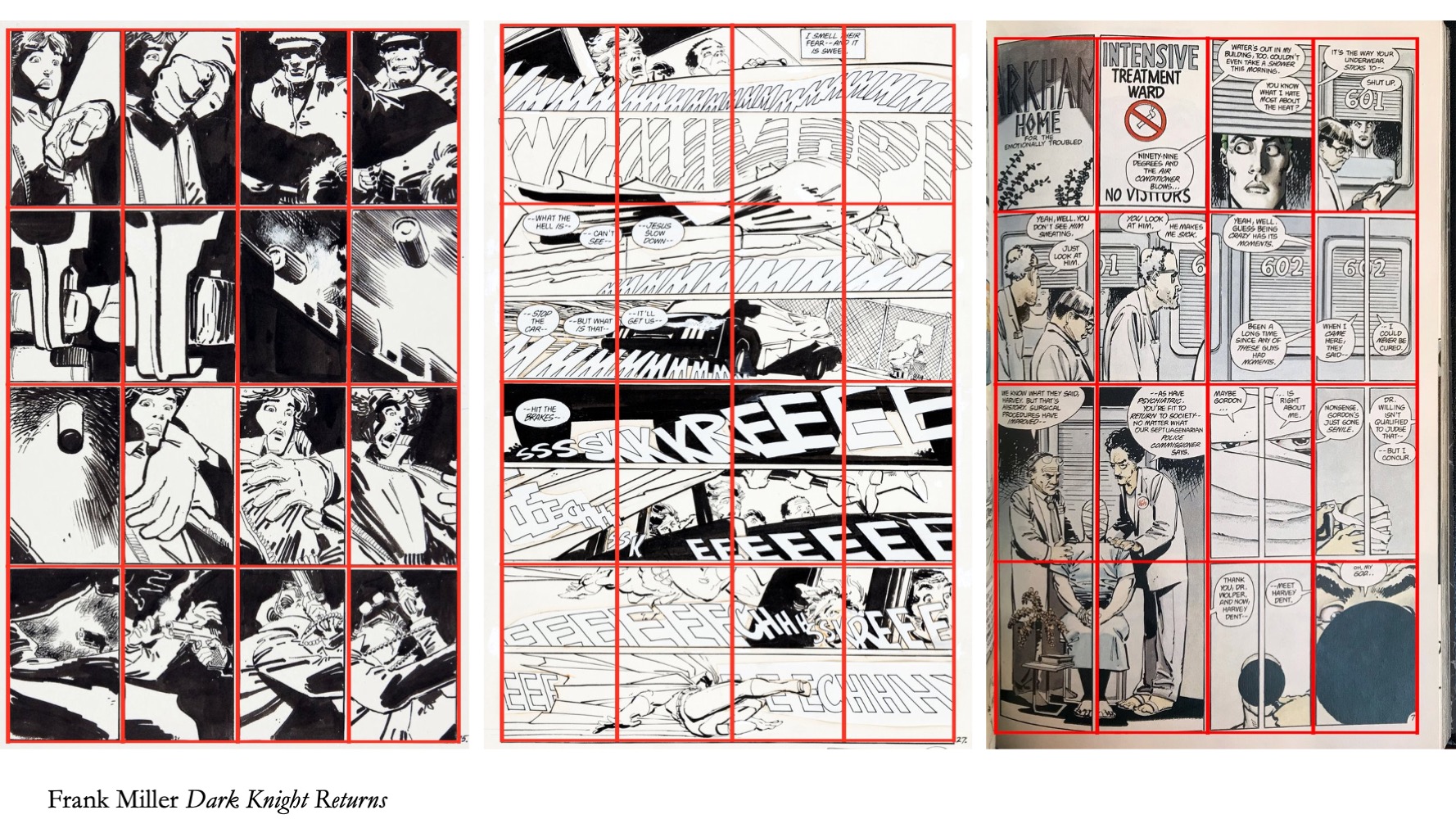
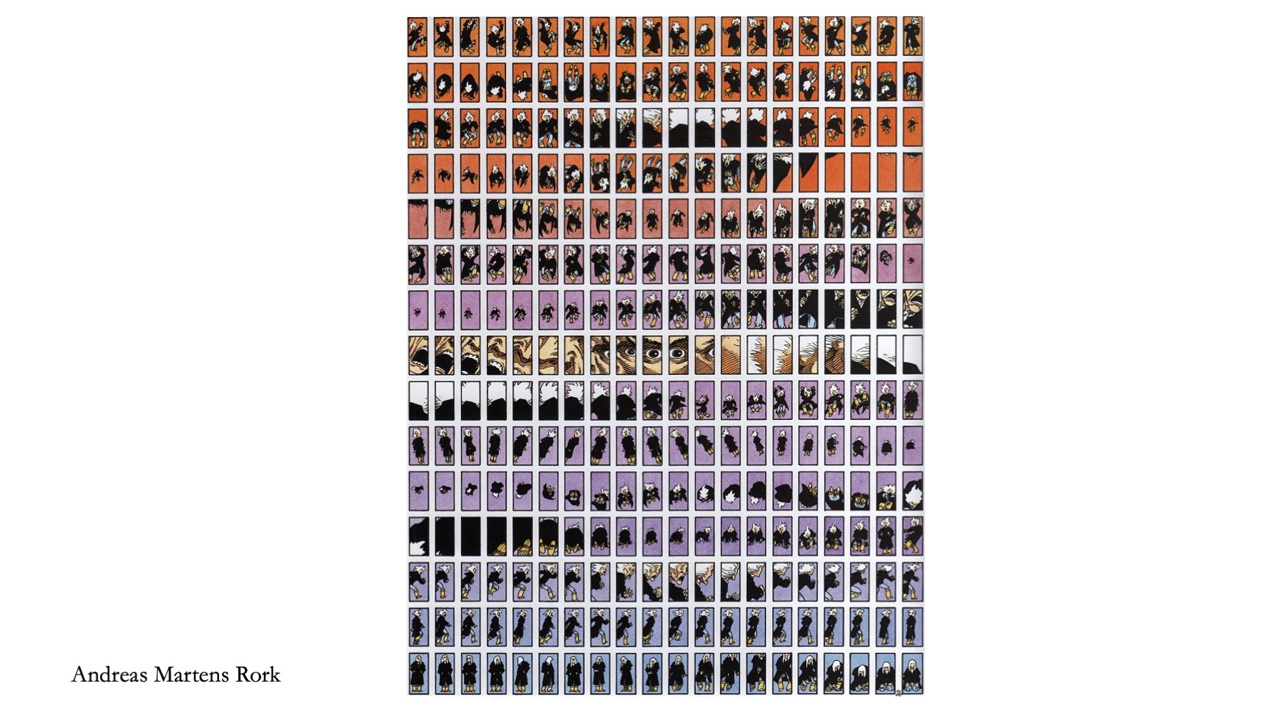
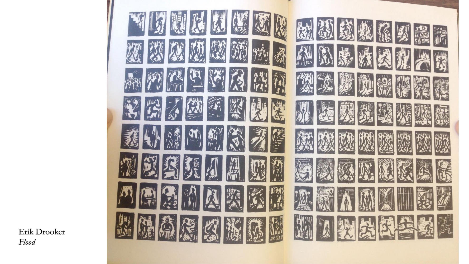
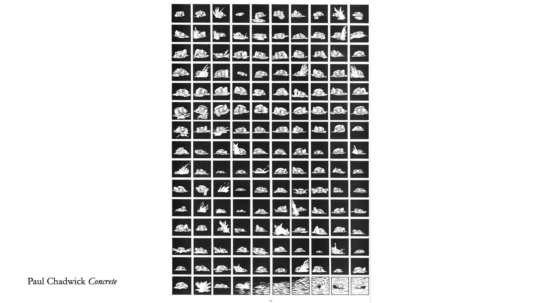
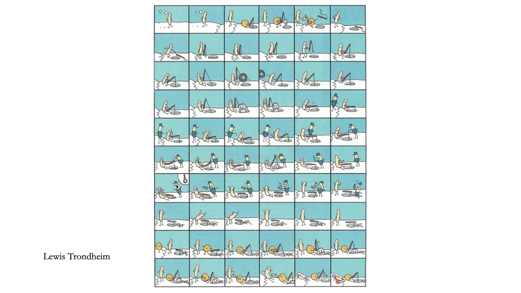
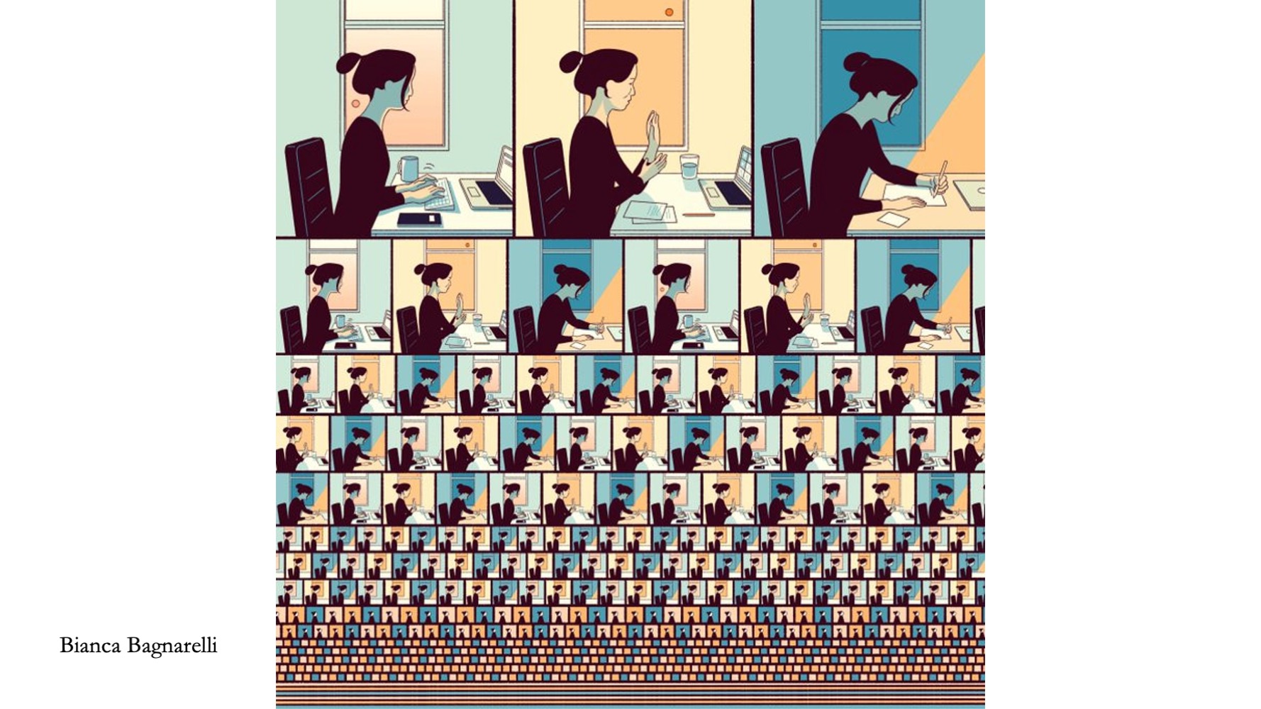
Now some bigger and then crazy big regular grids!
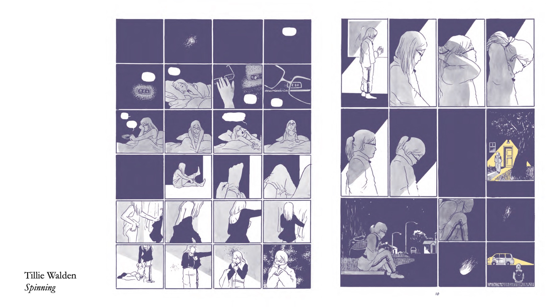
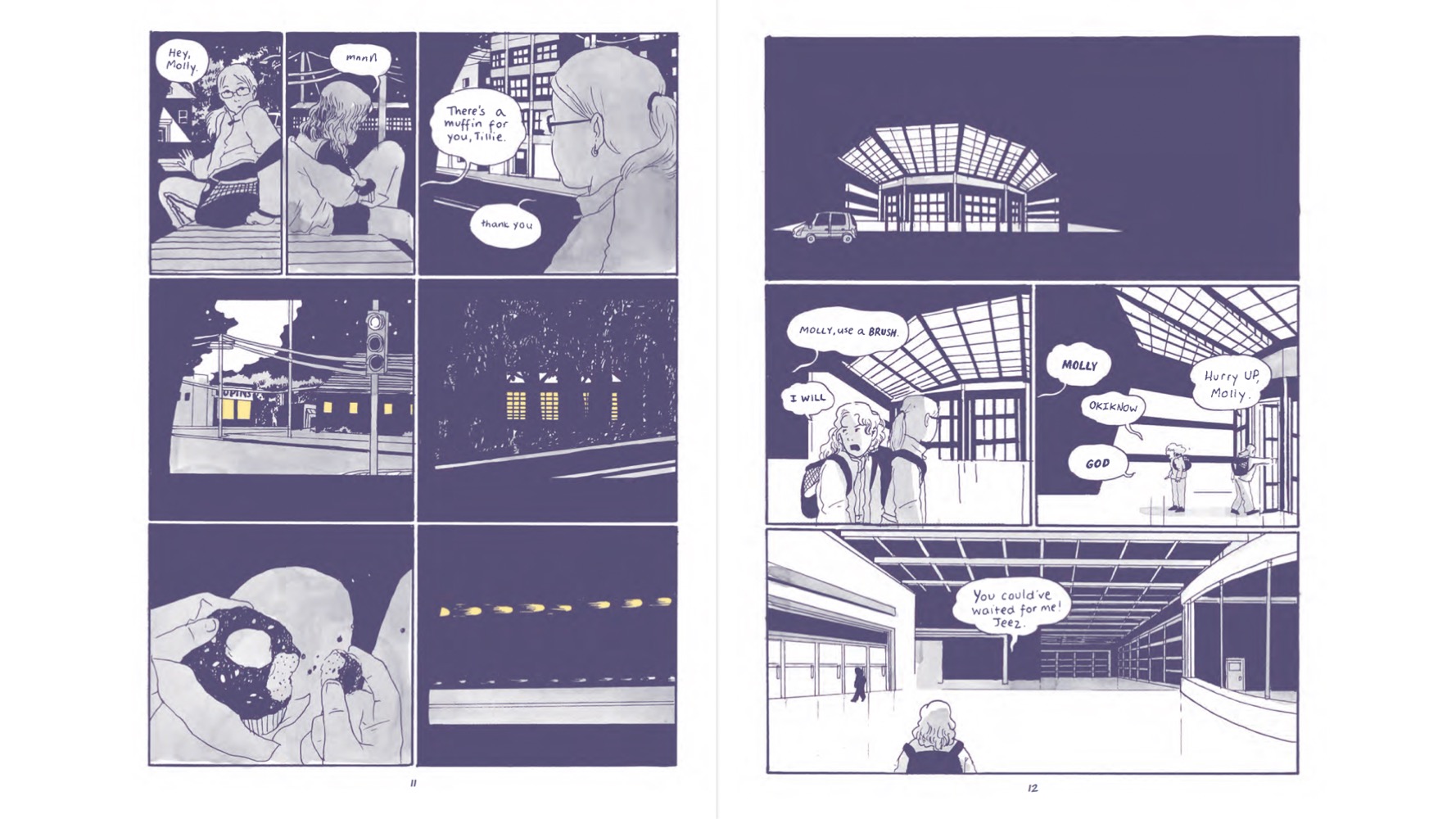
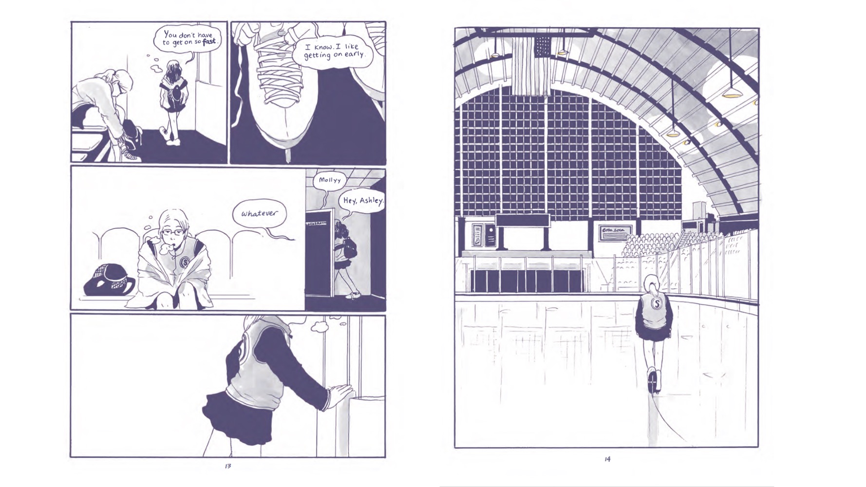
This sequence from Tillie Walden’s Spinning quite brilliantly uses the 4by6 but continues to smoosh it to the 2by3 (the most common layout in the book) before smooshing to the splash page.
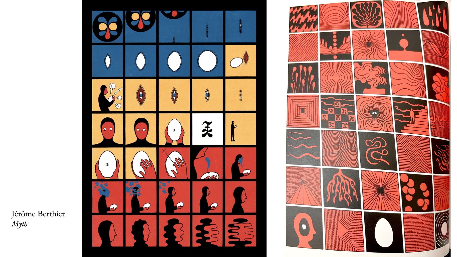
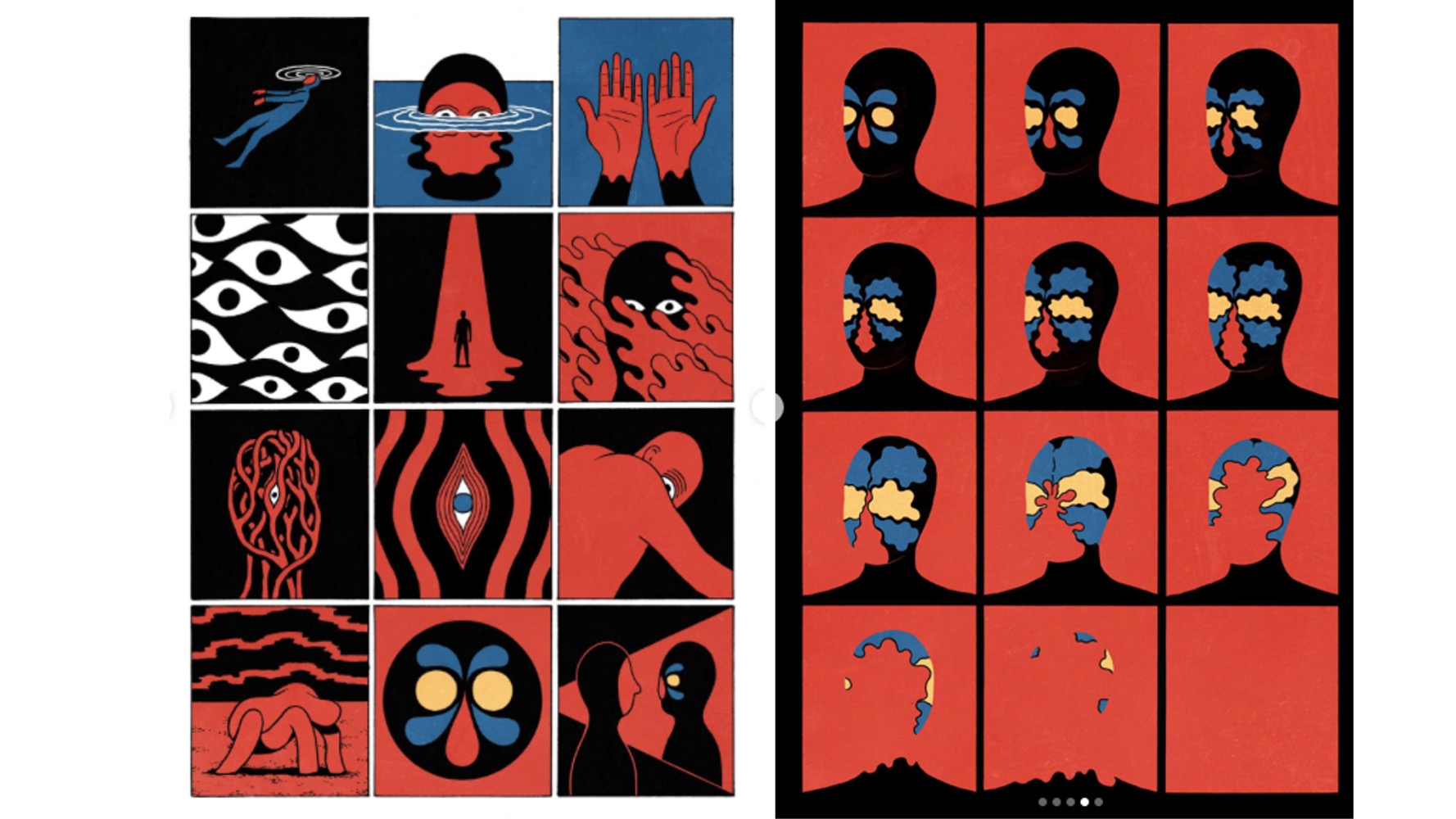
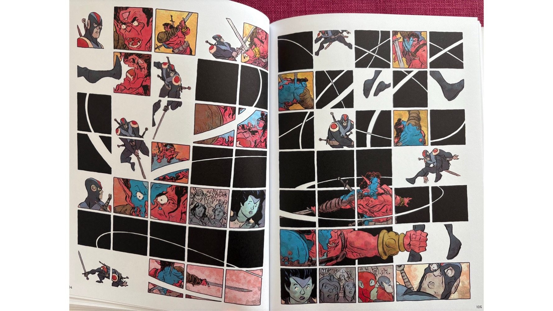
Jérôme Berthier’s Myth is just super cool.
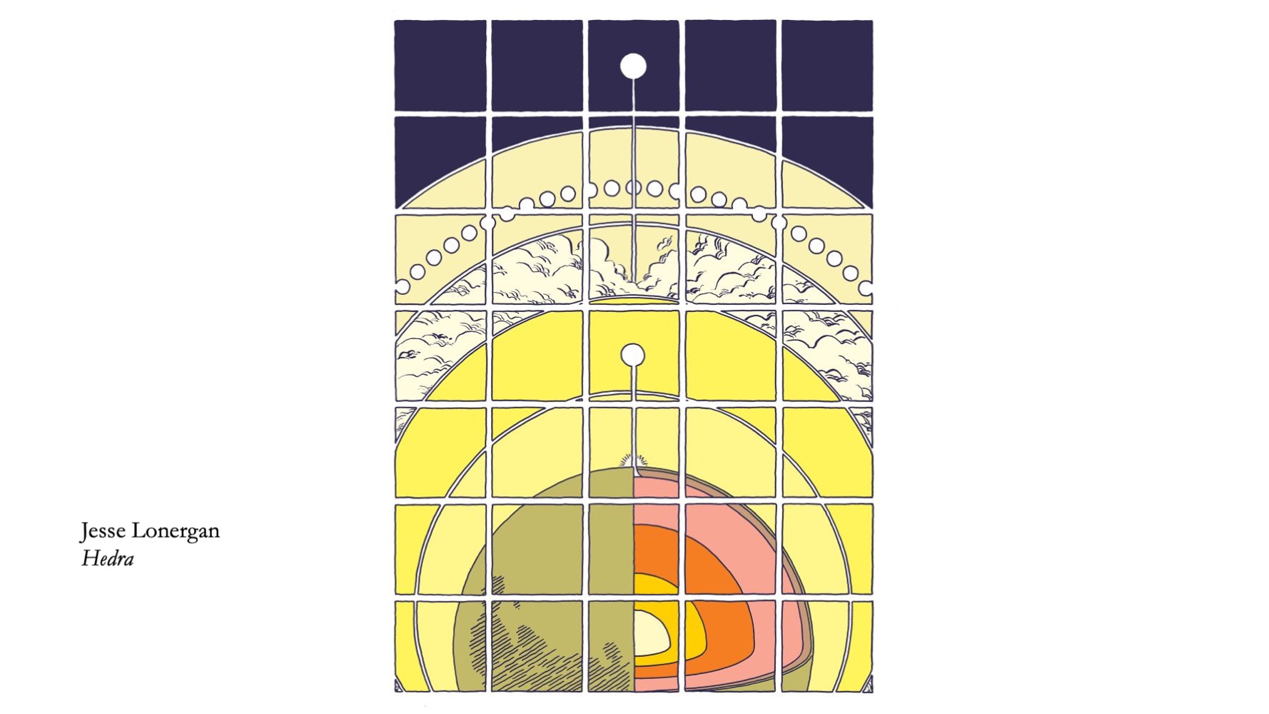
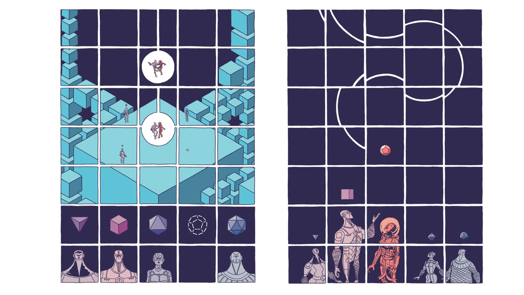
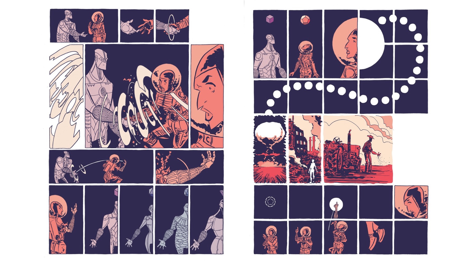
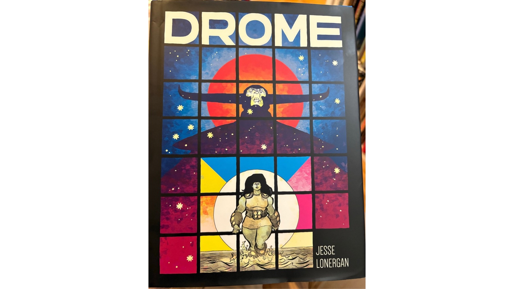
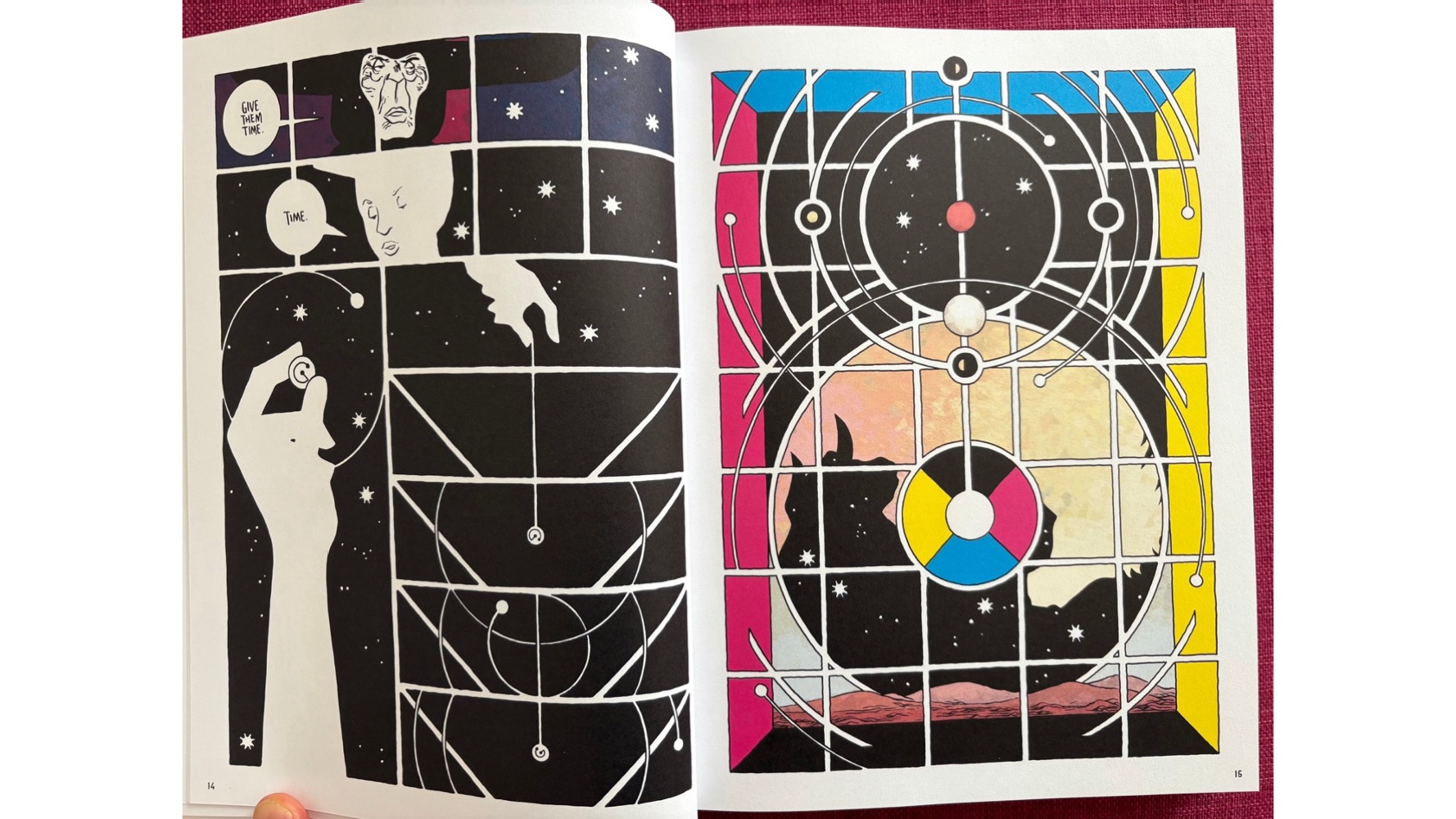
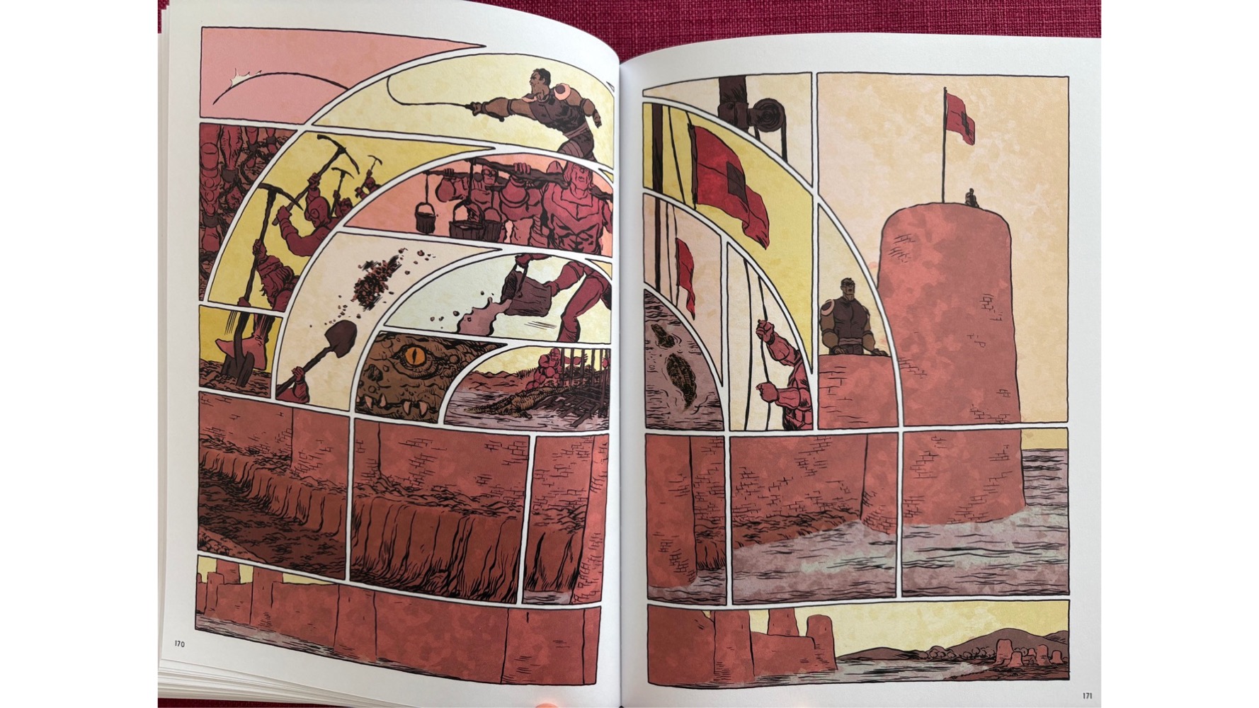
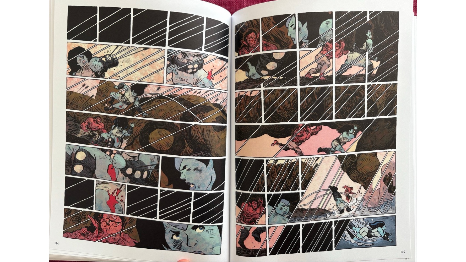
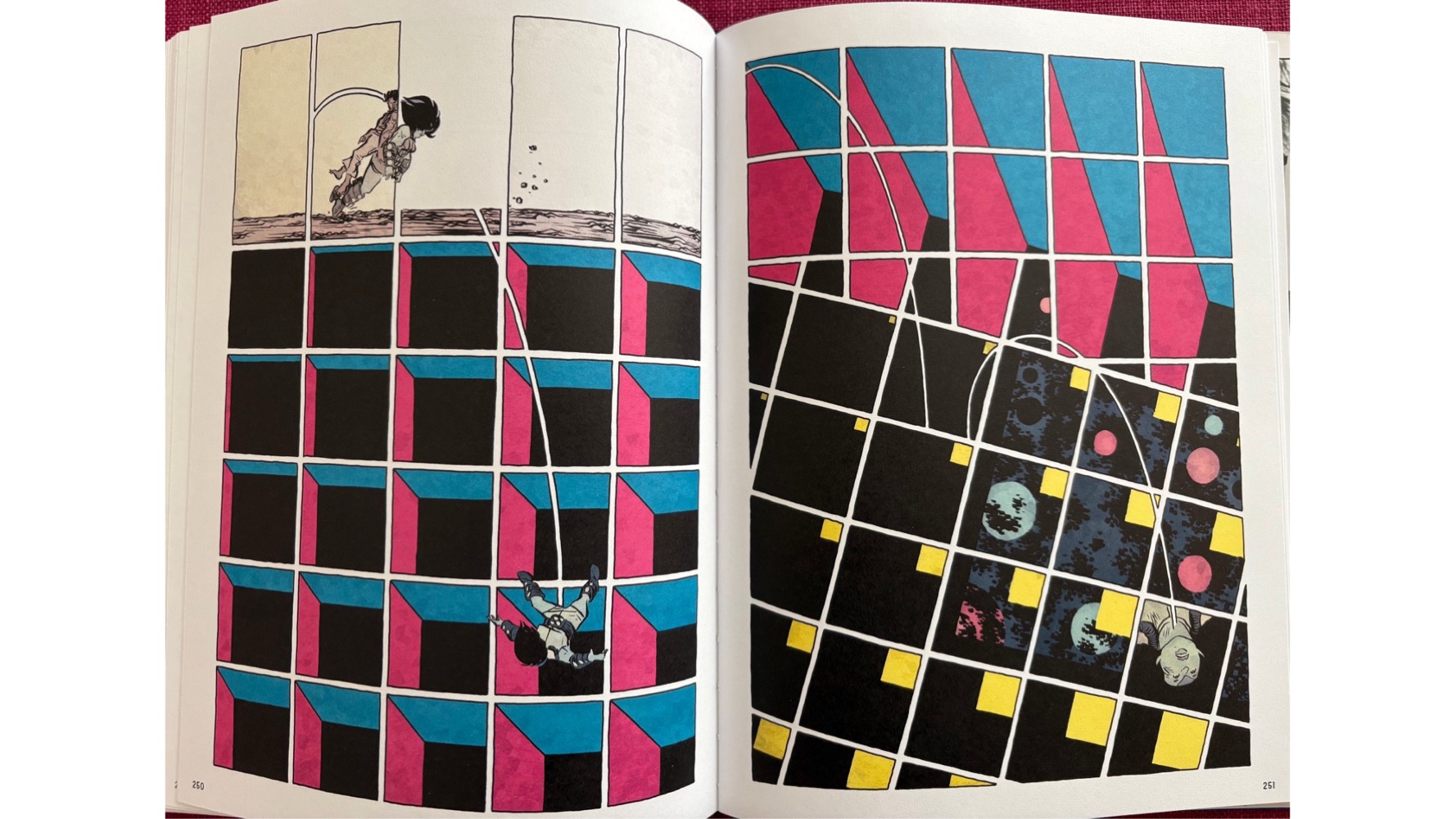
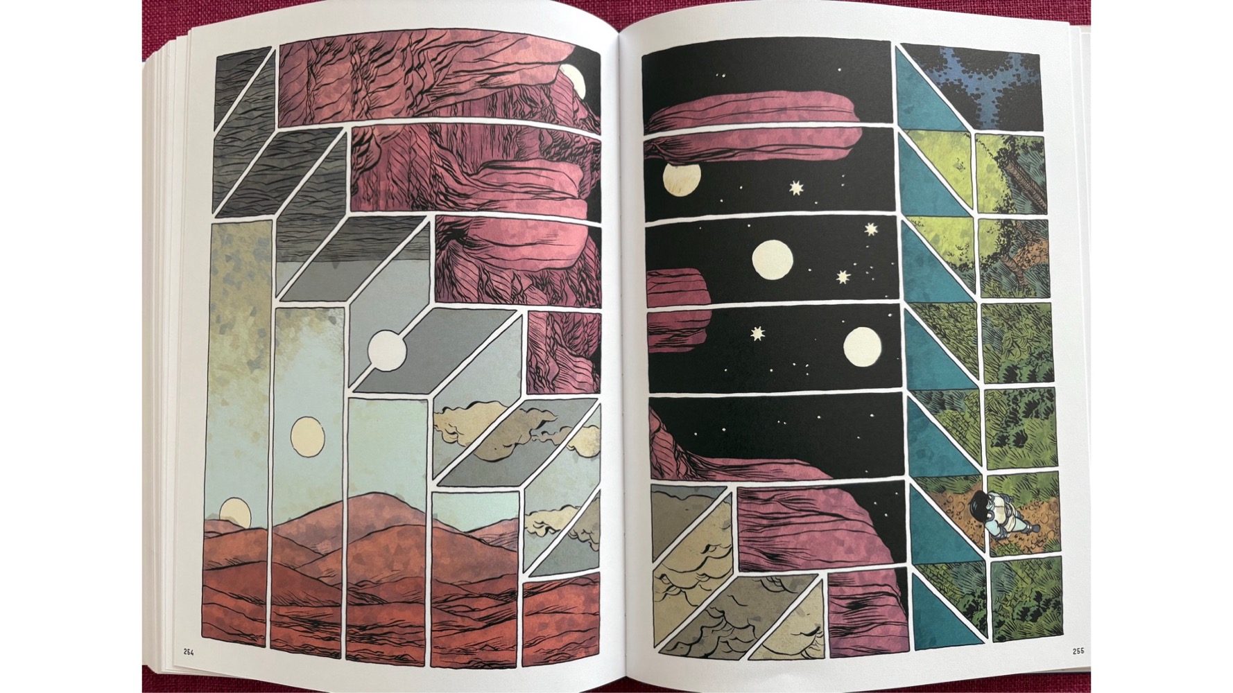
If there is a master of novel uses of grids in this moment, it must be Jesse Lonergan. I don’t have words for what he’s up to, but it’s all really cool and all quite distinctly his.
I’ll add to this as I can – and come across strong ones to work in. And as always, welcome your suggestions! – Nick